🎉 Welcome to the New Look of the PowerPoint Developer Community! 🎉
Hey everyone,
We’re excited to unveil our brand-new theme for the PowerPoint Developer Community! As you might have noticed, we've moved from our cartoonish and orange design to something sleek, modern, and professional. Here’s a quick tour of what’s new:
🌟 Sleek and Modern Design Our new dark theme gives the page a sophisticated vibe, perfect for our community of developers. The shades of blue bring a tech-savvy feel, aligning with our focus on innovation and creativity.
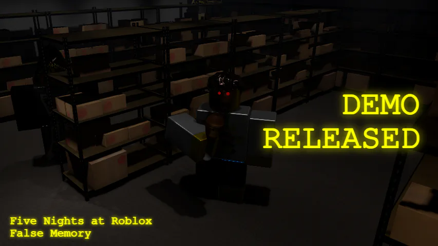
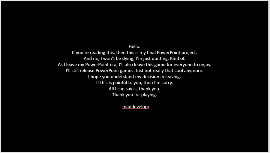
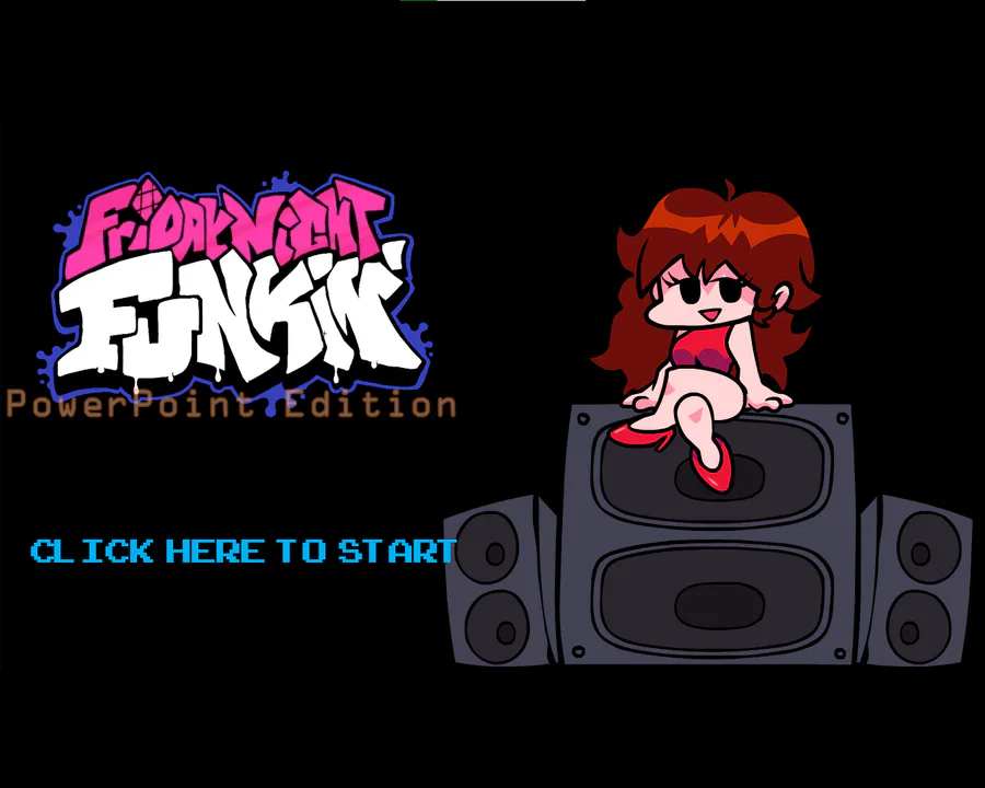
🖼 Engaging Header Check out our new header image! It features a dynamic collage of images from top PowerPoint games on Game Jolt. From well-known PowerPoint developers like @JadeJohnsonIndustries ![]() and @maddevelopr_realandofficial
and @maddevelopr_realandofficial ![]() to lesser-known ones like @foxy_fan_5
to lesser-known ones like @foxy_fan_5 ![]() and @thwl82.
and @thwl82.
🔵 Consistent Color Scheme The primary blue accents on buttons and the community logo look great and provide a consistent and clean look throughout the page.
We hope you love the new look as much as we do! Dive in, explore, and let us know what you think. Your feedback is always appreciated as we continue to improve and grow our community.
Happy developing! 🚀






1 comment