
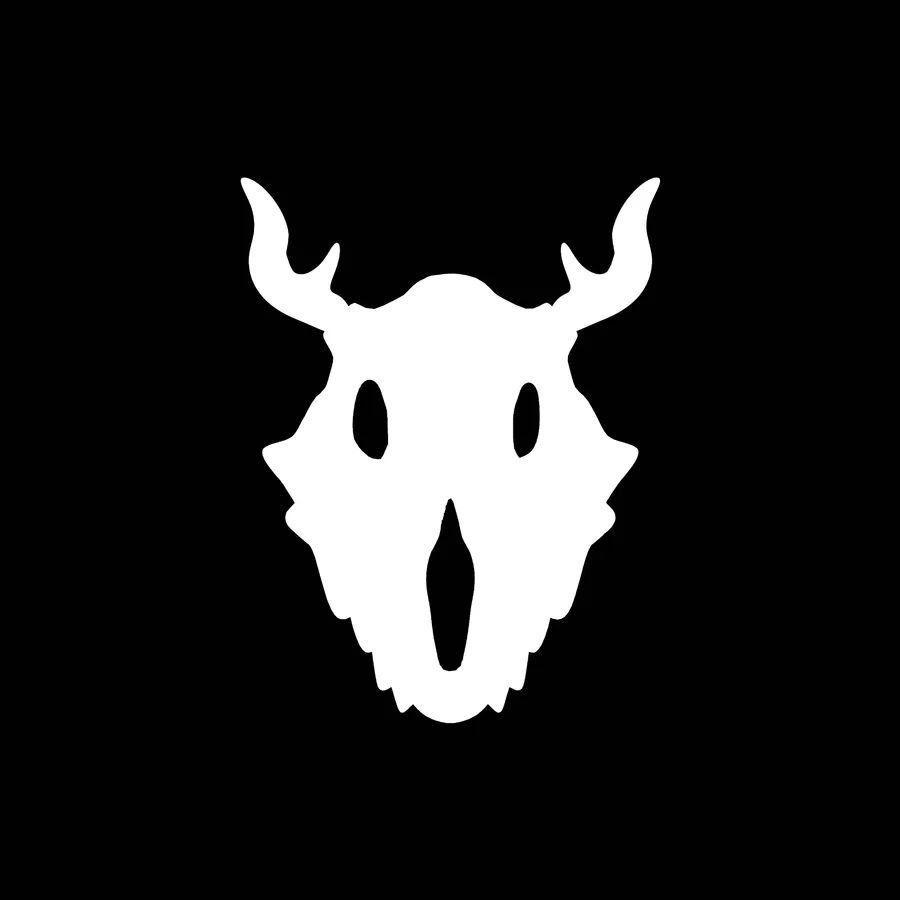
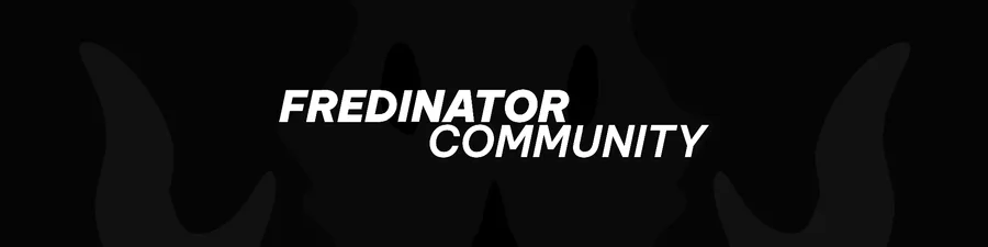
Edit: I like the Original Icon too because of the contrast, it can make your community pop in the crowd of other ones but the banner is absolute not visible but it is funny xd
3 years ago
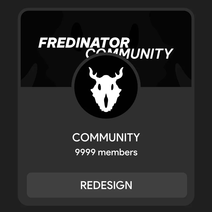
Re-Design | Fredinator Community
Very Simple Re-design, but GameJolt Loves Noise when stuff is crowded/noisy.
Colors Can Be Adjusted, Font Too but I have no idea what it should be and I'm going to sleep now goodnight <3


Next up
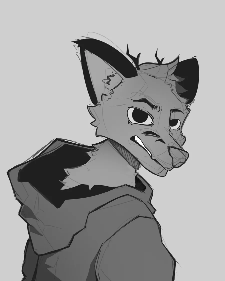
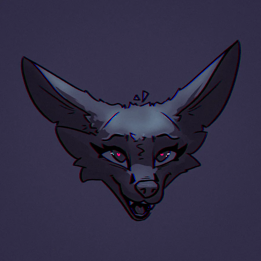
Drawing that i wont finish bc the head feels wrong but whatever at least its something to post.
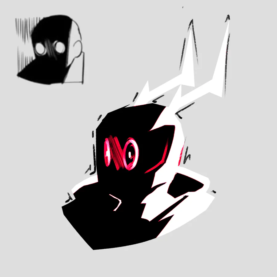
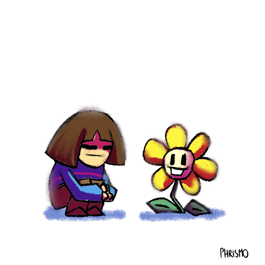
I'm using this old ahh quick sketch I made to fill the gap in posts between the weekends, when I can actually work on my sh*t in peace... xP
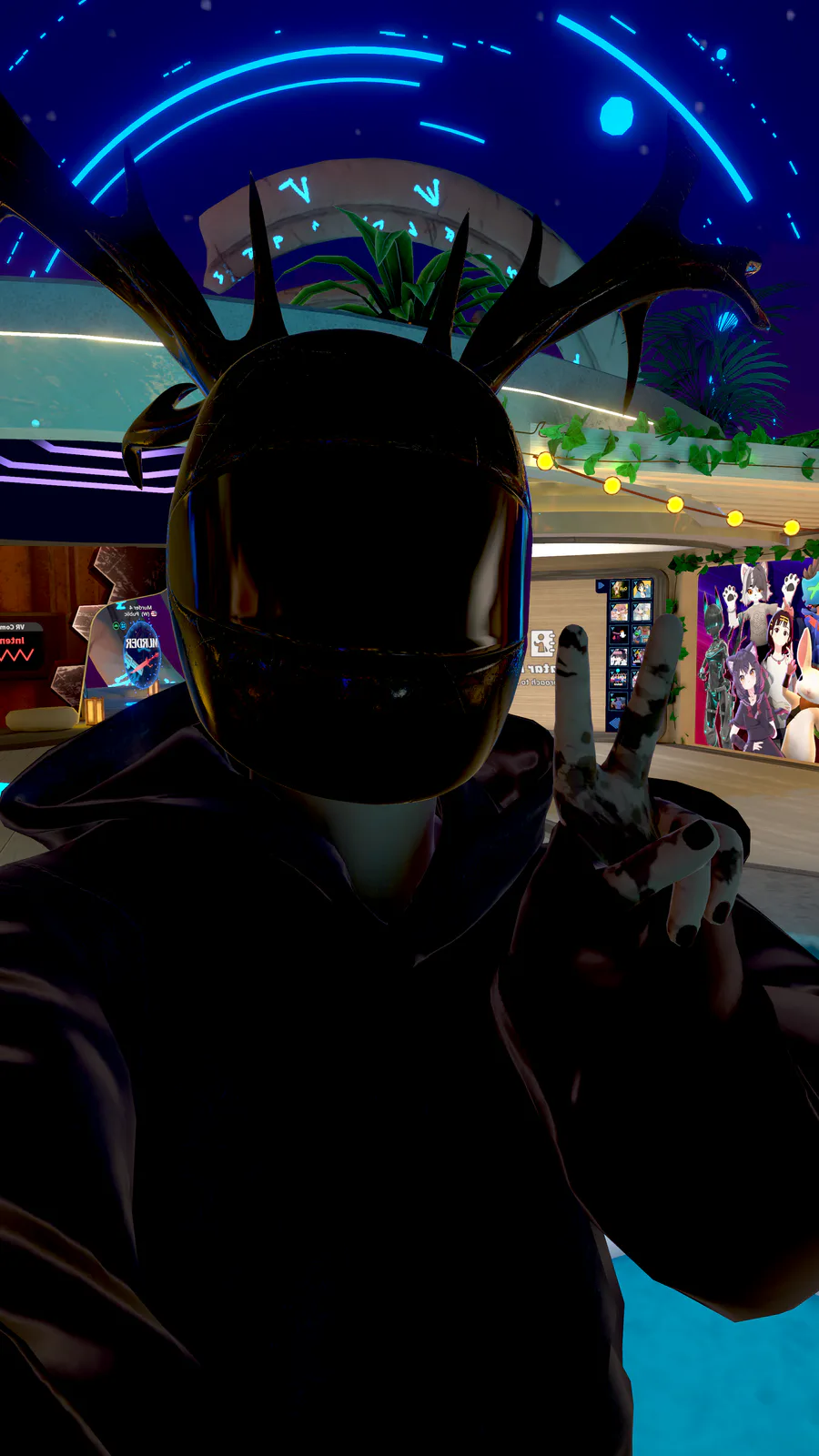
He's a bit broken but i menaged to port him well enough for my first ever VrChat Avatar.
I have no clue how the materials work in unity like u can see btw xd.


Work in progress… >:[
Here’s my live performance on the rig for something I’m not even sure I’ll finish.
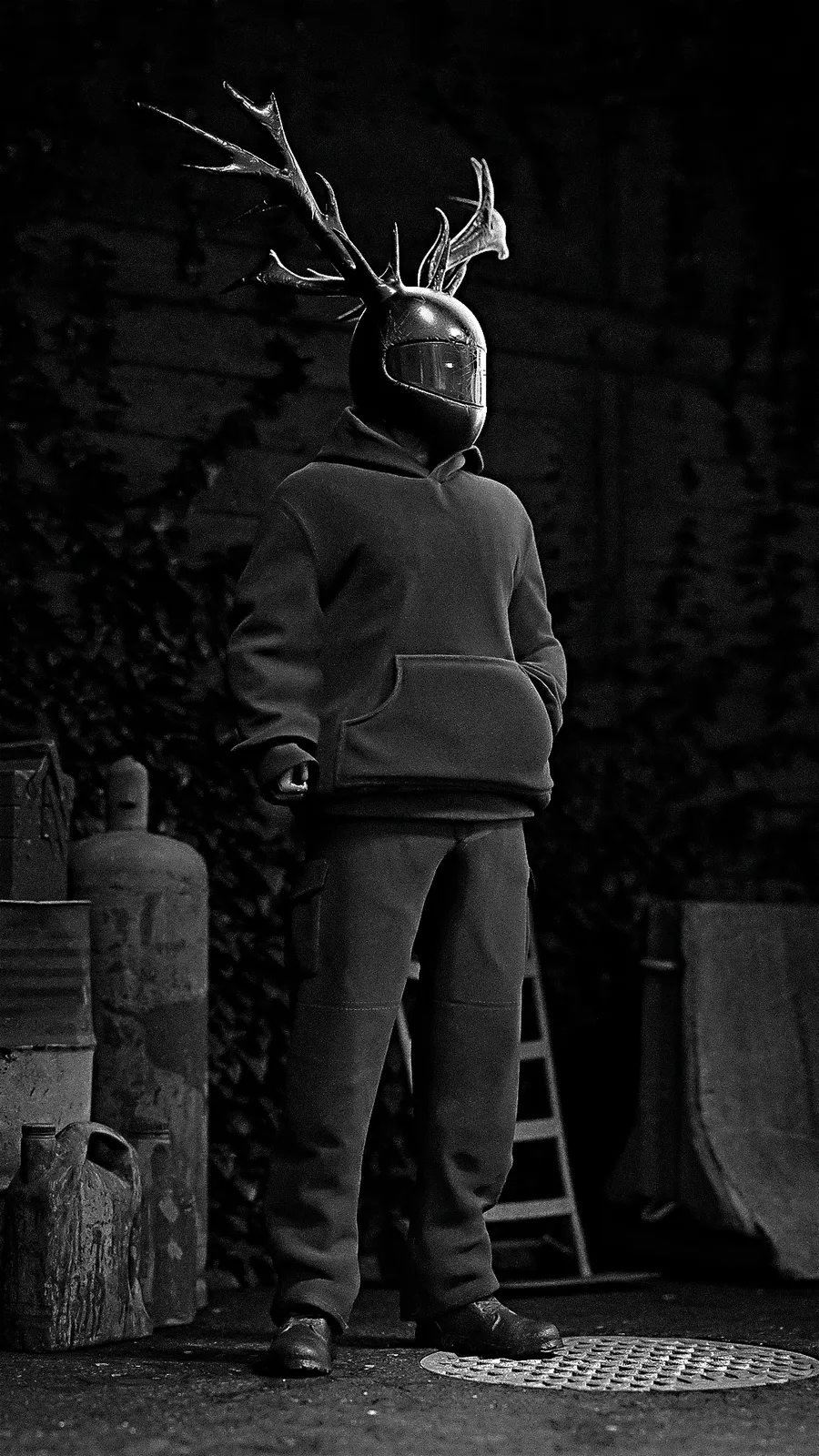
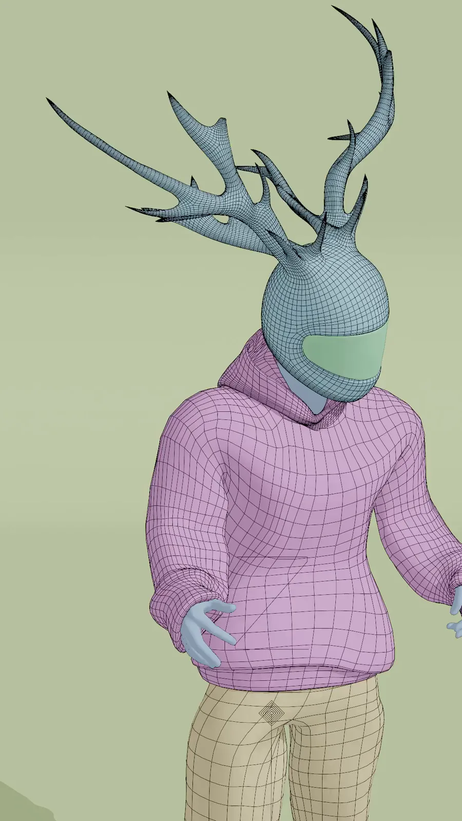
Remodel of the same dude... Again :3
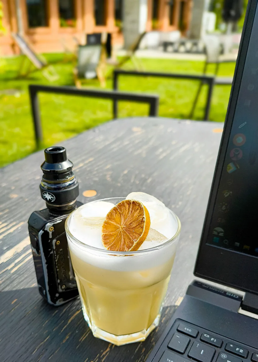
Look guys I went outside O-O Also I'm enjoying a nice Whiskey Sour.
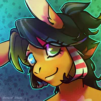
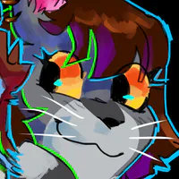
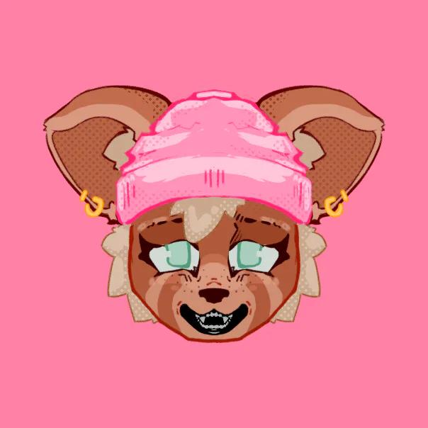
I have nothing else to upload... so... Have this profile pic thingy if you want it take it.

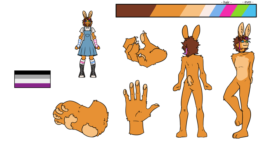
A doodle/drawing made for Kebble's VrChat Avatar im slowly playing with.
4 comments