
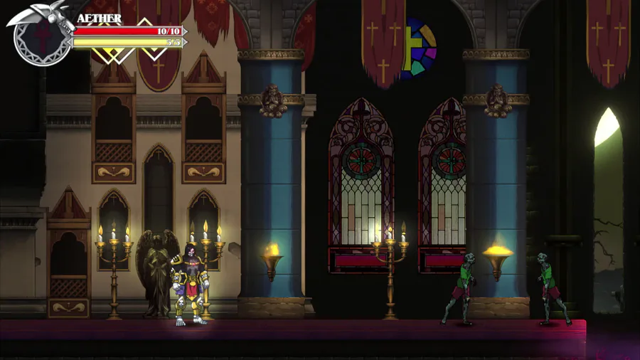
Hey! Alones here, and today we’re going to talk a bit how we tried to improve Red’s visuals to go along his new kit and gameplay!

To help sell our new approach with Red we decided to tweak his visuals as well. Red’s original design was steampunk inspired, with a lot of gold details, clocks and a stylish moustache. While it worked, it didn’t really look as dynamic as I’d like, with some parts of his armor almost feeling that they would hinder his movement. With the recent changes with Red, it was time for a wardrobe change!

To accentuate his new, energetic direction, we decided to strip most of his armor, helping he feel light and quick on his feet, while maintaining key elements from the original design - mainly his overall colorscheme and the idea of a enhanced machine-sword.

For the machine-sword, we decided going foward to a revolving-blade design, with it pointing backwards while resting and foward when active. The rotation help making Red’s attacks wider, making them feel stronger when he’s slashing down enemies, while at the same time keeping his machina-theme going without being too cliche.

Alright, that’s it for today! Stay tuned for next week!


0 comments