6 months ago

Regarding the redesigned speech colours:

I'd like to have some discussion about this, as it may not seem like it, but this is a big change for me!

(le article for more info)


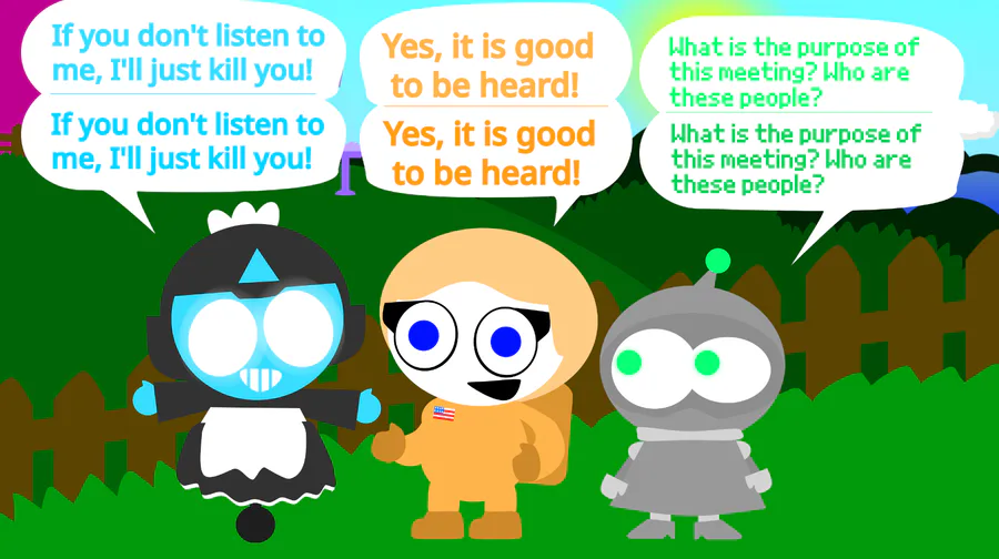
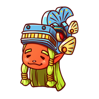
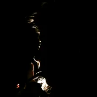
What do you think? (top: old colour, bottom: redesign)

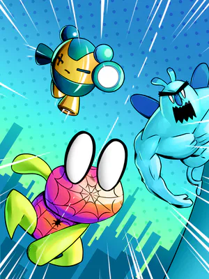
I personally think they're more legible, but seeing as shape and colour are all of MMNNPIDAH's identity, I can also see how they can be controversial.

I have made slight style shifts over time, but this is the first time I've had actual suggestions and first time I'm being public about it

So please, talk about this and share your thoughts! I look forward to hearing about it :D


15 comments

Loading...

Next up

Lovey bunny

I wondered for a while last night who I'd consider the main antagonist of MMNNPIDAH.

What do you think and why?

I might share my reasons later.

Banks a lot

I've finally finished @gamejolt origami logo for @thoro and @CROS <3

#origami #gamejolt #fanart

Watch your atone (Part 2)

Rudolph Richardson!

(From Ghost Eyes)

Watch your atone (Part 4)

Have I got a quay for you!

Basil!

I tried out a new rendering style and it took foreverrrr

Also, new watermark! :)

Watch your atone (Part 5 END)