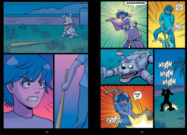
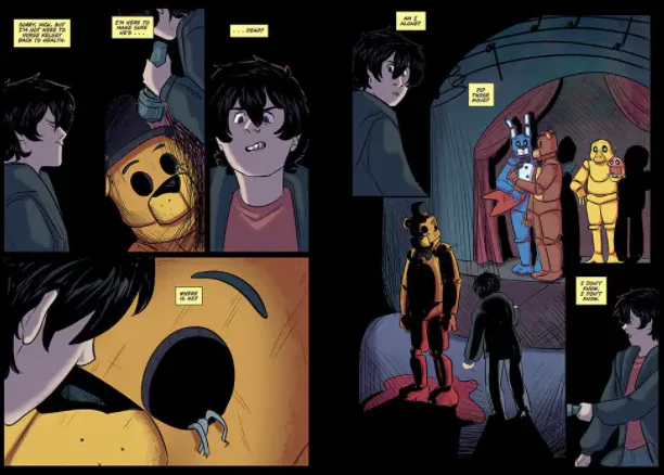
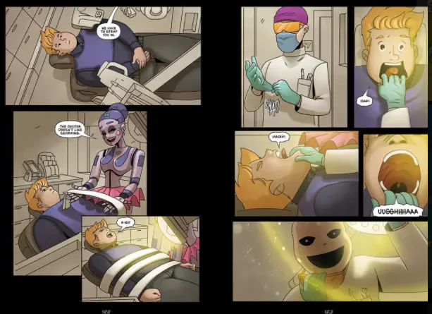
Let's start with looks in general, that's what a visual novel is for right? The books/stories seem to have a different style, which throws me off a lot. I'm unsure if this was just a style choice or if this was because of different illustrators for each book/story? Each book's style contrasts from the other, which I feel iffy about, but I think if it was an intentional choice the motivation was "Let's match each story's art to how the story might be portrayed! " something or other, unless it was just because each person who drew the lineart are different for each book. Following on from that, panels and colouring are both done by different people, yup! The people who draw the lineart aren't the people who end up colouring the scenes, which doesn't really make sense to me? I'm unsure if that's a common thing in illustration but I find that odd.
⚝--------------------⚝--------------------⚝
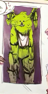
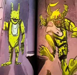
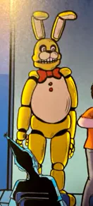
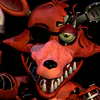
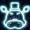
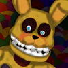
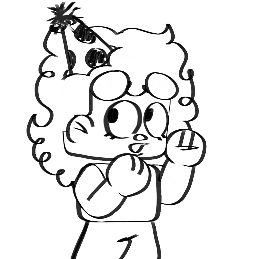
The images I've shown all contrast eachother greatly, from the faces to the way shading/lighting is drawn. You could even say the Fetch panels display more of a classic kid's comic-type illustration while the New Kid panels show a completely different style, leaning more into the horror comic style. Out of Stock's panels are messier and I honestly prefer this one's look out of all of the ones displayed, since I feel it fits with FNaF overall. Room for One More is... Eh... I'm really not a fan. This one just looks off overall, and it seems like they cut down how many frames there were since it feels like we've just skipped a part between each page. Where'd that dentist come from? However, I am aware that this may just be to not waste pages since there is a limit to how many there are with these books, I believe it is 192 pages?
⚝--------------------⚝--------------------⚝
False Advertising???
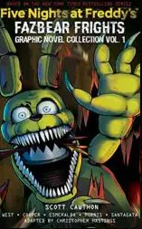
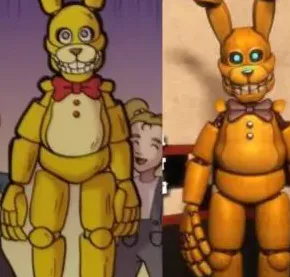
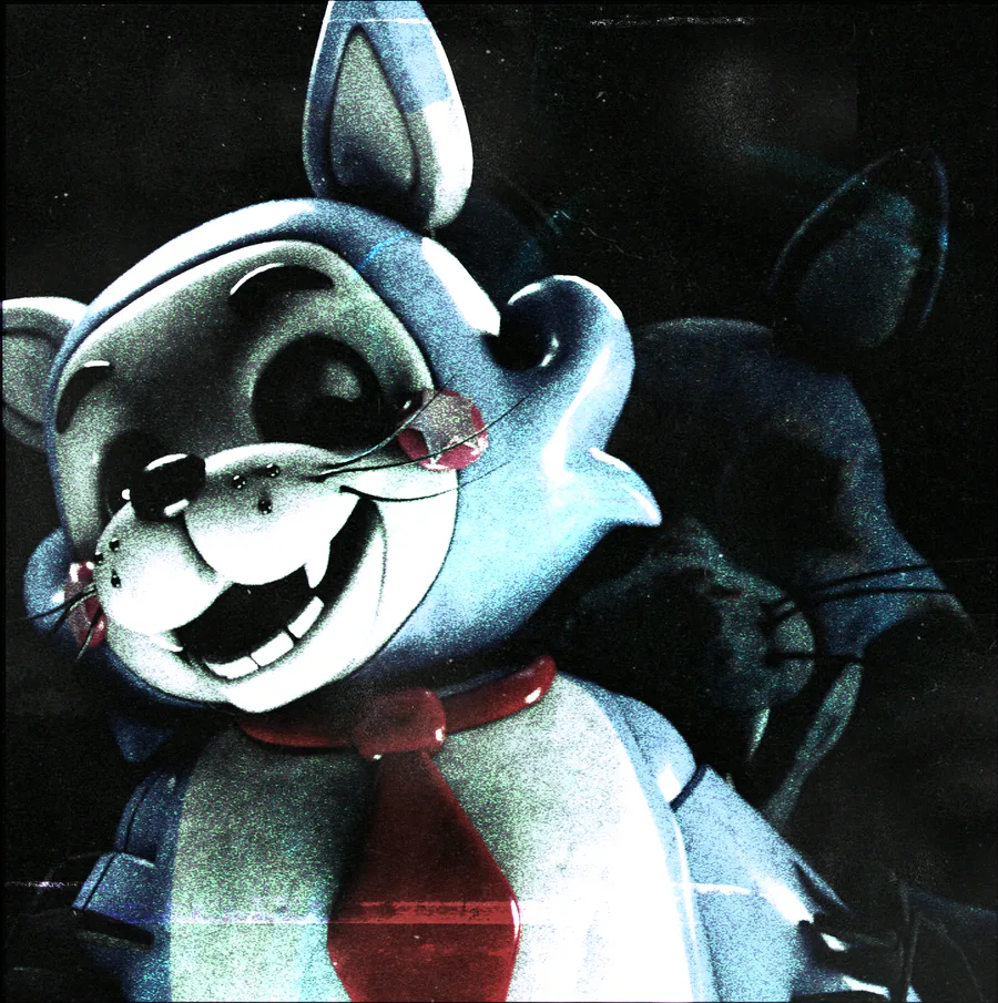
Moving on, I'm also a bit concerned with the way the covers are COMPLETELY different from the actual art, as you can see, the Plushtrap Chaser is completely different to the one we see in the actual novel, and I just don't get the point? Again, I'd understand if it was just because of each artist having a different style or being assigned to draw differently for each book, but I really see no appeal in it and it just comes off as inconsistent and iffy to me! Not to mention the designs of the characters seem completely wrong at times? Like, look at Chica in the New Kid Panel! Her head shape is.. Completely wrong, she seems more like a duck than a chicken; she's not even coloured correctly either! Not to mention some little details about Freddy and Bonnie, Bonnie's bowtie is black instead of the regular red and freddy has a stripe on his hat. I'm unsure if these were just to contrast from the actual animatronics and the animatonics in this story. Looping back to Out of Stock, the Plushtrap Chaser is described to be a mechanical toy rabbit with bleeding human eyes and rotten teeth. The eyes are also described to have a green colour; however, the novel shows Plushtrap with small, red button eyes (size could be a style choice???) and hardly looks like a little robotic toy. Overall, it just seems like when they hired the artists, they're just given a brief summary of the book and told them to make a comic out of it. Not to mention, they've practically taken a fan-made model and used it in the comics with practically no changes I don't know if this is a good or bad thing?? Sure, a fan-made design was put into the books and it could be honouring, right? Well, it doesn't even look like this in the rest of the panels!!! His bodyshape changes COMPLETELY, and there's far less details The styles are completely different!!!!
⚝--------------------⚝--------------------⚝
What's the rush?
Another notable mention is the overall design of each character, do note that these books ARE actually being rushed by Scholastic (aka the company making these books I assume), however I don't think this is because of high demand for the books, but I also don't know what other reason it might be for.
⚝--------------------⚝--------------------⚝
Summary Overall
The concept of visual novels for the fazbear frights books are great but the way they're being produced under pressure is really affecting the quality of the content and most people I've asked agree on this. Honestly, I'm probably not going to be buying any of these visual novels because the regular books just seem better and provide more story. Please know that this is just my opinion/criticism to the new visual novels!!



0 comments