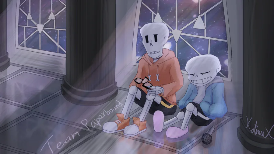
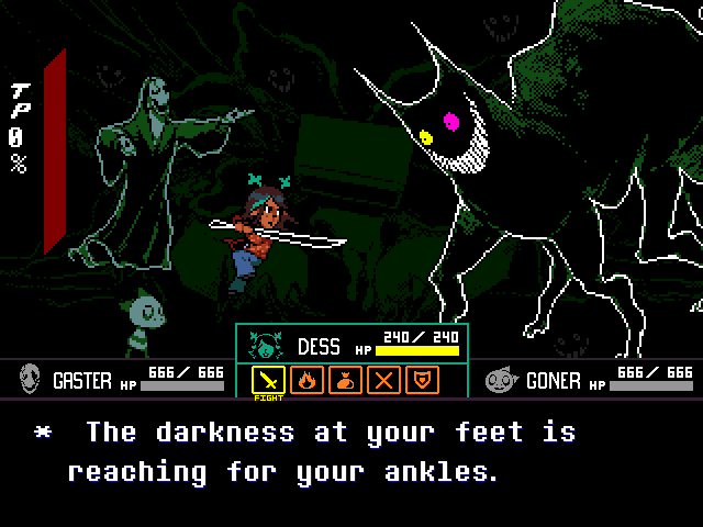
People like to make fun of the many mixel usage in Undertale and Deltarune. Mixels aren't a bad thing if used in the right way(which can really be said about any unconventional art technique). Undertale and Deltarune have some awesome mixel usage, mainly with the battle system.
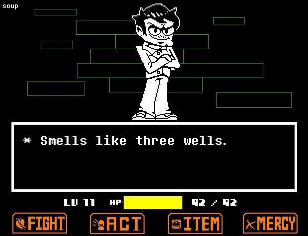
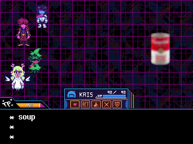
It's common knowledge for those more technically inclined, but both Undertale and Deltarune are rendered at 320x240, then upscaled to twice the original size, being 640x480. That means that all sprites are, behind the scenes, quite tiny and are upscaled for your viewing pleasure.


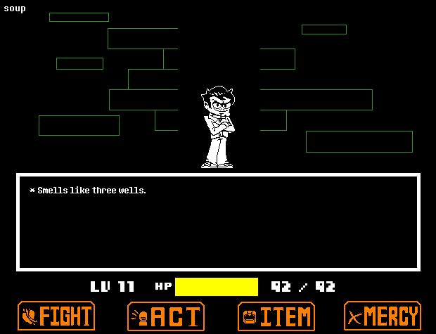
But sometimes, that isn't the case. For instance, UT's battle buttons are not scaled. They have been sprited in a way that they blend in with the battle scene so nicely to the point where you don't even notice everything has inconsistent pixel resolutions. The UI? C Menu? Yeah, that's all just a bunch of shapes with thick outlines. Again, the average player wouldn't notice this, which is great! Now, you may ask, what if everything was sized correctly? Well, you may find your results to not be very favorable.
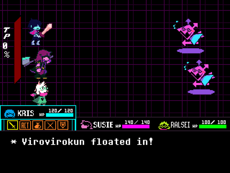
(from here)
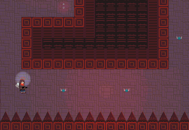
Looks cursed, doesn't it? The UI now looks all pixelated and the battle icons have less details than they should. You can only do so much with a tiny pixel resolution, that means sacrificing some details. Undertale and Deltarune gets around this by just saying "who cares" and ignores correcting the pixel sizes entirely. Another game that does this is Celeste, where the dialogue portraits, end card screens, and text are all hi-res art, the overworld map being just 3D models, while the main game is upscaled pixel art.
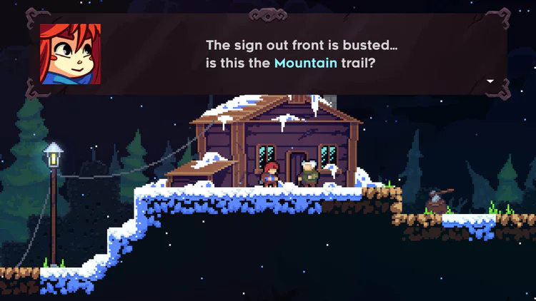
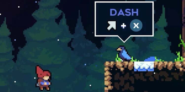
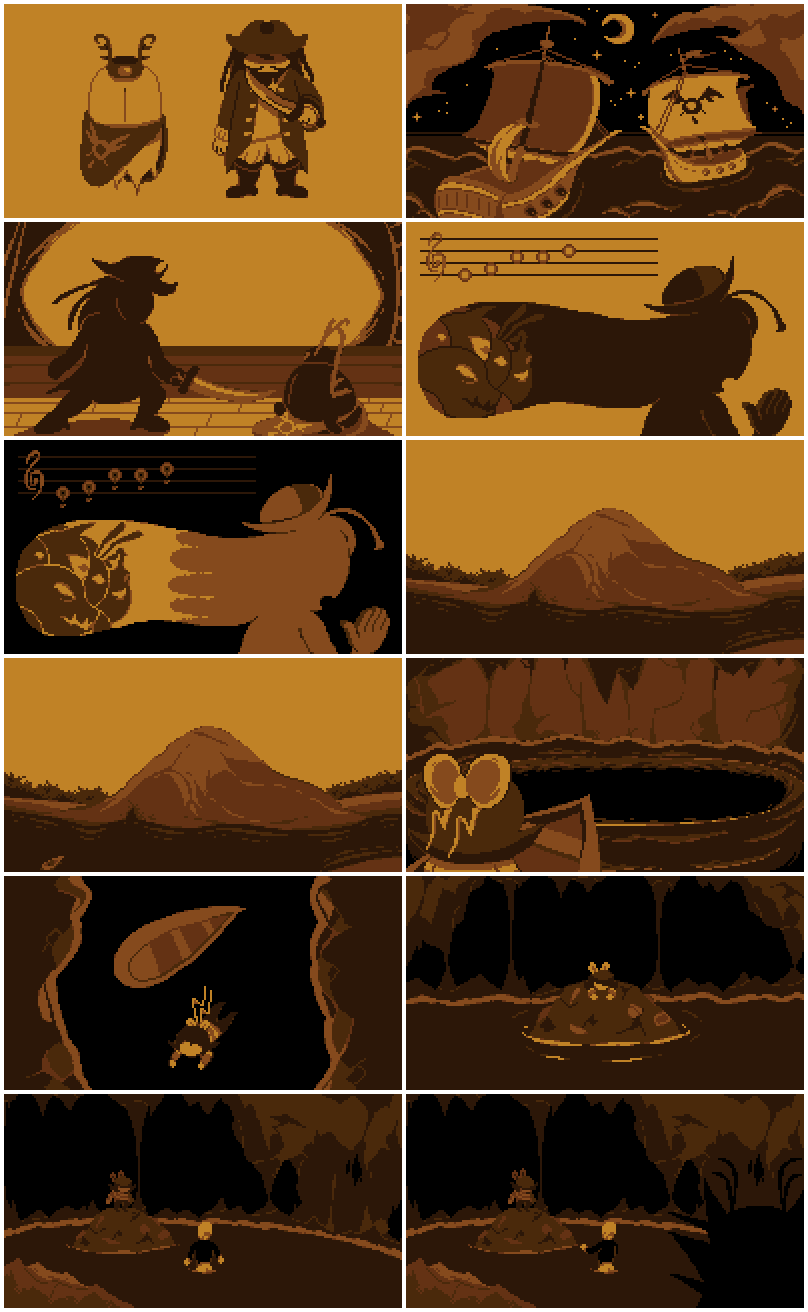
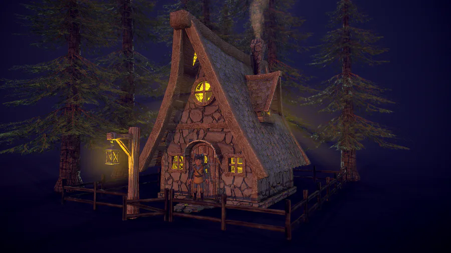
And again, it look great there as well! Inconsistent artstyles are fun, are they not? How about two popular examples currently being talked about? Smiling Friends and The Amazing World of Gumball:
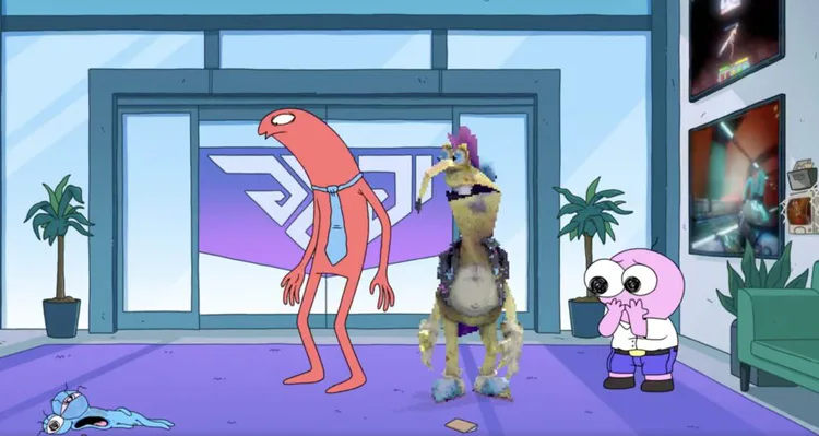
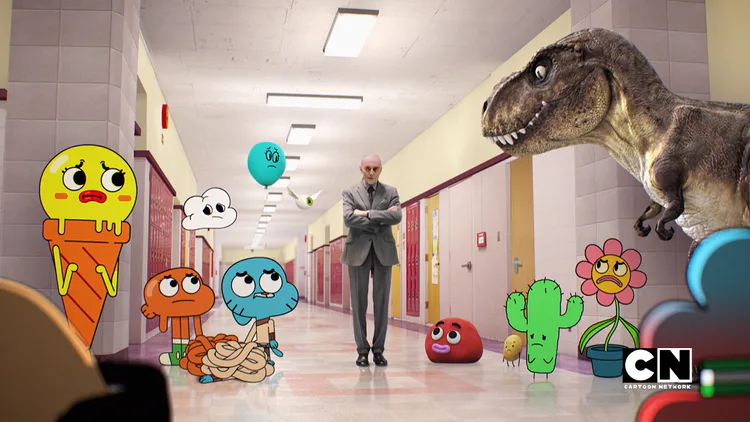
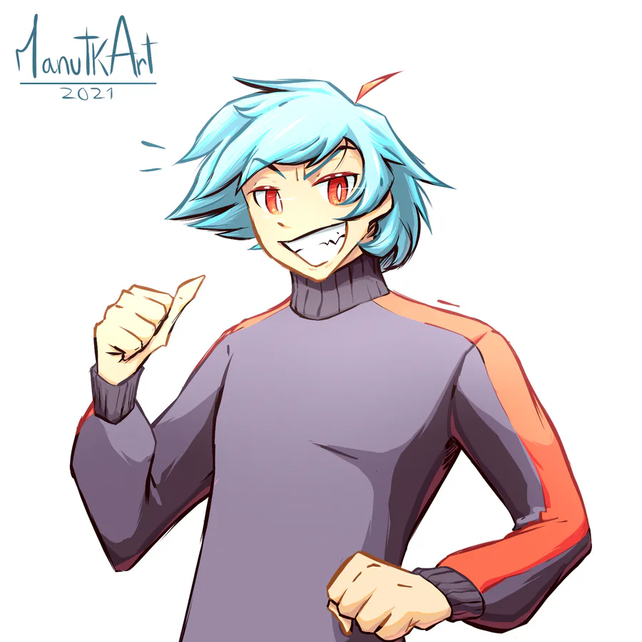
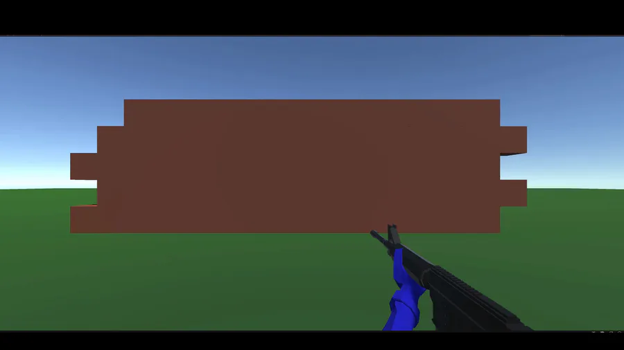
You see 3D models being mixed in with 2D art and realistic people. You may sometimes see rotoscoped animation(where you draw over a live action scene) for comedic timing. Best part? It all blend in very well. Why is that? The key to any art is to be consistent. If you're gonna have a bunch of inconsistencies, you need to stick to your guns and be consistently inconsistent, or else you break the world's immersion. It's why when you see AI art, it looks ugly as all hell.
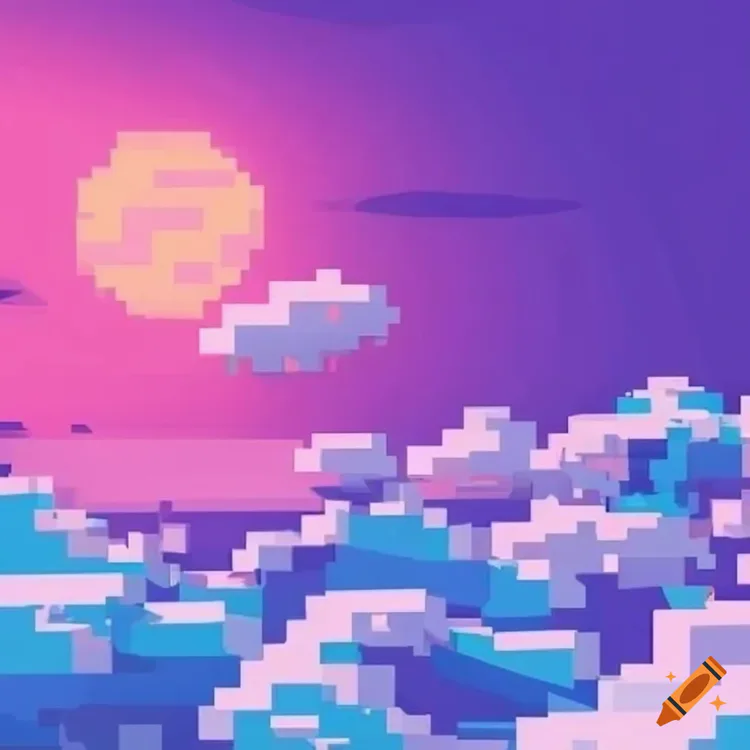
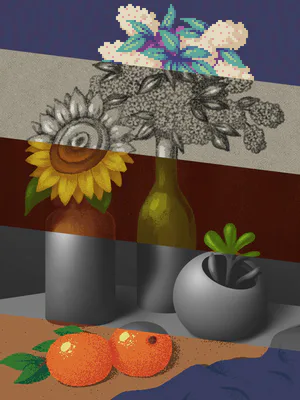
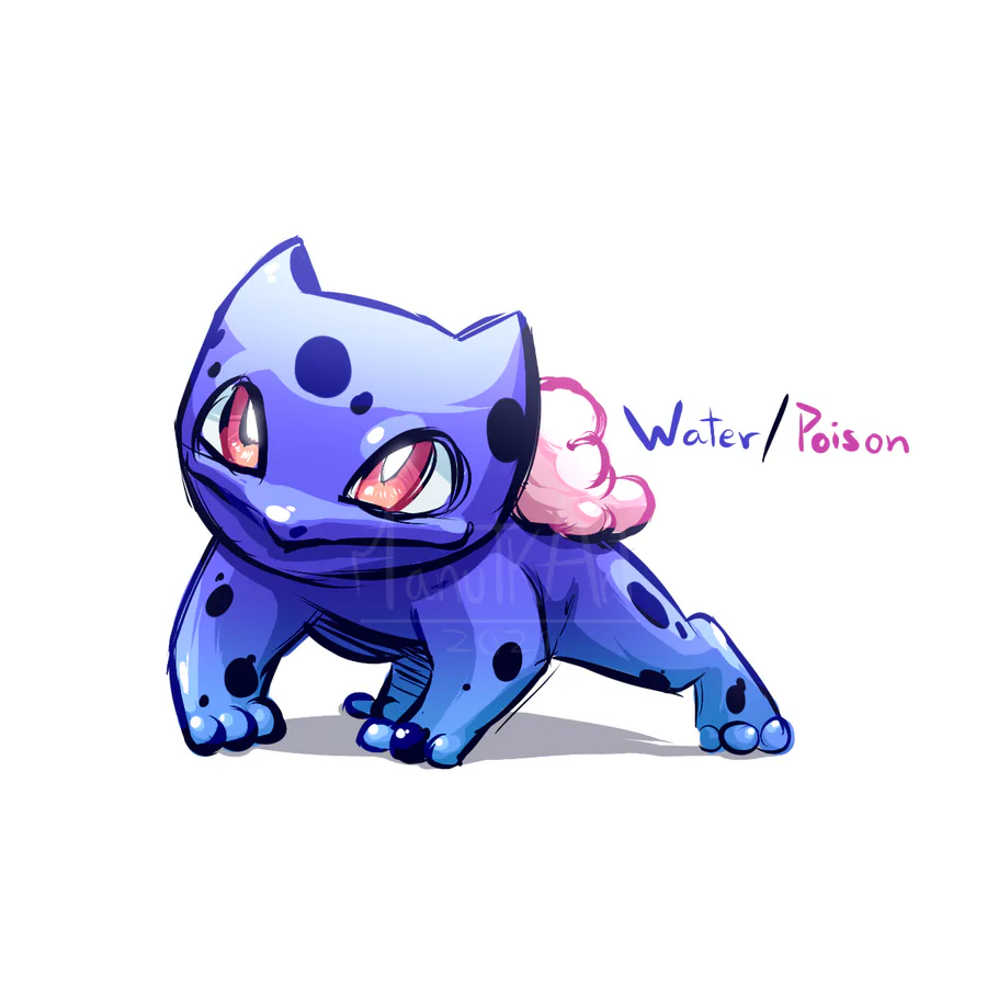
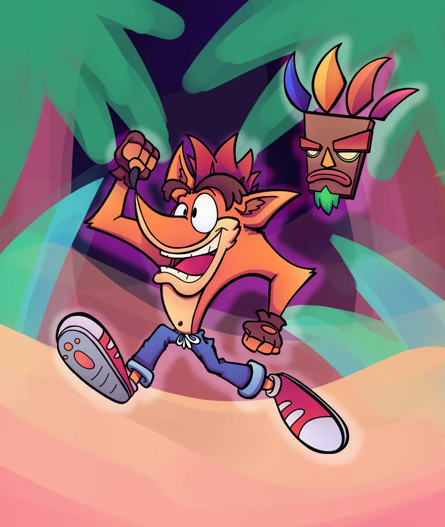
It wants to be pixel art, but it also wants to be a highly detailed painting and it just doesn't look right at all. AI still struggles with outputting real humans. You may sometimes see hair fading into the skin, missing fingers or extra fingers, off proportions, etc. It's inconsistent. It doesn't look right.
So the next time you think about your artstyle being a bit inconsistent, uhhh don't! In fact, maybe you wanna lean into that 👀
...
Or maybe just work on your art some more.
¯\_(ツ)_/¯
Doesn't matter to me, but just know that you don't have to feel bad about not being perfect!
Anyways, stay soupy! :))










16 comments