Swim Out is a strategic, turn-by-turn tiled-based puzzle game where you control a swimmer who want to get out of a pool, a river or the sea. Here is a preview of the game in progress:
Except for sound design and music, everything we created in the game started on paper, without any computer at all. Gameplay was first designed by quickly drawing boards on paper. For example this level’s sketch and how it is ingame now :
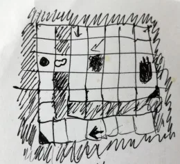
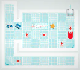
These sketches were fast and easy to make, but problems appeared with more complex levels : we couldn’t figure out level’s turn-by-turn progression without drawing tons of boards ! So next step was to cut squares of paper for each tiles, draw swimmers on them and place them over a board with a fixed grid background.
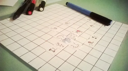
We could test our new gameplay elements much faster ! These small pieces of papers were providing us instant feedback, we could evaluate our swimmers behaviours by simply moving them turn by turn.
It’s a common practice we have in our team because paper prototyping also helps communication and ensure that everyone understand and visualize the gameplay. Ava and I are used to sit around the table to play, test and discuss only game features without focusing on the look of the game, and without any distractions.
Any idea can be tested very fast, even if you’re not good at drawing, even if you suspect it would be long to implement because you hadn’t planned your architecture to support non turned-based moving objects, out-of-sync animations, etc… You’re totally free to imagine without constraints what you think would be funny !
We need a diver, moving several tiles per turn before entering the pool !
Great, then after 2 turns he should go back to normal. Oh and he should get out of the pool on the other side and dive again, let’s see how it goes.
It would also be great to have a kid jumping in the pool !
Oh yes ! But then we’ll need to add some waves
How much and in which direction should the waves pop out ?
Let’s try !
We truly believe that if a mechanic is not fun on paper there is very little chance it will be in our video game, even with the right graphics and shiny effects.
With paper prototyping we were able to test in one hour something that could have taken days to be coded in a game prototype. We can immediately eliminate non relevant features and give a chance to more tricky mechanics. We’re often even surprised to see how behaviours that first sound complex, once put on a paperboard, can be organized in a clear sequence or replaced by a metaphor perfectly acceptable for the player.

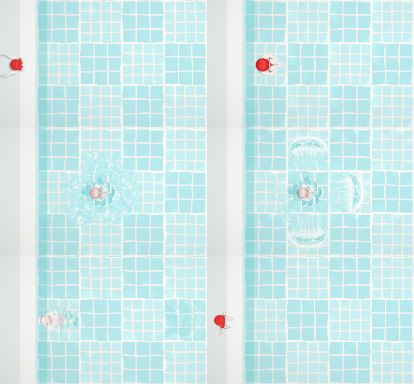
It also helped a lot with controls, for example how should rotation be working with multiple tiles sprites, like when hero is using a kayak (1x2 tiles) or a noodle (2x1 tiles). It let you try all the possible options until you find what’s look like the more natural for the player and get smooth pathfinding algorithms.
Once we were totally happy with the gameplay, it was time to prototype the visual aspect of the game.
As a small team (actually we are making the game only the two of us) we couldn’t afford having orientation-based characters, specially with animations, so we were willing to use only a single point-of-view for each swimmer, that we can simply rotate whenever he goes up, down, left or right.
Initially we thought of a mix of top-view and semi-perspective visuals. We were willing to keep pool tiles and decorations top view to have a clear setup of the board without overlap, and we were considering to have swimmers in a semi-perspective view to have more recognizable key-positions for human animations, knowing that sprites would be small on screen.
We made the graphics of two swimmers in this representation and quickly coded a prototype.
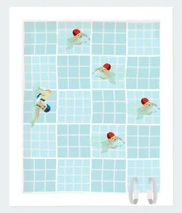
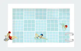
While we were very happy the kinda awkward look, we found out a few problems with this representation :
It was looking good on the vertical axis but not on the horizontal one because one guy moving left was having his head heading top when one guy moving right was having his head heading bottom of the tile, this was a bit confusing ! To avoid this we could have mirrored sprites (like we did in the first screenshot above), but some animations were not mirrorables. For example the backstroke swimmer move once every two turns. Her left arm raised is a signal for the player that she will move next turn, while her left arm down means she’ll stay put. That’s an important gameplay information for the player so mirroring was not an option either.
To ensure a good readability of the levels, swimmers graphics must not overlap their neighbours tiles. The semi-perspective representation became problematic when we decided that swimmers won’t always stay in the pool but will sometimes be standing on the ground, like divers, fishermen, water-bombing kids, …
We finally stated that a full top-view would be the solution and Ava drew a few more sketches :
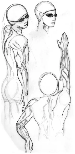

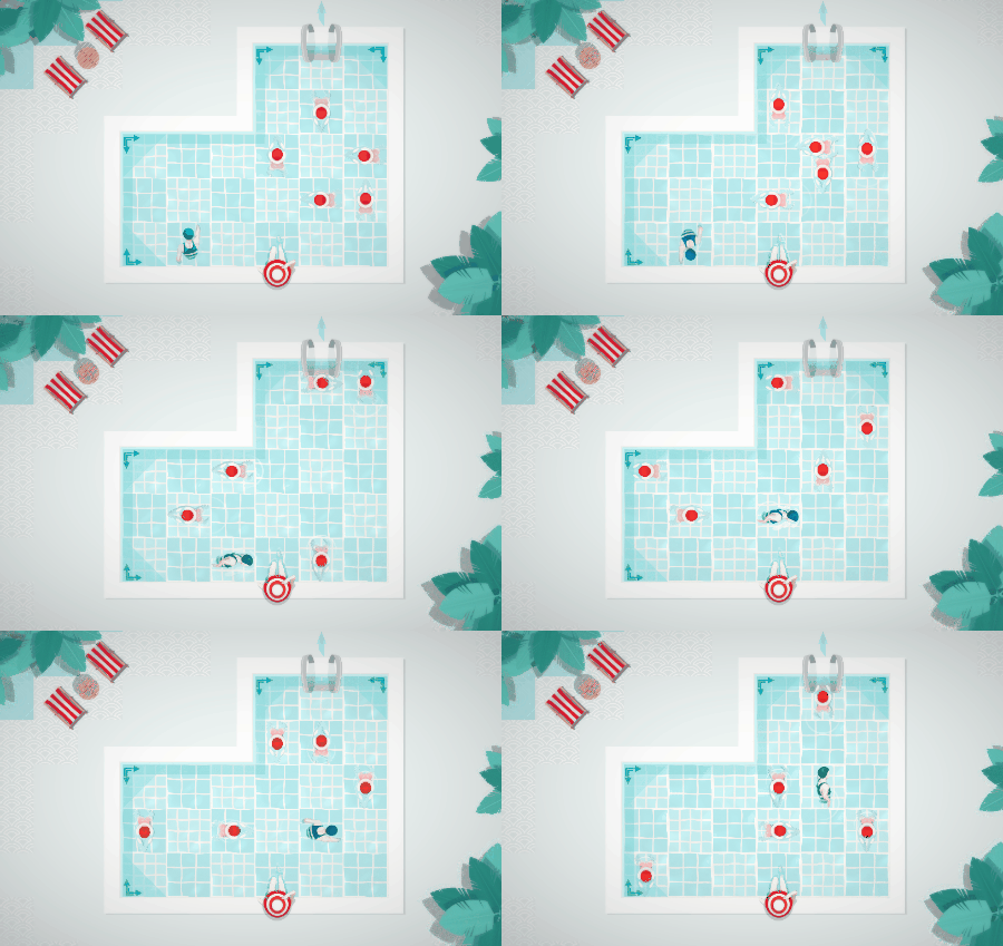
Nice, but let’s optimize their occupied space on screen ! We chose to hide immersed part of their body, while keeping the transparency of a very clear water. So we seized the opportunity to work on some animated water effects that blur bodies while periodically marking strong shadows at the bottom of the pool.

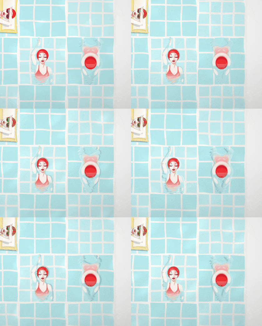
With top view, we also felt like we were losing some substance we previously had in the perspective view. So we decided to work on shadows effects, and dynamically generate shadows with their angle and intensity varying during the game.
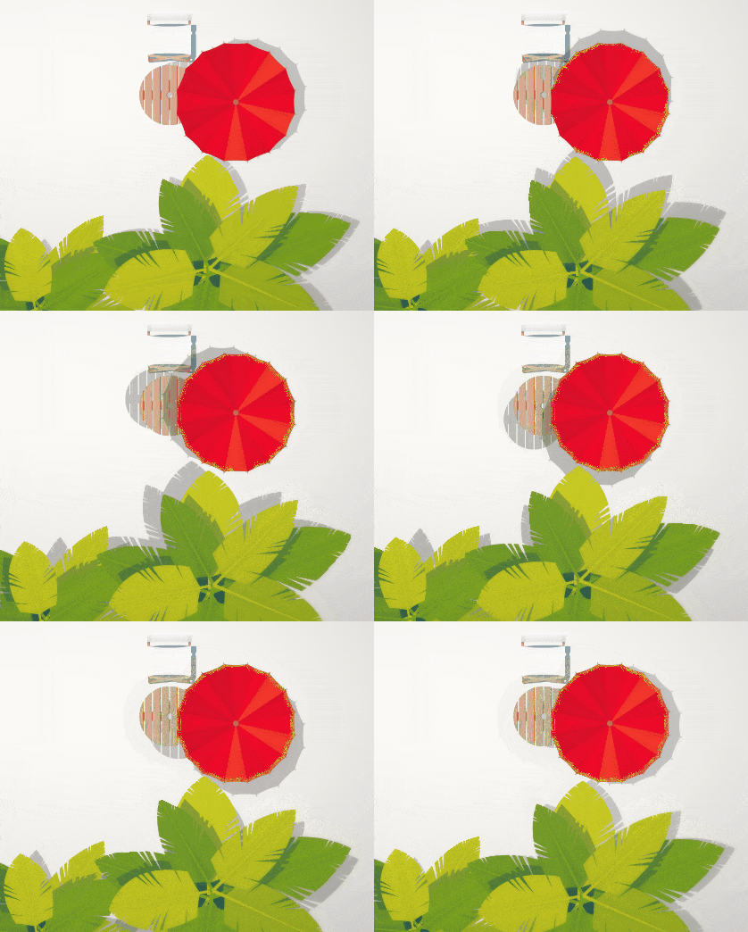
Here is the result right now, which we think is very clean, readable and still original and appealing :
We believe our game couldn’t have been designed efficiently without this phase of paper prototyping. Also no computer mean stay focused on the prototype’s content with no diversion, no emails, no notifications, no Facebook, no Twitter, no GameJolt ;-)
Swim Out is planned to be released this summer, and currently on Steam Greenlight (psst vote for us !).
A demo is available on GameJolt for Windows, Mac and Linux.
You can follow us to get latest news about the game.

1 comment