Hello everyone! I am Michael along with Dru and we are developers on The Maestros! Check us out on Steam if you want to add it to your wishlist!
It’s important to keep game clarity on your mind during development. Games can inadvertently become a busy mess. Colourful characters, vibrant VFX, enchanting environments, and even UI/HUD elements can cause confusion and frustration to players. Separating these elements into readable and easily notable groups can greatly improve the player experience.
After receiving feedback from our latest batch of public testing, clarity was something we needed to refocus our efforts on. 11.5% said they often felt unsure what was happening during gameplay with 42.3% feeling somewhat confused. After pooling all of the responses we grouped these issues, and focused in on graphical clarity.
Graphical Clarity
As the name suggests, issues that fell here are what the players saw on screen. Our visuals happened to blend a little too well for some players during intense gameplay.
One main graphical change took the form of what is called a “Sobel Edge”. Think of this as the stylized comic book black outlines you may find in highly stylized games or graphic novels. Applying a sobel edge was a non-destructive process that allowed us to customize the look and feel of The Maestros quickly and effectively.
First the scene is rendered in real time based on depth (distance from the camera) where white is up close and black is farther away. Then where high contrast occurs between these values a line is drawn.
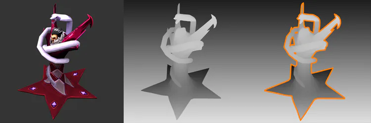
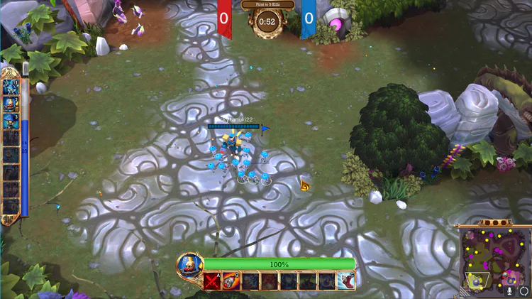
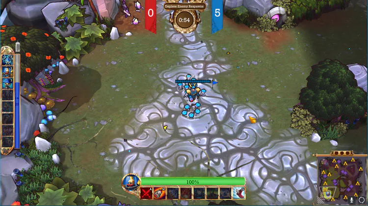
Adding this sobel edge helped us show players what is important, like Commanders and Units, compared to less important things like the ground. This also added a level of polish to the overall art making The Maestros a little more glamorous in the process. Here’s the before and after, notice how much more characters stand out from the environment after.
Before
After
Another graphical update was the addition of damage flashing. Previously it was difficult to see if one of your units was taking damage. To solve this we added a coloured flash to the individual character mesh whenever they were hit.
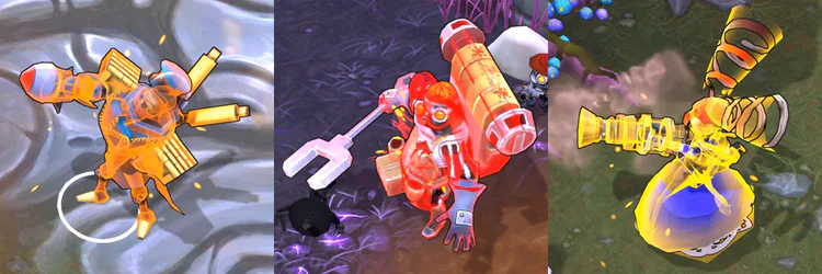
This let players know who is being attacked. They could then react to move their army to safety and overall more strategically. We also added the ability to see when both enemies and allies are being damaged to show who you are dealing damage to and to help save a friend in need.
Lastly we improved some outstanding UI/HUD elements, namely icons and cursors. Icons on our minimaps now represent places such as a transform pad or an enemy camp. This also included icons for the Shrine and Dreadbeast. Our main cursor also received an upgrade to closer fit the scheme of our current HUD.
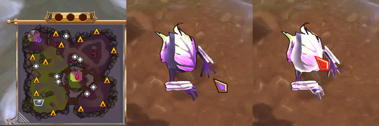
We hope these graphical additions will help players immediately understand their surroundings and play with confidence.
Movement & Player Input
Another area that we received feedback on was pathing. Over half our players found that unit movement got in their way at least some of the time. Pathfinding is a difficult problem even for the most veteran developers, but we want to carve out a solid, consistent-feeling movement experience.
Issues often group together to obscure a problem like this though, so we looked for low hanging fruit that might hinder our evaluation of unit movement. In particular, sometimes clicks and selections are only “generally” what a player wants in the heat of the moment. A great example is when you first encounter an enemy on your left, you might rapidly click to your right on some rocks. You know that the rock is unpathable, but you’re in a rush. We had left this problem of “Move Towards” unsolved previously, resulting in behavior like this.
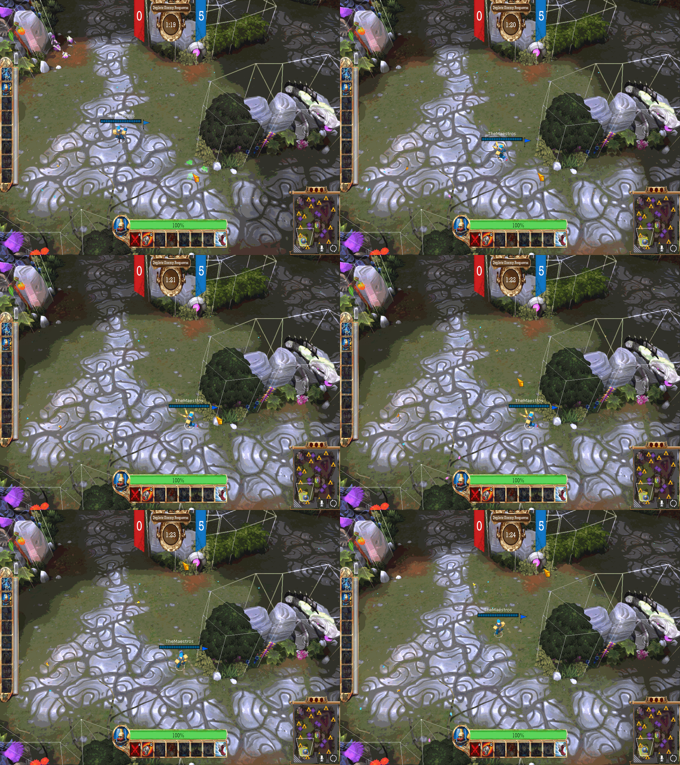
That made battles around obstacles very painful, and the cries of “PATHING” would ring out on voice chat just before round end. Now when you click on an obstacle near a path, we fire raycasts towards the point from various angles, and look for their collisions with the obstacle we ultimately landed in. The raycast closest to the obstacle is the one we pick, and we’ll use that to find a spot nearby for your units to move. Now you only have yourself to blame for feeding ;)
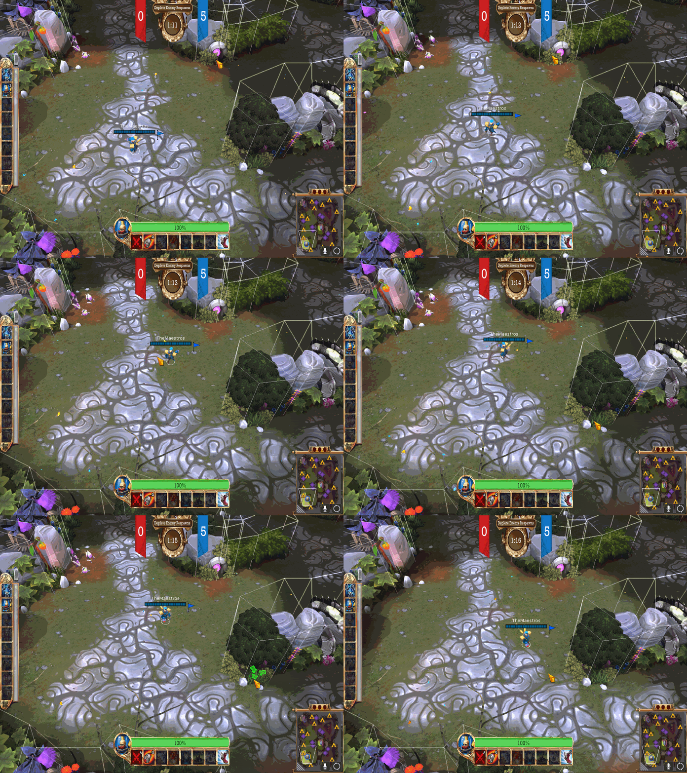
Another skill that suffers under strain for us mortals is drag selection. Especially with units you want to arrange, like for a Conductor split, you might only be able to snag a corner of their frame when you’re frantically setting it up. Anything less than a generous selection is going to feel bad, and bugs are going to magnify that feeling.
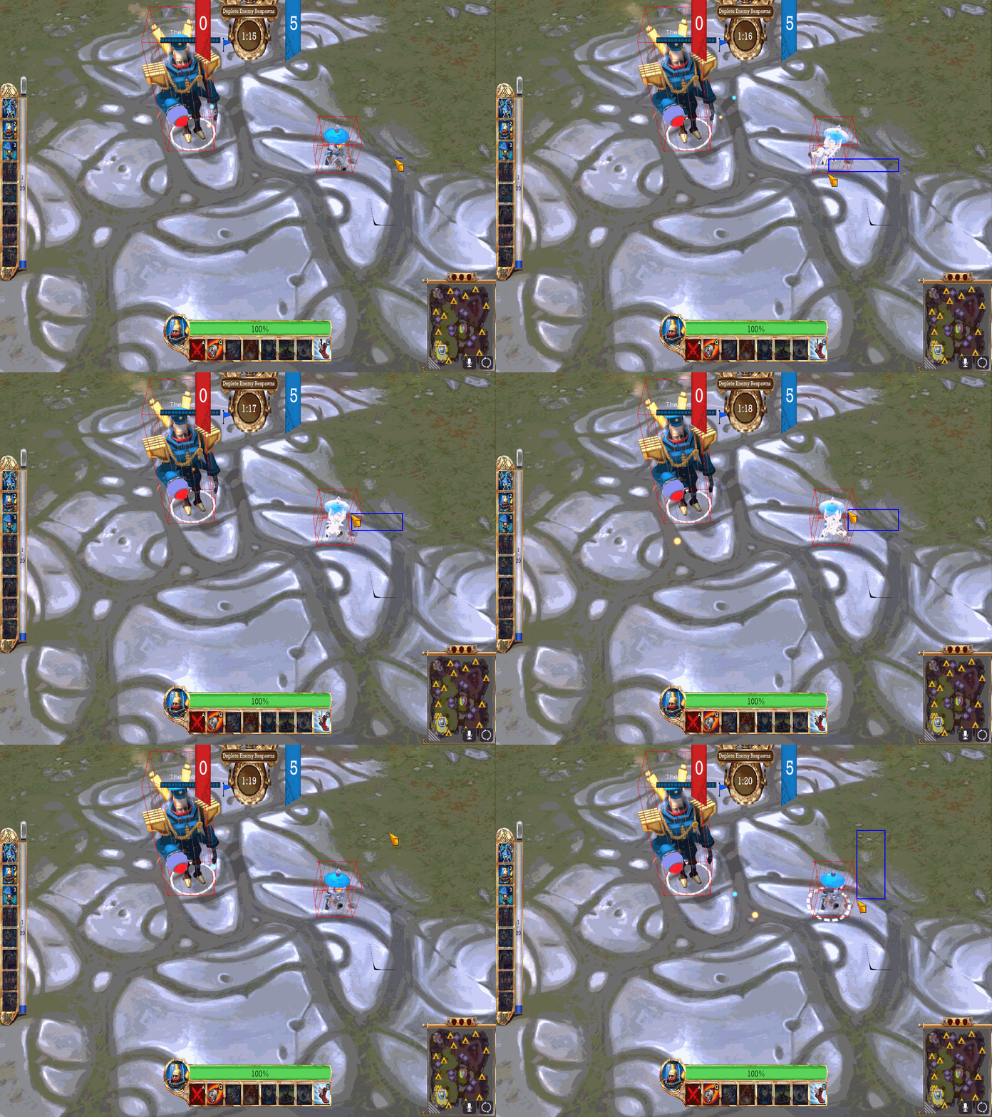
(dotted circle indicates Doughboy will be selected)
Not only was our selection incorrect, it was solving a much harder problem than necessary. Previously, we’d attempt to project the drag-select box on the screen into a 3D object on the ground and check if units overlapped that unit. If you want to do this right, you’d need a kind of 3D “trapezoid” to reflect the camera’s view frustum, and that is not as simple as generating a primitive cube. Instead, we now project the bounding box [i]back into[/i] the screen, and do some 2D maths instead - easier and much less prone to programmer error.
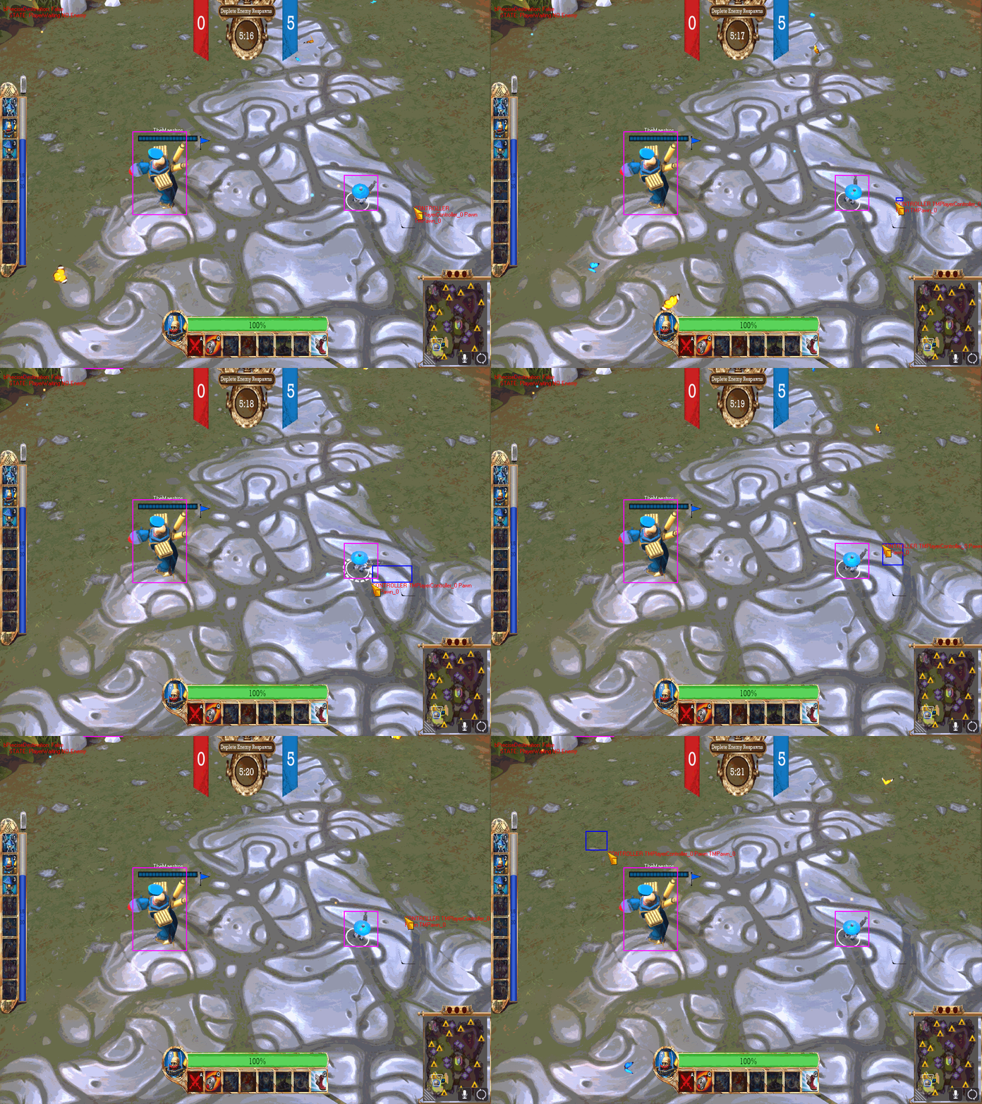
(again, dotted circle indicates Doughboy will be selected)
Players expressed that The Maestros was overall a wonderful experience during our first beta weekend, and we hope to improve that further as we head closer to our Early Access launch. These changes were all made possible because of the valued feedback of our players. We hope you continue to follow us on this journey and further help shape The Maestros.


0 comments