I’ve always subscribed to the philosophy that it’s possible to make a game’s world its main character. Just like a main character, the world can have a detailed personality with multiple intricate layers while being pleasantly predictable and beautifully surprising.
That’s what I want with the world of Lone Phoenix. I always want something new around the corner, but as you play I also want you to feel like you’re getting to know the world.
So with that being said, here’s a new look at the section of the world that I’m showing off.
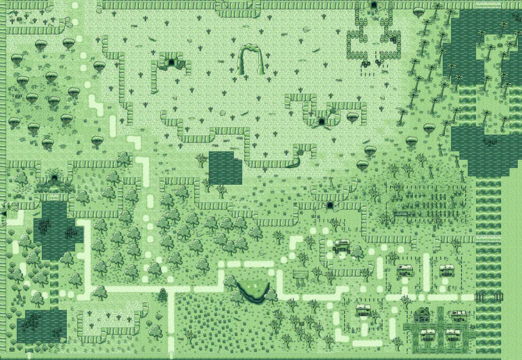
Here’s a look at the 2 month old map I shared previously:
And here’s a look at the current map:
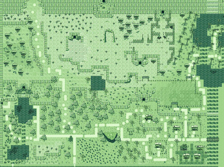
There aren’t a whole lot of huge changes so I’ll point out some of the major differences:
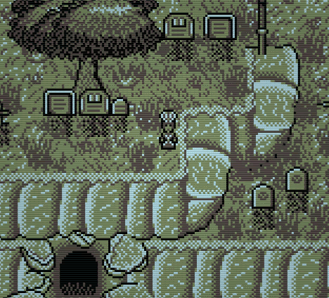
-The graveyard has been expanded. The position and size of the graveyard didn’t fit well with the rest of the world. It felt like something that was added in to fill a blank space (which it was). Now I feel like it flows better with the natural shape of the world
-I’ve also managed to convert the large desert region into several smaller and more distinct sections.
-I also added clear boundaries between regions. With the inclusion of the ColoRegion effect, I wanted to be sure that color changes wouldn’t feel random. So for each region, I’ve made “doorways” to other regions so that the player could visibly recognize that they were leaving a region before the color effect kicked in.
Here’s the map again with some overlays to illustrate some of the design ideas I’m trying to follow:
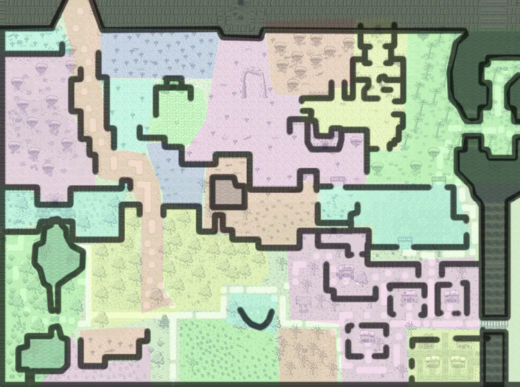
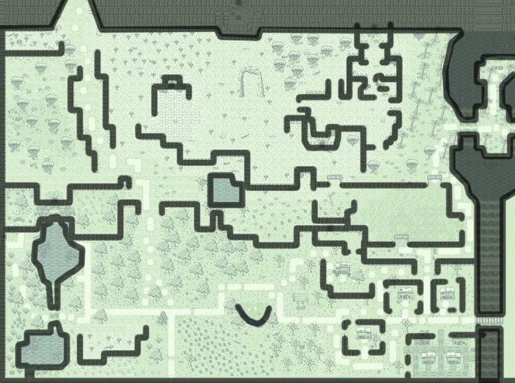
I want to find a balance between opening up the world to allow for freedom while segmenting the world so you can’t ever feel lost. For example, the 5 regions in desert are visually distinct, but they aren’t sectioned off by hard borders. And the same thing with the plains down south.
Let me know what you think.
Thanks for reading,
God bless
0 comments