Tips
NOTE:
I am far from an expert in animation, and am still somewhat learning myself, this is mostly for people who are fresh and might not know what certain settings do or not know about some techniques.
These tips are assuming you know the bare minimum of SFM, how to add models, how to move bones, how to animate etc.
Software Setup
SFM has many features which may go unnoticed at first, this section will teach you how to enable a secondary viewport, how to import material overlays and more.
SECONDARY VIEWPORT
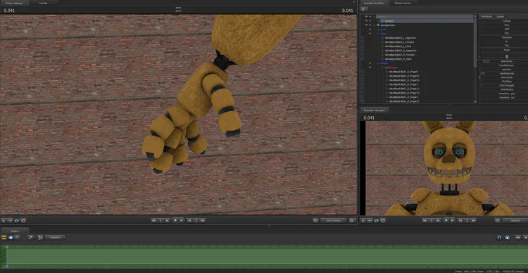
Having 2 viewports is incredibly useful as it allows you to see how your render looks from camera view whilst you're doing things out of camera view (eg. posing, lighting etc), to open this, click on the tab that says "Windows" at the top of SFM and click secondary viewport, then you can drag it around by dragging the "Secondary viewport" tab that appears.
Material Overlays
Material overlays are mainly used for RoT (Rule of Thirds) and letterboxing, which are both gone over later in this article.
To activate one, scroll to the bottom of the Movie Clip Editor (blue one), and right click on the red part at the bottom of the timeline. Then, select "Add Element" and click "Material Overlay", then, right click the red bar that appears, and click "Show in Element Viewer", where you see three dots next to a text box, click it and you can search for any material to, well, overlay.
Lighting
When lighting, there are many tricks and settings you can apply to get a more visually pleasing result.
RADIUS
Radius at first glance may not look like it does anything, but if you go into the Movie Clip Editor (the one with the blue bar and shots) and wait a bit (depends on how good your pc is) you can see your lighting looks a bit different, now this may seem like it looks worse than normal, but what this does is add soft shadows.
Soft shadows help you achieve a nicer look and make shadows less dark and sharp, if you can use radius correctly you can achieve some pretty nice looking lighting, higher amounts of radius mean a higher amount of shadow softness, so play around with the slider to see what best suits your render.
WHEN RENDERING RADIUS, DO NOT RENDER AS A POSTER, RENDER IT AS AN IMAGE OR IT WILL MESS UP YOUR LIGHTING
No Radius
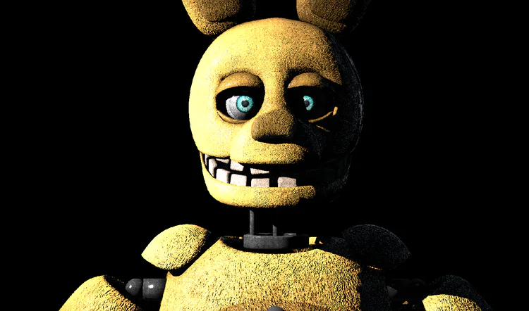
Radius
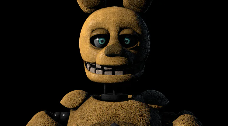
(Shine on the right is the model, not the light.)
THREE POINT LIGHTING
Three point lighting is a lighting technique used in many pieces of 3D animated media, as the name suggests, it contains 3 lights.
Light 1: Rim
Light 2: Main
Light 3: Fill
A rim light is a light that defines the subject of the render, it is typically placed behind the subject and creates a "rim" of light behind them, hence the name.

(Example of a rim light, made in blender but still stands in SFM)
The main light is what will mainly light up your subject, its typically placed at an angle above or below the subject whilst still facing it.

(Example of a main light, made in Blender but stands in SFM.)
The fill light is what fills the shadow of the main light, what the main light cannot reach its the job of the fill light to fill in the shadow to add a sense of colour depth.
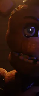
(Example of a fill light, made in Blender but stands in SFM.)
Three point lighting can be integral to making nice looking renders, however you don't inherently have to follow it to make something look nice, and you can change it by adding a few extra lights if you do choose to follow it.
SHADOWDEPTHBIAS AND SHADOWATTEN
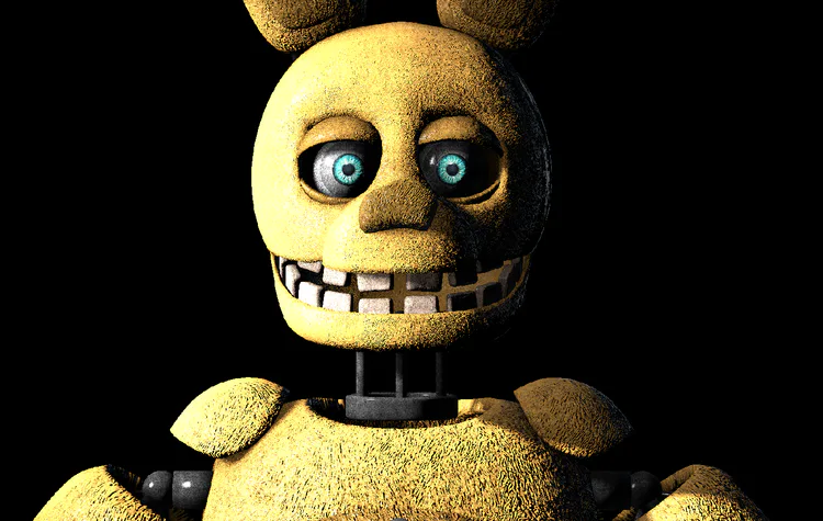
These sliders are incredibly useful to get nice looking lighting, they control the sharpness and darkness of shadows and can make your lights go from this
To this
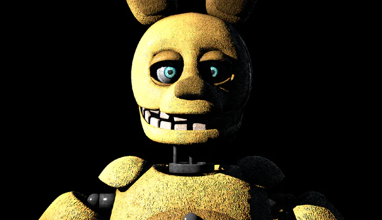
In order to utilize these you want to turn the sliders DOWN, not up, turning them up will not give you this effect and will kind of make it look like it has no shadows.
COLOURS
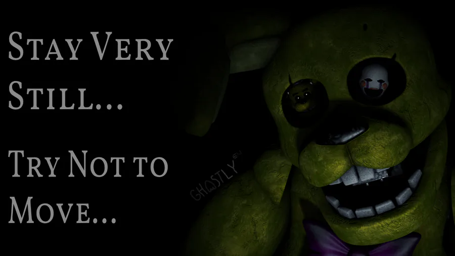
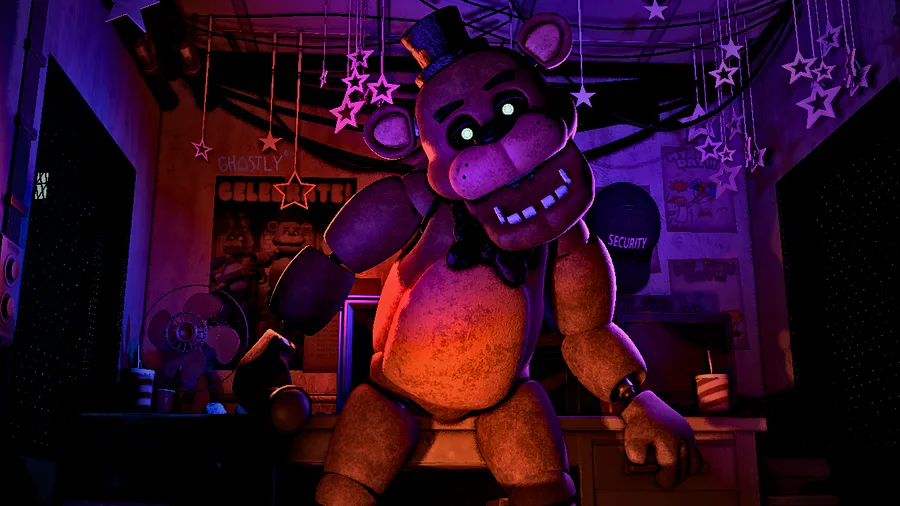
This isn't inherently something you need to do, but following a certain colour pallete when lighting can make it far easier on the eyes (eg. cold colours (blue, purple, green etc.) and hot colours (red, orange)). However, contrasting colours can also work to lead to a very unique and appealing effect (if you follow me, you may notice I really like to use red & blue lighting. this could also be done with green and purple and any other contrasting colours.)
Alongside this, and this isn't needed and it's just something I like doing, instead of doing a raw white light, try and make it kind of blueish by turning down green and red slightly (around 1/3 down), it adds colour and can make a relatively dull light go to being appealing to the eyes.
POSING
Posing is what makes your defining subject look unique, posing can be a make or break like lighting, but this is significantly more integral to the final product.
FINGERS
Something I see a lot of new artists do is not pose the fingers, which is okay if it's not really visible in the render, but if it is, leaving them stiff and un-posed can make the render look unfinished and weird. Posing fingers can add significantly more "character" to a render as seen here;
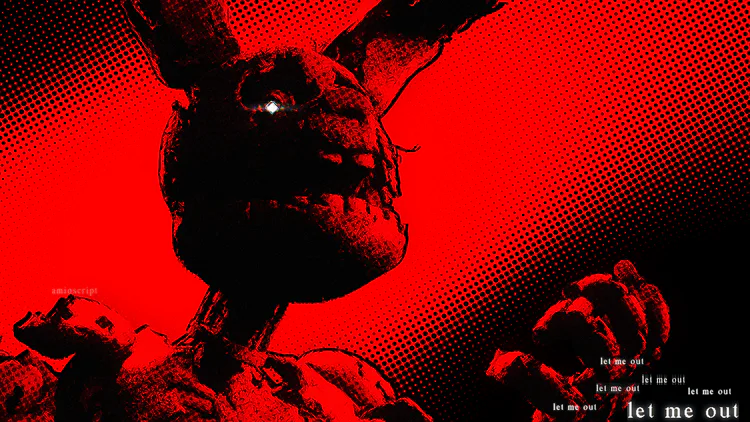
(now imagine this if the fingers were unposed and stiff, would it still look the same?)
Something I like to do when posing fingers if they aren't really a big part of the renders is making them kind of have an "outstretched" to "inner" scale kind of thing.
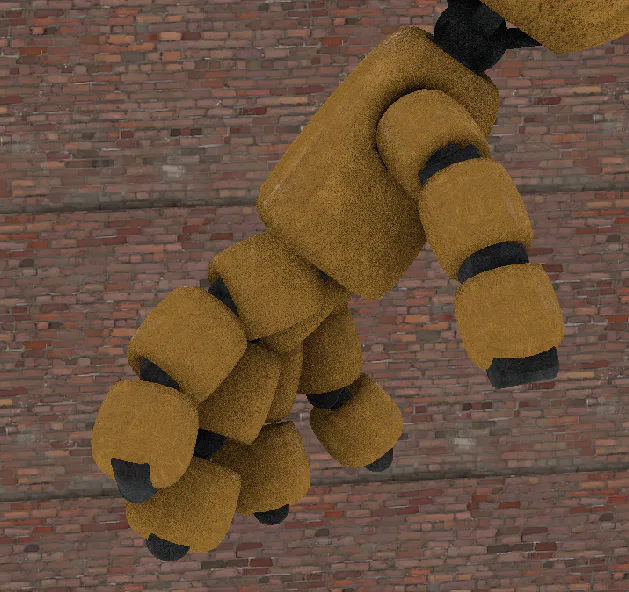
A tip when posing fingers (or just moving multiple bones at once in general) is to right click on the "rotation orb" and hover over rotation mode then change it from world to local, this will make it so all the bones selected will rotate as if you had chosen them individually instead of moving locked to the world.
RIGGING
Top apply a rig, right click your model, hover over rig and select the rig you wish to apply.
(rig_biped_simple will NOT work on models with bip_ as their bone names. This rig is designed for SFMs inbuilt TF2 and HL2 models as well as human models using them as a base.)
IK rigs can help a ton in posing and animation, they basically simulate actual movement of the bone (eg, moving the pelvis down will now make the legs bend, moving the foot will lift the entire leg, etc.) You won't need addons if you're using sfm built in models (HL and TF2), but for some workshop addons (FNAF, BATIM, etc.) you'll need an addon,
https://steamcommunity.com/workshop/filedetails/?id=848269649
(universal IK rig, works with every bipedal model.)
ANIMATION
SMOOTH SLIDER
The smooth slider will be your literal best friend as a beginner animator, what it does is what it's name suggests, smooths your animation, this is found in the motion editor (green bar) and can be used by selecting the bones you want to smooth and turning the smooth slider up (it won't actually go up or down but it will change the movements.)
Try to avoid relying on this slider too much though, as turning it all the way up will basically make the animation "too smooth" in a sense and make it incredibly slow and boring. (also because relying on this will basically make getting better pretty hard.)
JITTER SLIDER
The jitter slider, as the name suggests, makes thing jittery and shake, you can find it in the motion editor and it works the same as the smooth slider.
After turning it on you may be like "why would I ever want to use this?" and the answers are quite simple.
Camera movements
Shakier movements
Combining this slider with the smooth slider is integral for it to look good. Using this for camera movements is incredibly useful to add a sense of "action" and "humanity" to the camera movements instead of just being boring in and out side to side movements.
PHYSICS
Yea, physics
Most of you are probably FNaF animators, meaning you're animating a lot of animatronic movements, something I do, especially on animatronics is make the neck react to the spine and pelvis movements (etc, spine moves back, the neck moves forward and at the end of the spine movement it goes backward and balances out again, this is prominent in a lot of my animations.) When moving arms, you may want to make the lower arm follow the upper arms movements, and the hand follow the lower arms movements.
Again, this isn't required to make something good looking, this is just how I like to animate things.
CAMERA MOVEMENTS
Camera movements are an integral part of many animations, if you can do them right, they can make your animation go from looking rather stiff and boring to much more lively, but if you do them poorly it'll end up making it look significantly worse and kind of jittery.
Try and open a 2nd viewport (guide on how to later in article) and rotate the camera on the X-Axis to add a nice little touch to your movements, other than that camera movements are entirely up to what your animation style is and how you want to do them, I can't really provide any more tips for them.
CAMERA
Your camera is your pride and joy, its what frames your shots and is the fundamental building block to a render.
COMPOSITION
Composition is very, VERY important when making a render, I cannot give you any definitive tips since I myself struggle with it, but here's a link to a video explaining a technique I like to use a lot.
LETTERBOXING
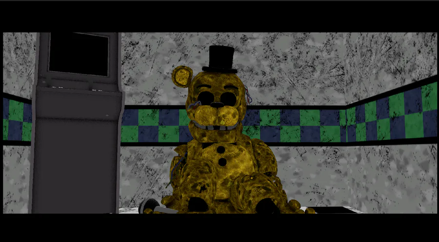
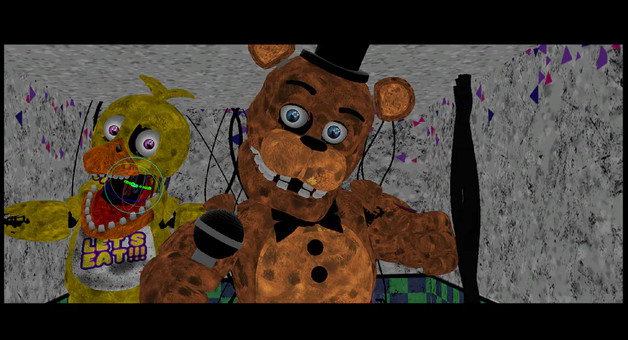
Letterboxing is something that's typically not really talked about, and for decent reason, it's not really important and you can go without using it once and it won't really affect the quality of your renders.
What letterboxing is is basically those black bars you sometimes see in movies and games, it adds a cinematic feel to your shots and can help enhance it a bit.
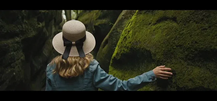
ASPECT RATIOS
This is what defines your image's "shape".
A 16:9 image is what is mostly used in renders and animations, examples of this are the constraints "1920x1080" and "1280x720".
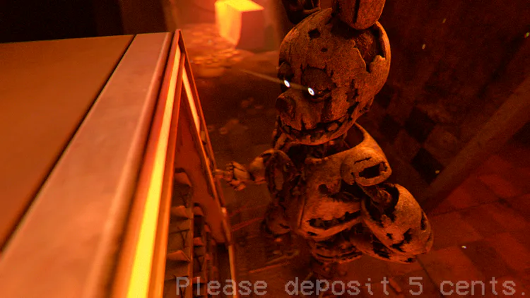
Example of 16:9
Changing image shape can help you achieve certain unique looks.
1:1 is another example of an aspect ratio, it's a pure square and can be used if you're trying to nail down a camera look or something.
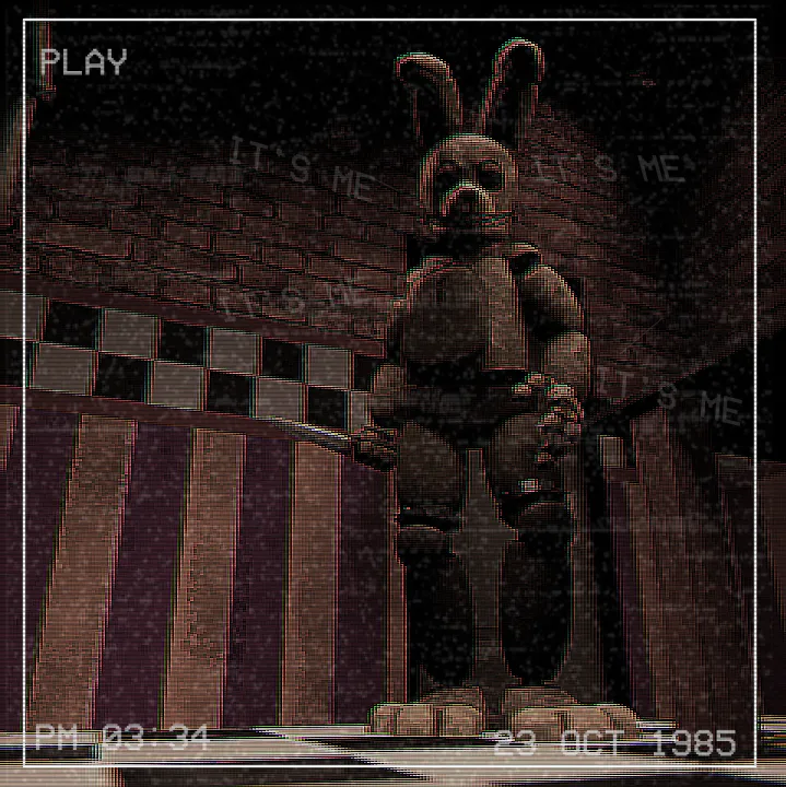
Example of 1:1 aspect ratio.
Addon which adds aspect ratio overlays (must crop in order to actually make it look like the aspect ratio.)
https://steamcommunity.com/sharedfiles/filedetails/?id=2344126573
RULE OF THIRDS
Rule of thirds is a technique used by many animators, from amateurs all the way up to the people at Pixar, it basically means to follow a 3x3 grid on the screen and to put any points of interest where those point intersect.
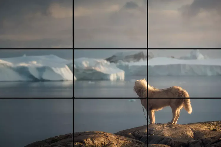
A mod exists that allows you to put this as an overlay in SFM so you don't have to go off estimates, this also adds letterboxing, a technique discussed previously. Just ensure you delete the grid when rendering, as it'll appear in the render/animation and I doubt you'd want that, I personally forget to turn it off myself a lot too, which leads to re-renders.
https://steamcommunity.com/sharedfiles/filedetails/?id=886589389
SFM BLOOM
Turn it down. Turn it all the way down. Please. For the love of god.
SFM bloom is awful, and something I'd recommend is to add the bloom in post, that's all I have to say. You can turn the bloom off by selecting your camera and turning down "bloomScale" to 0.
DEPTH OF FIELD
This helps define subjects in your shot by blurring out the background.
You can use this but tuning the focaldistance slider and having the purple plane be clipping into your subject
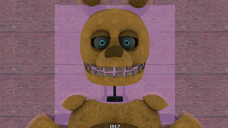
Tuning the aperture slider will adjust how blurry the back will be, higher amounts mean more blur.
You can adjust the quality of the depth of field by right clicking, render settings and adjusting the amount of samples used next to the depth of field box (says Use Camera Settings by default.)
Higher samples means longer rendering and can cause issues during longer animations.
EDITING
I can't inherently give many tips for editing, however, if you want a free to use program for editing, try Krita, it's a drawing app but has many, MANY filters you can use. Utilizing colour balancing is also good to make your colours more defined and pronounced.
MISC
2 VIEWPORTS
Having 2 viewports is incredibly useful as it allows you to see how your render looks from camera view whilst you're doing things out of camera view, to open this, click on Windows at the top of SFM and click secondary viewport, then you can drag it around by dragging the "Secondary viewport" tab.
This is personally my setup, but preferences differ so you can put it where you like.
TROUBLESHOOTING
SFM is a buggy mess, theres no doubt about that, so troubleshooting is generally requiem when using it. If you have a problem, try and look it up on google, and if you cannot find a fix, try and find out if its a model or map causing the issue.
ANIMATIONS ABOVE 720P
If you've animated in SFM before, you may have noticed your animations cannot go above 720p, this isn't really integral however if you want that slight bit of quality you may want to change this and render in 1080p or even 4k (do not render in 4k it will take forever your pc will explode)
To do this, follow these steps
Right click on SFM on steam and click "Properties"
In the General tab, find the "Launch Options" category
In the text box, copy and paste this; "-sfm_resolution 1080 -w 1920 -h 1080" WITHOUT the quotations
For 4K rendering, replace 1920 with 3840, and 1080 with 2160 (this will literally murder your pc)
Now when rendering an animation, you can click on where it says 720p and it will say 1080p.
Source: https://developer.valvesoftware.com/wiki/SFM/Rendering_at_1080p
Just remember to always take things at your own pace, you don't have to be amazing on your first week, month or even year and the best way you can get better is by practicing and learning yourself, this is simply made to give a heads-up on some things that are typically rule of thumb which many new animators/artists might not know.
I'll be updating this article as time goes on.



1 comment