One long wait has come to an end. As of version 0.30 we have implemented the new visuals for our Battle UI (in-game UI). It still needs some tweaking, but we think it looks very promising.
Check it out!
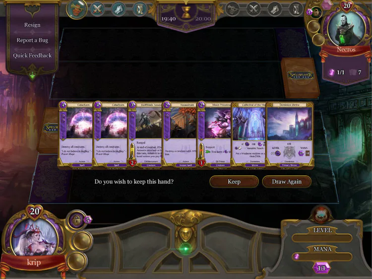
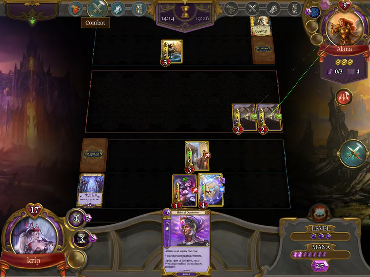
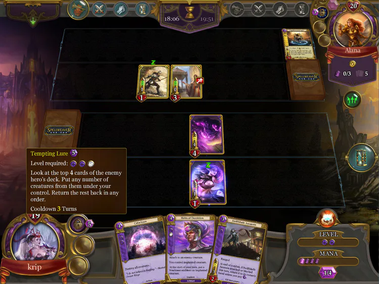
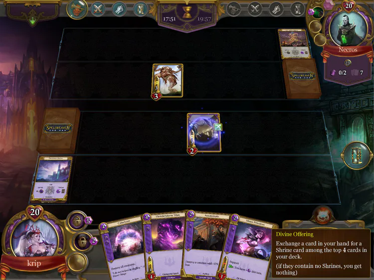
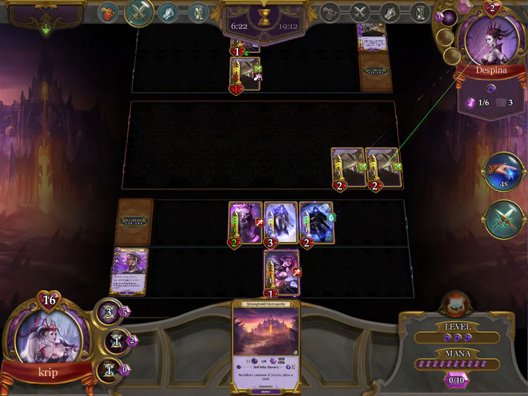
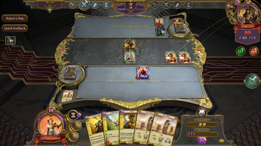
The previous visuals of the battle UI were only a placeholder. We worked with different artist for the Spellweaver UI and at the end we wanted to make sure the user interface of the client, all the different menus and the in-game battle UI will look similar and in one line. We wanted cohesive visuals in tone with one another.
To see the new battle UI fully explained follow that link - Spellweaver-tcg.com
We hope you guys like it! Don’t forget you can always share your feedback and opinion about our new visuals in the forums or in the social media.
Cheers!
**FOLLOW SPELLWEAVER TCG ON**
Facebook.com
Twitter.com
G+

0 comments