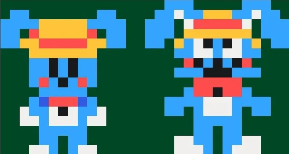
What style looks better to you guys?
Next up
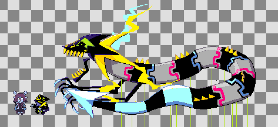
Damn people still use this site? #deltarune
U can just tell they're desperate for money at this point. Like, I'm sorry but this is just bleh... If y'all need money so much, bring back firesides and allow them to be monetized. People have been wanting them back for ages. It's the least you could do.
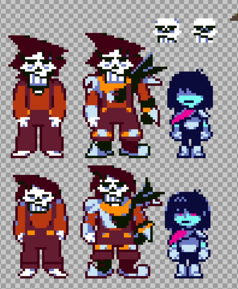
Forgot to post these pffft. Improved Striker's overall proportions and streamlined his look a bit. Might draw some more of his AU between FLORALSHUFFLE posts yaya. (Kris was just me messing around a bit, they aren't a part of this AU.)
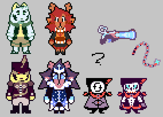
Here, enjoy some FLORALSHUFFLE thingamaloos. (It took two years but yes, these are their absolutely final designs. Took long enough...)
@Briferstorm ![]()
is a Jolter to Watch, Brazilian Solo Game Developer, Writer, and Pixel Artist! Follow @Briferstorm
![]()
before the quest ends on October 28 and you'll get Coins!
I'm feeling so Fazbear Fanverse
Yup. That's me. You're probably wondering how I got here.
Happy #WIPWednesday! Are you working on a game? Making some art? Practicing a song? Something else? Tell us in the comments!
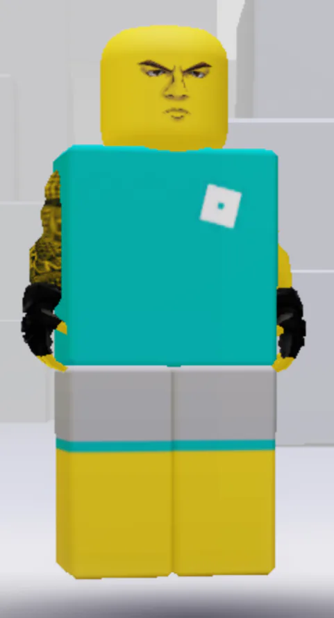
I decided to delete my Roblox account earlier, mainly because of how terrible of a platform it's become, which just made me not care for it anymore. R.I.P. to the best avatar in existence.




0 comments