1 year ago
Next up
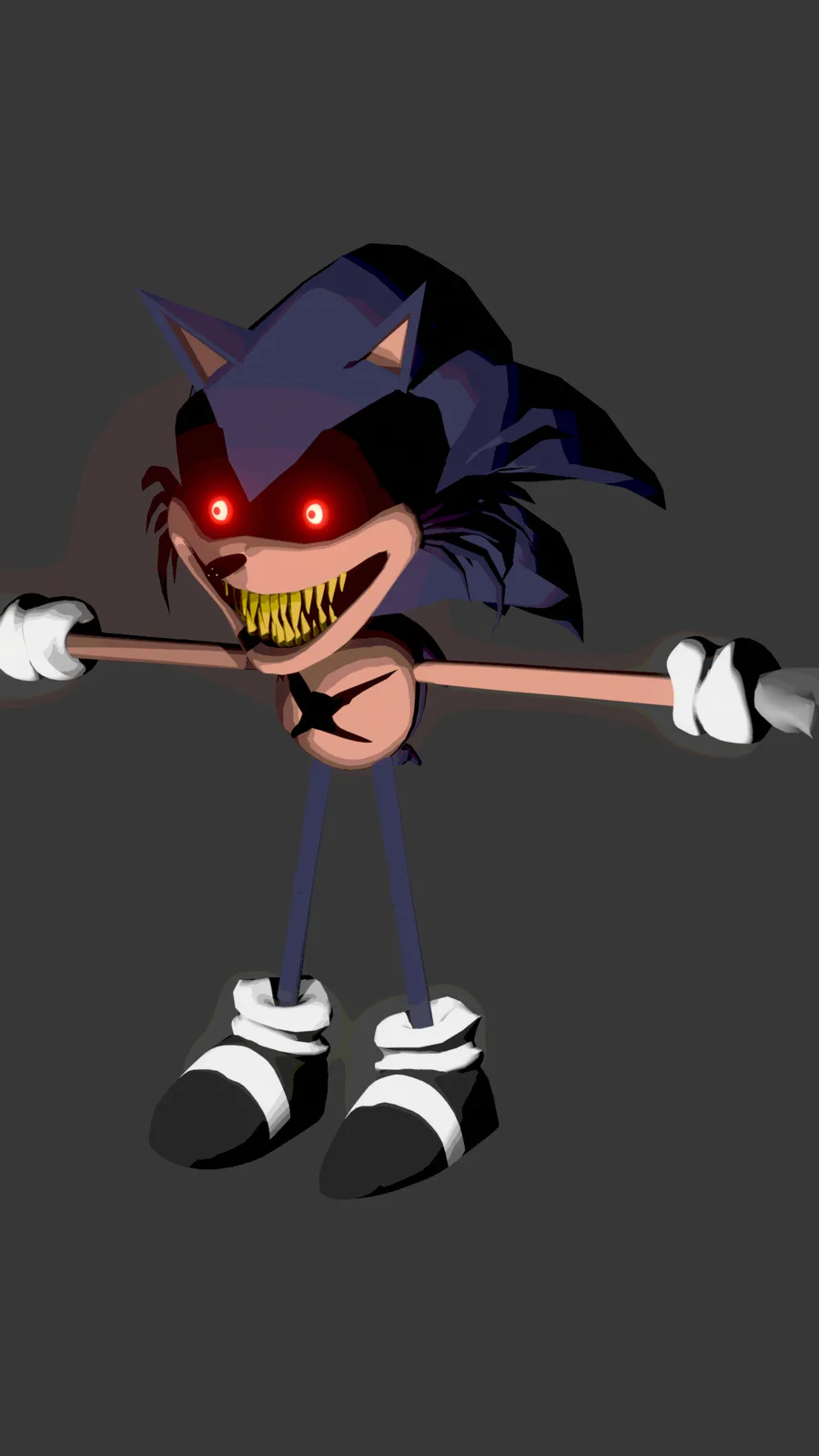
First real good model (mesh) and first time I made a hand ✋
Wool!
All that's left is to weight paint and copy the transforms of rewrite...
Then I'll work on Making 😅🥲
He has ascended!!!
Woho!!
He's gonna getcha!
Finallyyyy, I still need to work on the eye rig. Honestly she's really hard to recreate (especially her face)
@Jester_mvrk ![]() here's the final result.
here's the final result.
I FINISHED IT YAYAYAY
Trying to work on a longer animation for once
How's the animation and voice acting?
Gf's voice not mine
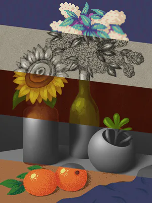
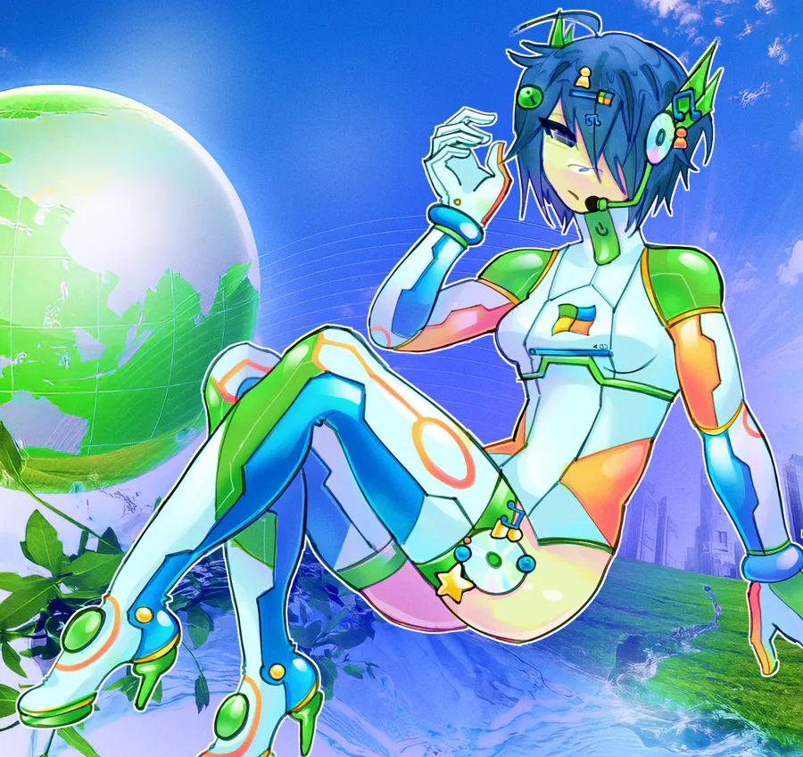
oo oo FATAL POSTED AN ACTUAL DRAWING HIP HIP HOORAYY!! fruiteger metro inspired
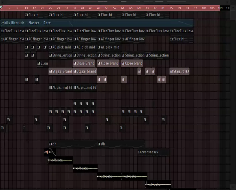
been a while since i actually made music. rate it (in the comments)






0 comments