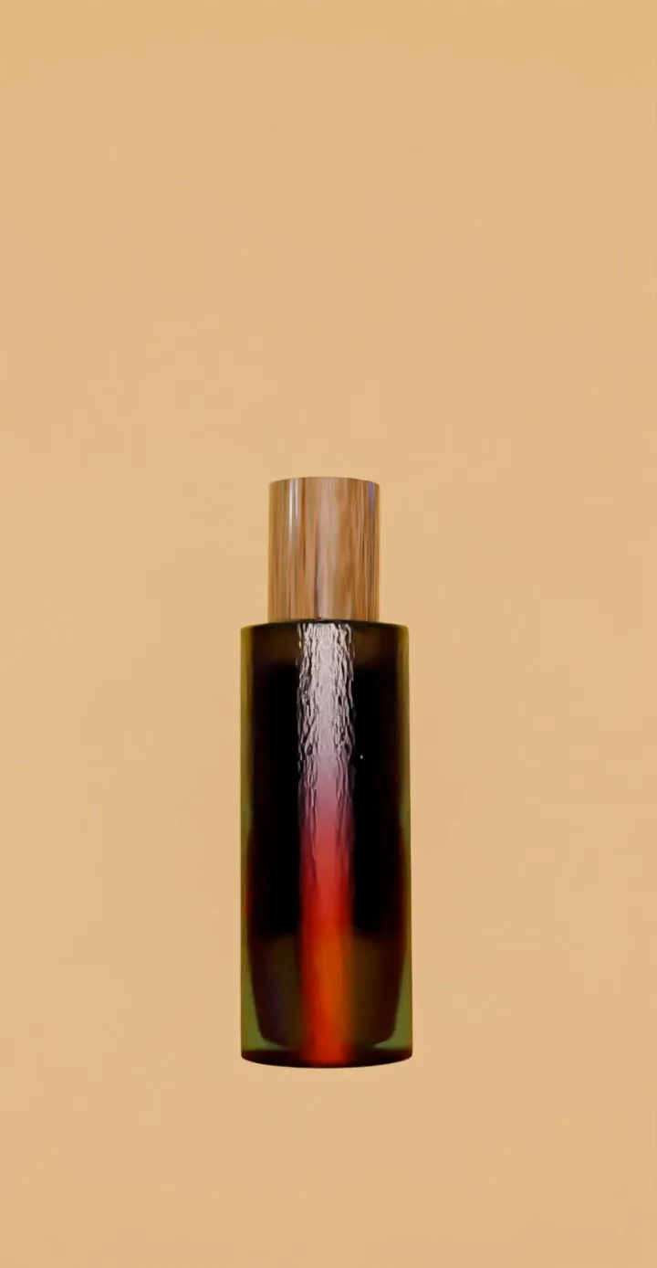
Next up
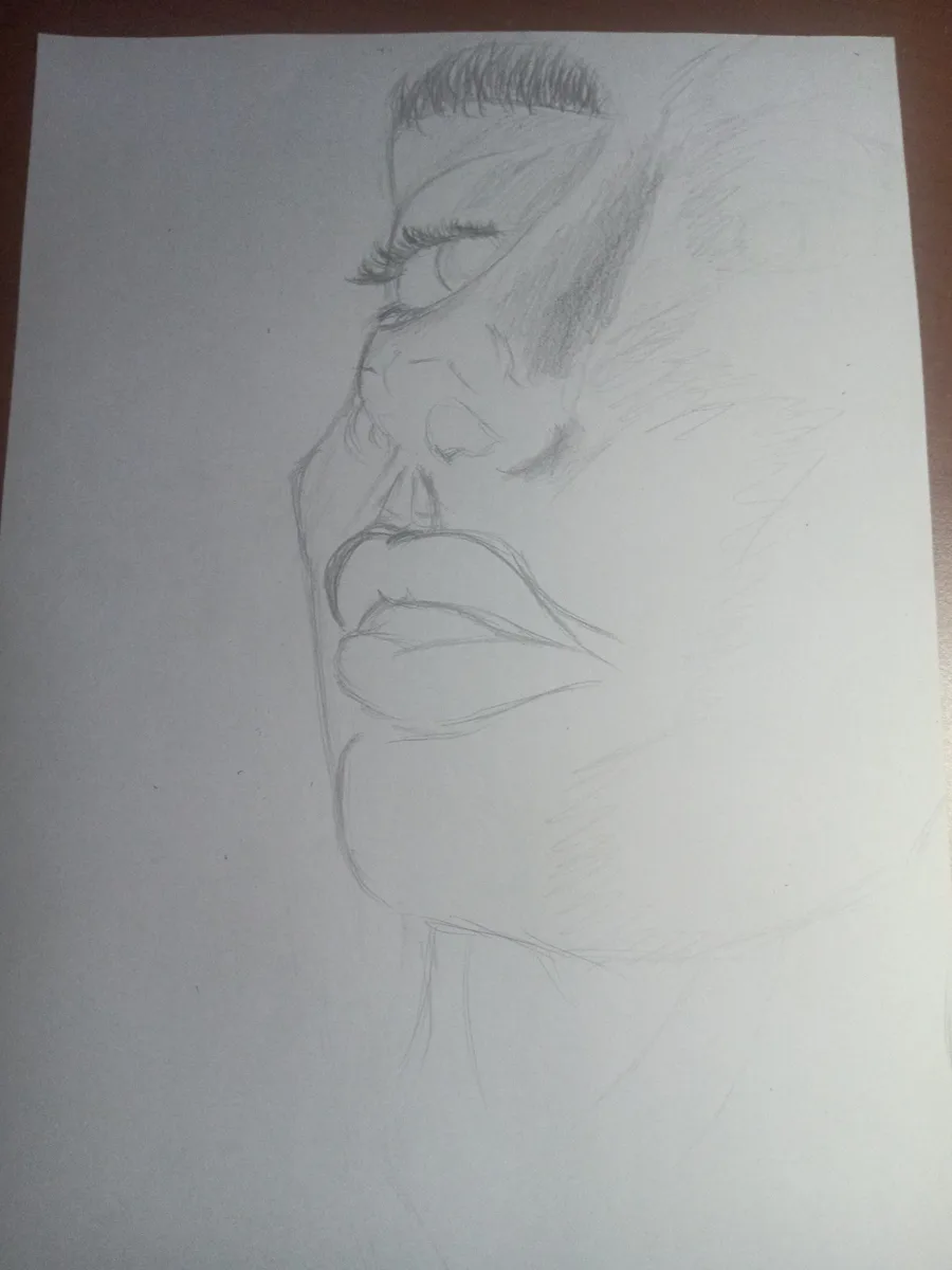
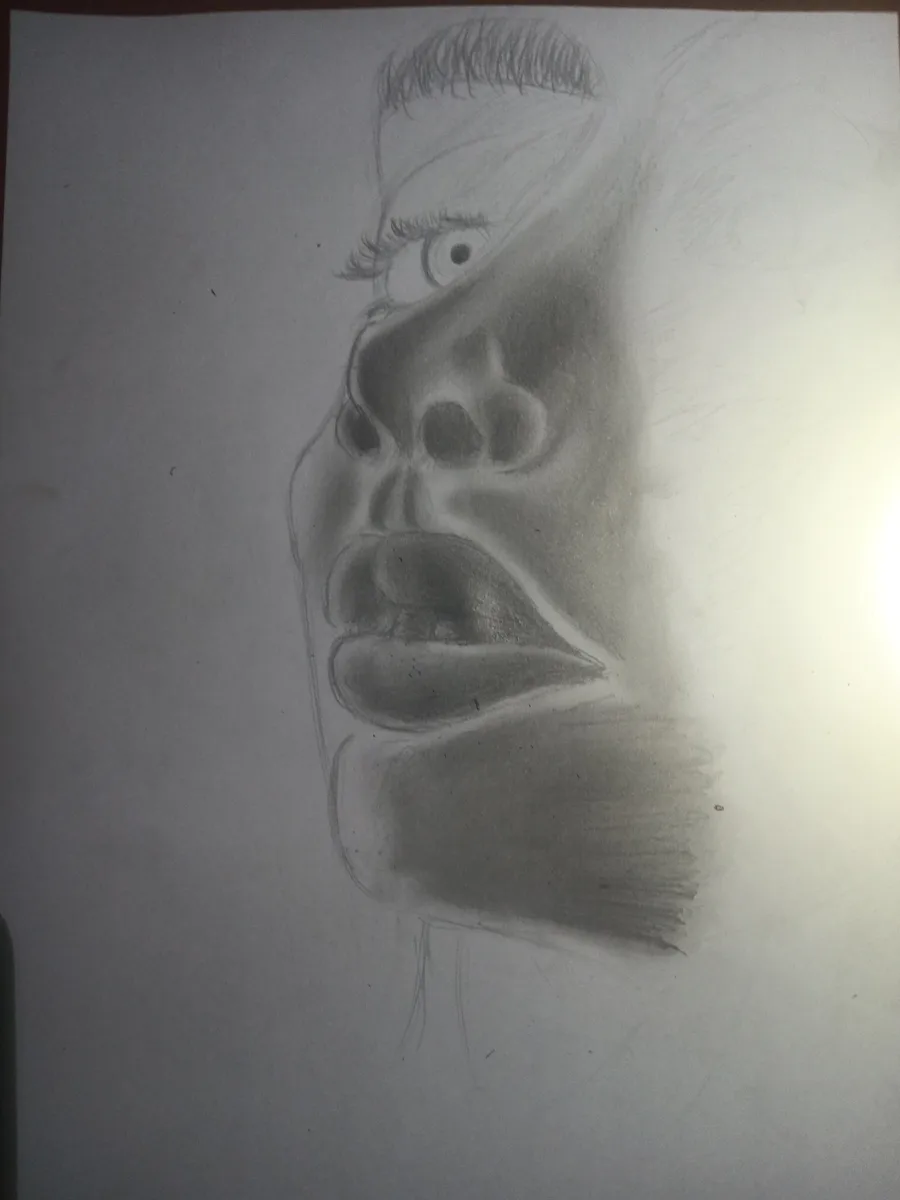
Haven't drawn in a REAAALLY long time.
Hope it comes out nice
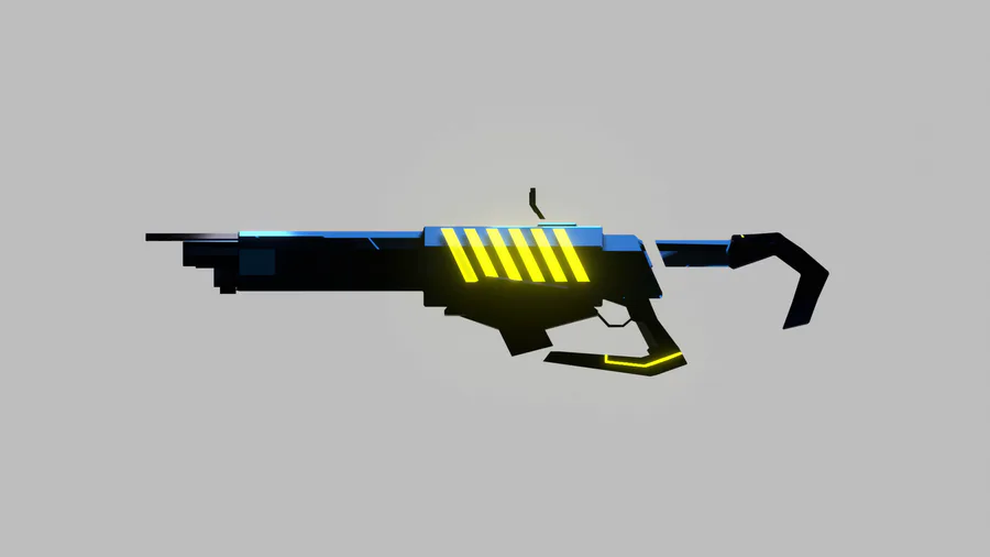
Gun!!!
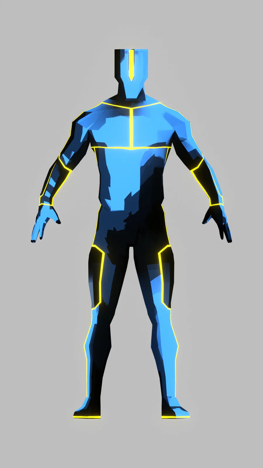
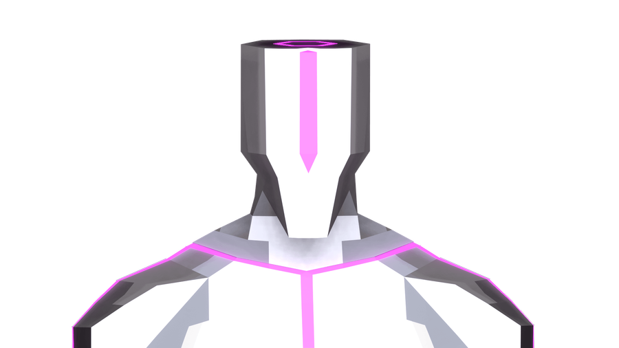
Concept art/model for THE game. It's not 100% perfect but it's close to the idea I have.
Character model.
Not official but it looks close enough to the "male" character I have in mind.
I outdid myself with this one though 😏
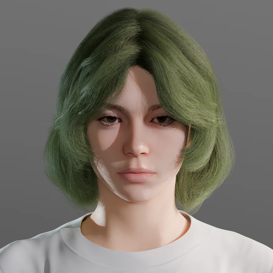
The new early WIP Clara model for Achluophobia
modeled by @Kyesen ![]()
Discord:https://discord.gg/tv4YTqmajN
Progress report
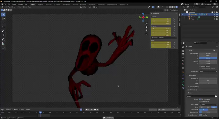
Huge!!! Problem
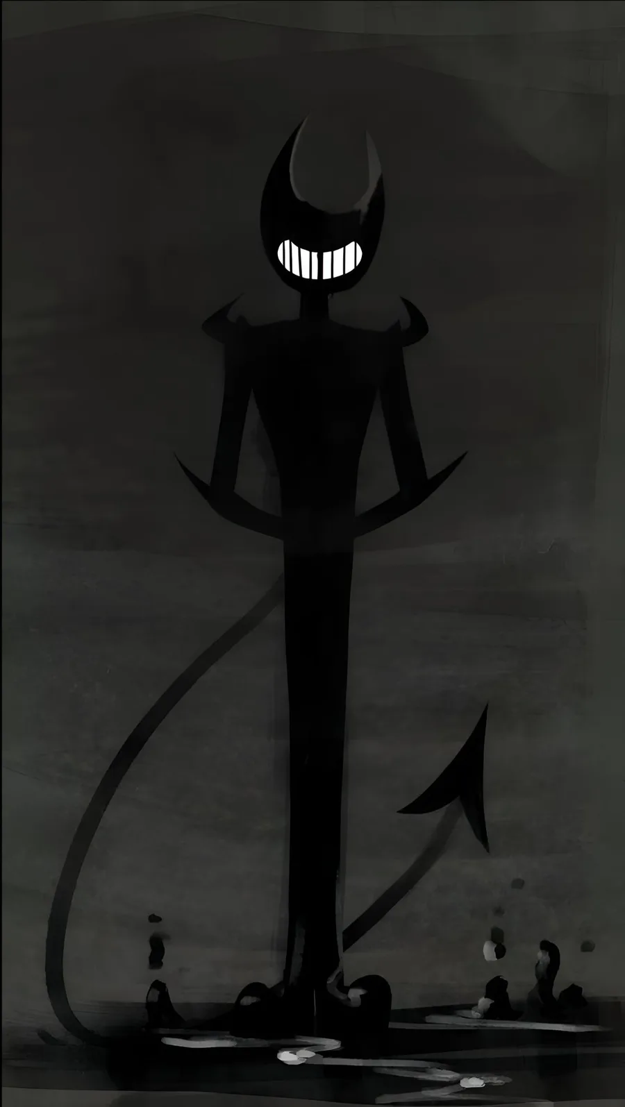
I can't make the dark any darker 😐
Disgusting.
Finally at 10k likes, awesome!
But the streaming thing just didn't go well at least I can bet on NOT streaming games soo yeah
BUT: https://gamejolt.com/p/i-want-to-work-on-a-game-i-know-it-s-weir…
I want to create a game (I know it's weird coming from me) but the idea IS solid ✋👀🤚 but I need help.
I can't guarantee that the game will be a success but it's better to at least get it up and running.
PEOPLE!!!! I'M GOING TO START STREAMING TODAY...ON TWITCH
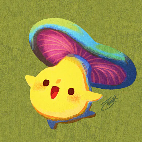
NOT MY ART BTW






0 comments