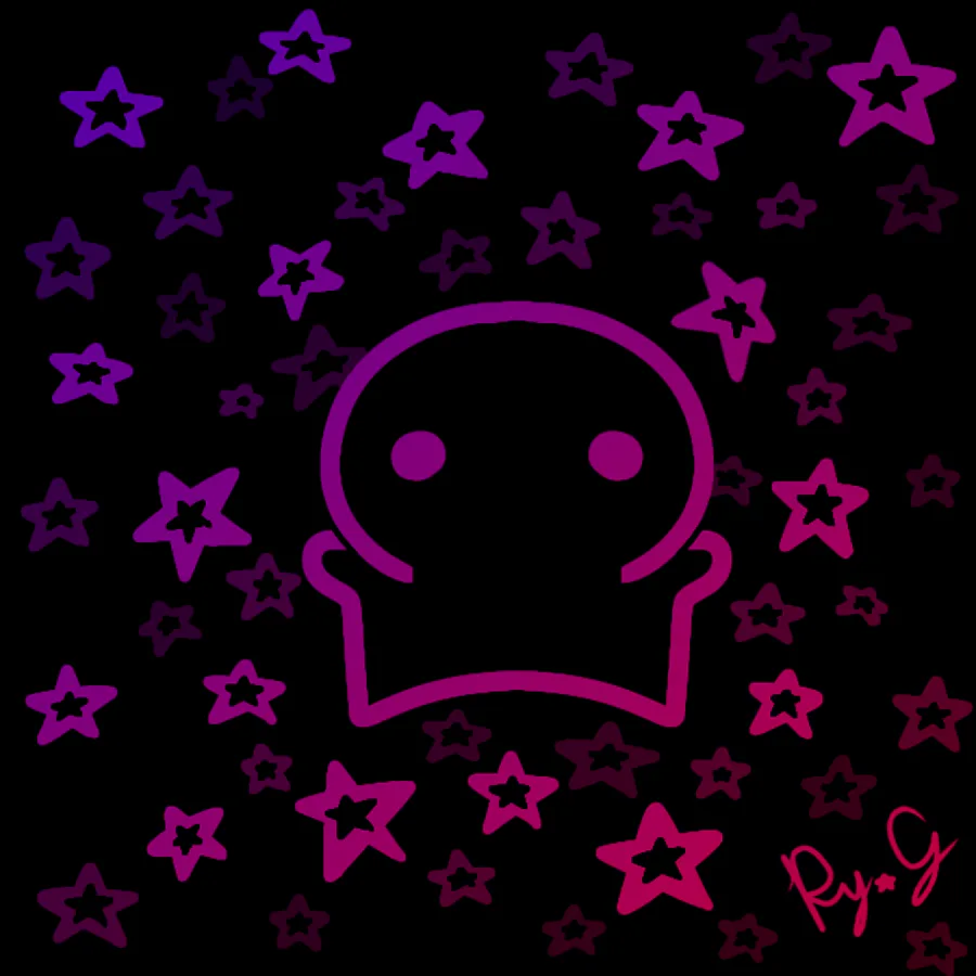
The Stars are so Pretty.
An experiment at using clipping layers. I think it turned out kinda good, although I feel like it could still have been better.
This was inspired by a shirt design that was suggested in my class' group for it to be our Interclass games shirt. They made a poll with 2 shirt designs, in oder to decide which one was going to be. The first option was a purple shirt and the second one was the shirt I liked, that had a Neon style with Stars on it. I end up being the only one that voted that shirt and most people were criticizing it for being "ugly". 
At least the one chosen still looks good… although it somehow took an incredible long time to actually be truly "chosen". My class were arguing about the shirt design until 10PM, when it was finally chosen that the first design, that was being chosen ever since the first poll, would be the design they would make. At least the argument they had were one of the funniest arguments I've read in a long while.


2 comments