FOR MORE INFORMATION PLEASE READ DOWN HERE:
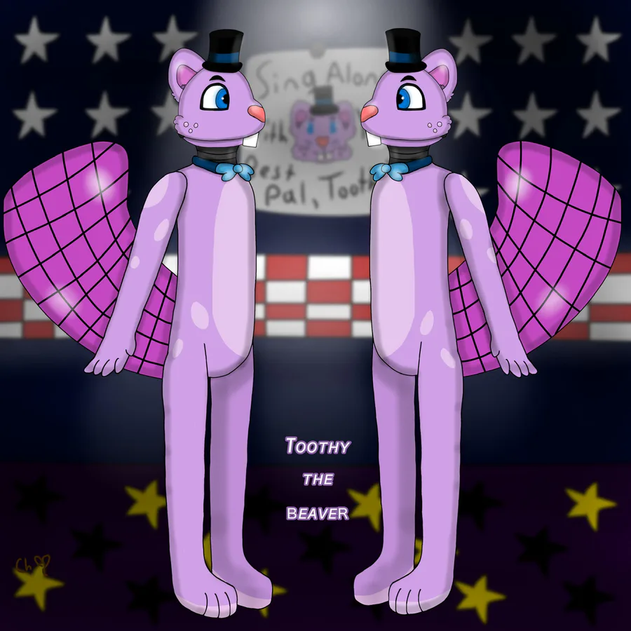
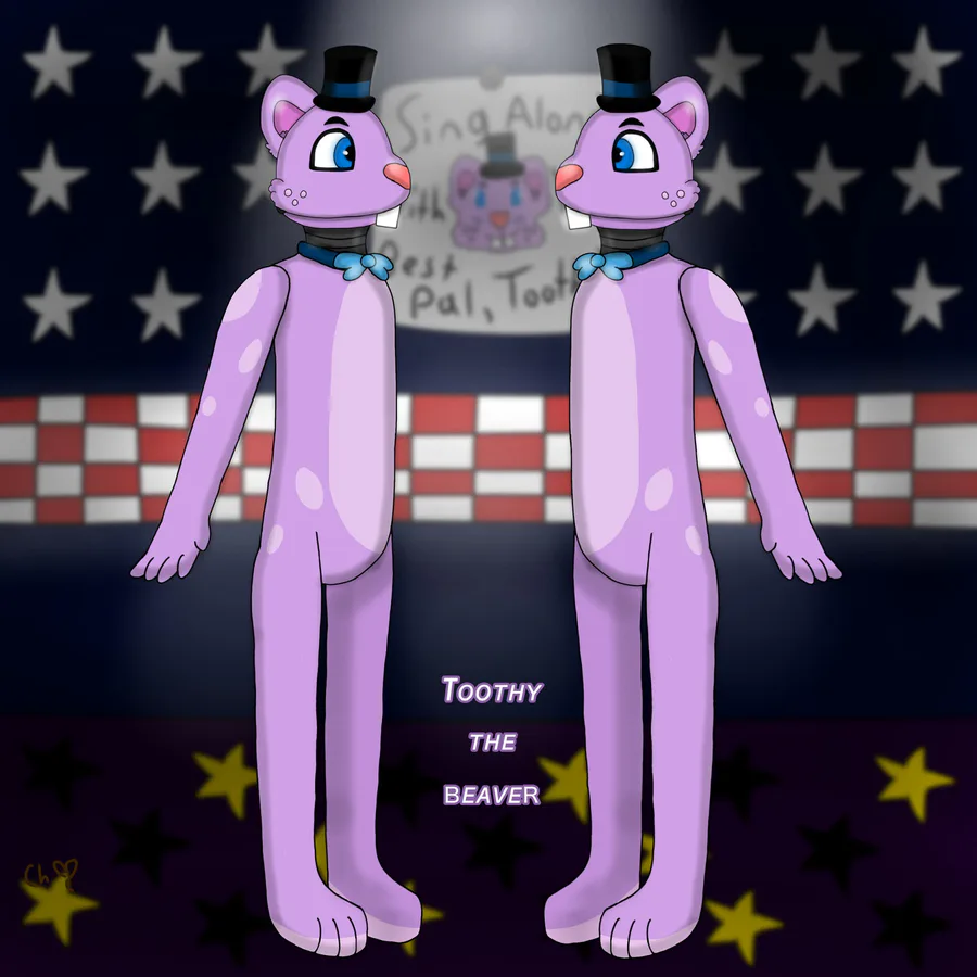
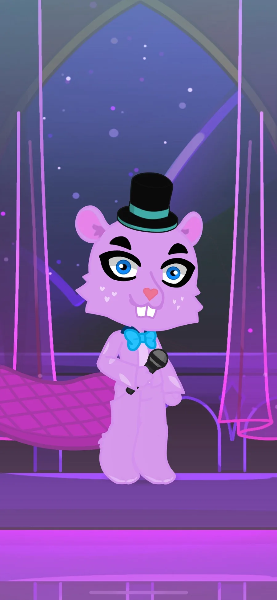
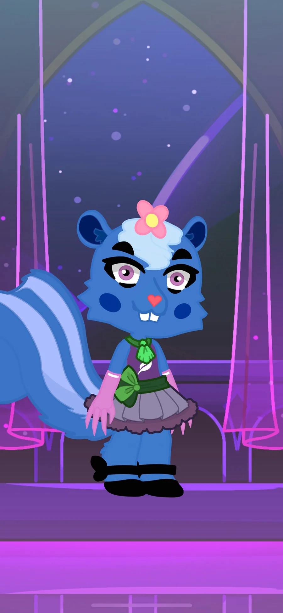
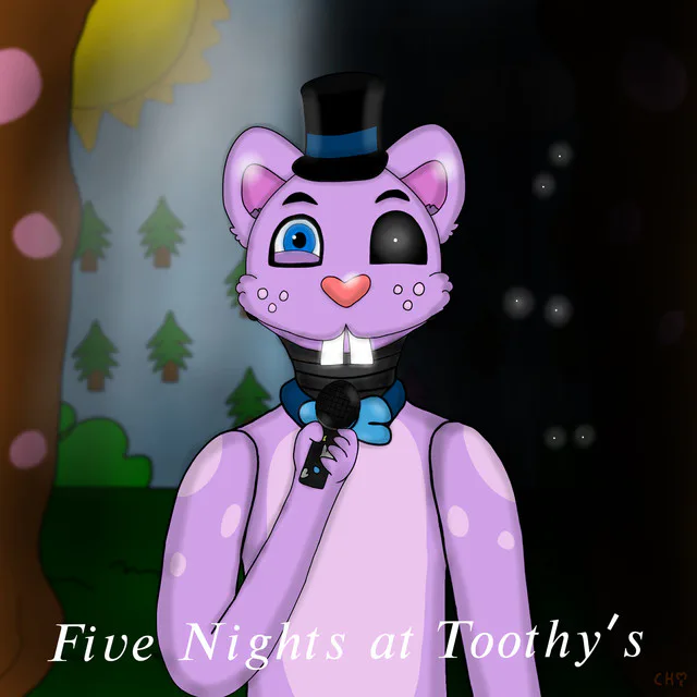
Ahem, I basically redesigned Toothy as the purple beaver that everyone knows and loves (via Toothy’s Tree Palace). Plus, please always remember and note that this is a mixture of fnaf & htf. Meaning in the fnaf community, please don’t take this down for being off-topic when it’s not ok?? Good!
Anyways, in me redesigning Toothy as a better version of himself. I happen to mostly think that maybe a 3d model could be made of Toothy the Beaver.
Yet, before that I must be prepared of having all 2d designs of the htf characters before then.
So for now, I must say that I advanced my art skills a bit to where my art tool (IbisPaintX) made sure of helping me make character design to be better than the old version of Toothy.
Another thing I want to say is that due to me remaking the way of how Toothy looks, I’m officially going to remake the Menu Screen for my fangame since it was actually unfinished & ugly (to me) as crap.
Very importantly as a thumbnail (not the official header yet) of Five Nights at Toothy’s, i’m also here to say i’m changing how the thumbnail looks for my game too.
It’s only thanks to me changing direction of everything revolving Toothy’s physical appearance.
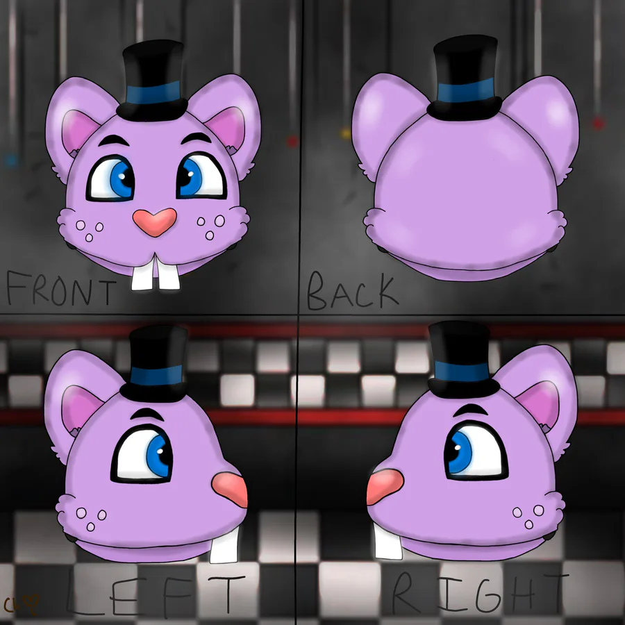
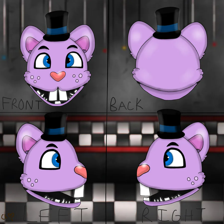
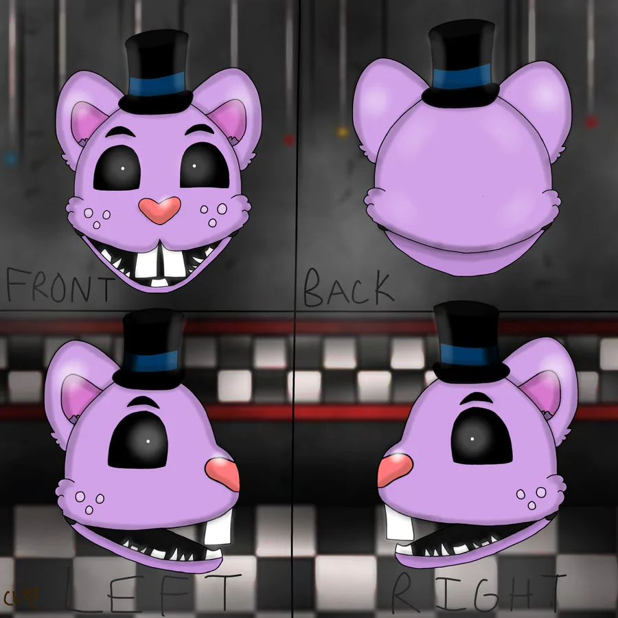
For a more in depth explanation with the drawings that’s in this post, please know that the drawings of Toothy’s new look is mostly for impressions of if I choose someone in my own time to make a 3d model of Toothy.
Including when the last time I made the (ugh) ‘Old’ design of Toothy, nobody knew what other way would this purple beaver look like other than the mess (as the artist) made months ago/one year ago.
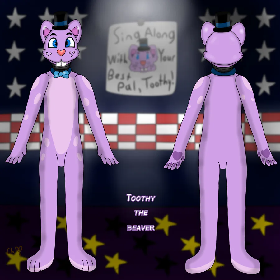
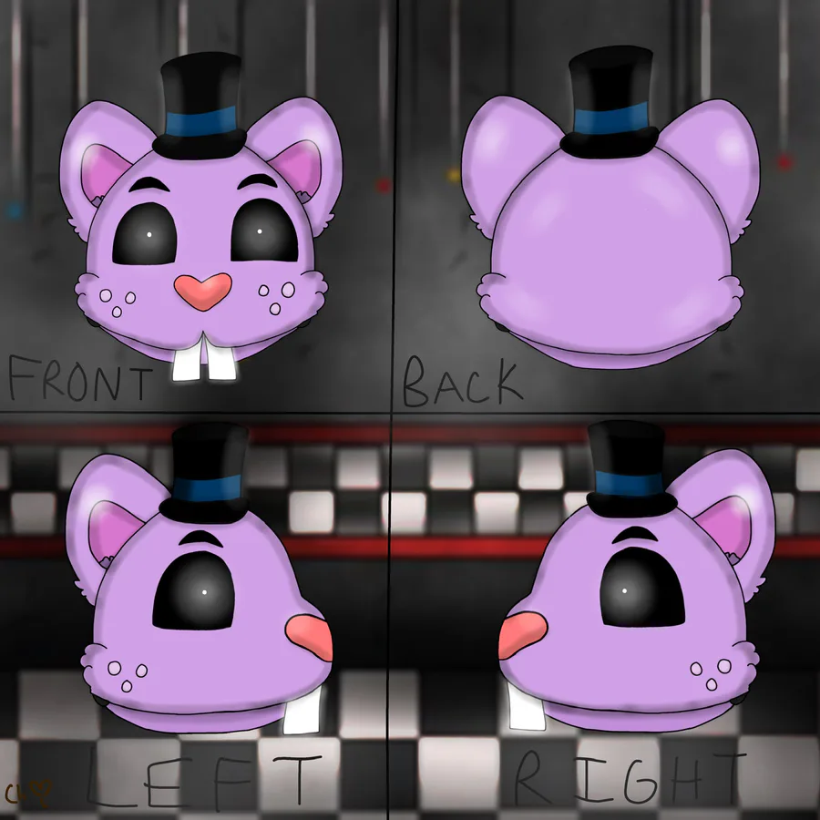
So in concepts of having to solve that problem, I provided not just the front view of what Toothy looks like but to also include the back of his face/body and the left & right sides of the same things.
Oh and, here’s a huge comparison between my new design of Toothy & the old one here combined together!!
With my comparison, just read below:
There's THIS (The old 'bleh' design of Toothy that I drew last year) ----v
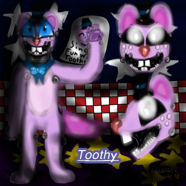
VS
THIS (The new 'ooh' & creative design of Toothy I drew since February) ----v
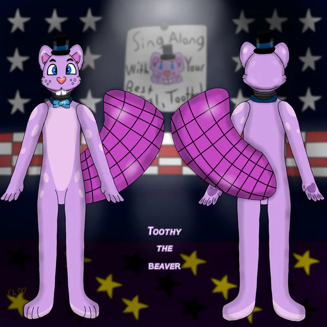
Question is, which one would you choose? The old design of Toothy?? Or..... The new design of said beaver?? Let me know down below!! Cause, so far I believe I would choose the second image as its my better creation in the name of CH (ChocolateHearts).
In conclusion, I want to say there will be more drawings other than this one y'know?? Just know that characters I already made designs for will get redesigned.
While characters I planned to design will have to get switched into this new look (not exactly art style as it might change) that I've acquired for the htf animatronics.
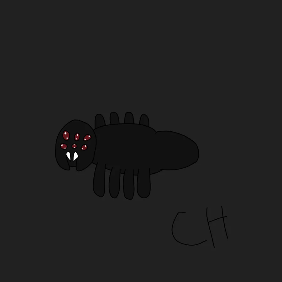
Finally, I just want to let everyone know that just like my older posts & drawings that whatever I draw in my own artwork belongs to ME ok?? Since basically in all the images I've included my signature (no matter if you can see it or not).
Which obviously means nobody at all can steal/trace my artwork or else I'll plunge you deep in the toilets that exist in the world. Plus, CH for short will mean nothing else except ChocolateHearts (aka my name) proving ownership of the drawings I perceive.
Anyway, I'll stop talking. Hopefully you guys enjoy my post and leave a comment if you want to.
(HTF X FNAF AU/Five Nights at Toothy's)







7 comments