3 years ago

i don't like seeing coloured text and state icons in descriptions


coloured text and state icons feel like dress-up to disguise poorly-written descriptions, even if the intent is to make them easier to look at

using red text to showcase how angry and mad and berserk a character is just feels edgy, i don't need red text to know if a character is mad

if dialogue is hard to write find someone to do the beta reading, to this day base painful and hopeful still have the best writing out of all the serious lisa fangames out there

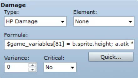
plus, state icons take up important space, skill descriptions in rpg maker can only store so much

but who even spends that long looking at said skill descriptions, anyway? i only check them out to look at the combo dials


1 comment

Loading...

Next up

made a comment on a post asking what animal buddy armstrong was coded into

decided to draw it

it turns out you don't even need a custom script to detect the height of an enemy battler's sprite

the more you know

there has got to be a better way of phrasing this, this sounds wrong

Greetings, everyone. Today is a very special day, 18/02/26 the 5th anniversary of the 1.5 update(the last) for Lisa: The Pointless Scholar Of The Wilbur Sin. Happy 5 years birthday to this fantastical mod and that it shall last for the next five years.

rampaging minotaur's animation looks cool, i just wish it was properly attached to cyclops instead of being exclusive to his route, he should have received support-based moves instead to further contrast him with lanks

unlikely I will ever finish this, but still you can take a look at some WIP stuff!

buddy armstrong if she had more family resemblance

oh, you love lisa the pointless?

name every arnold perspective mod

A proof of concept

rando if he had his mask on, but not his shoulderpads

*maskless for comparison