Why should I redesign it?:
Part of the reason why TurboWarp (and especially Scratch) aren't used as much as a game engine is because they look more like a toy than a professional IDE.
Even other mods, like Gandi IDE (which have far more comprehensive redesigns to distance themselves from Scratch), still target themselves towards kids - not to mention they're closed source and developing extensions is a nightmare, but that's a whole other problem.
TurboWarp kept the same aesthetic as Scratch. This is fine, but the design language of Scratch is fundamentally for children, and Unsandboxed inheriting that doesn't feel fit for what it's trying to be.
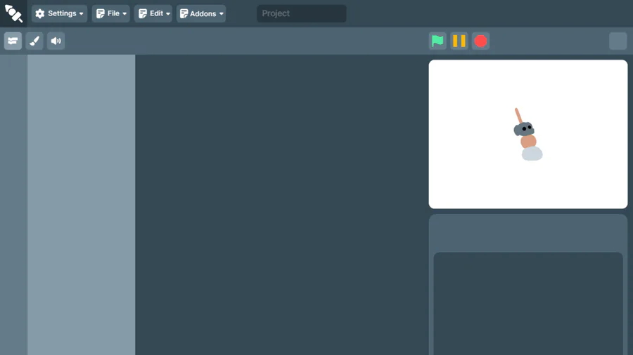
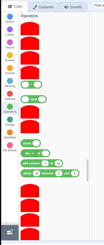
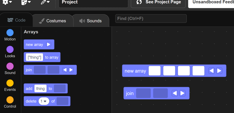
This redesign aims to polish up the dated UI design while still keeping everything in the same place. I don't want to reinvent the wheel, I just want to build it out of something that isn't wood and cardboard.
What will this achieve?
People won't feel ashamed to use Unsandboxed when entering a Game Jam; they won't be afraid to send screenshots of what they're doing to their friends; they won't be afraid to say to people "I use Unsandboxed, and I like it.".
Last year, I got the highest marks in my class on an assignment where I had to create a game from the ground up. I used TurboWarp and gave it absolutely everything I had. I know first-hand what TurboWarp is capable of, and I know what it's like to be scared to admit to people that you're "using Scratch".

15 comments