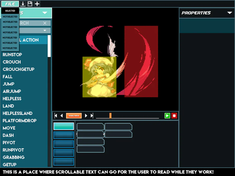
Been a design week this week. I’ve been working with the wonderful Yannick Toney on another UI design. This time: the Legacy Editor! We’ve settled on a layout for the builder that I think manages to combine ease of use with aesthetics.
You can see, on the left is an action panel that will always be available. This is a change from the previous pull-down menus and split panels we’ve tried before. This should hopefully give you a better idea of the overall structure of your fighter’s moves, as well as giving you a quick way to check that you’ve implemented everything (the text on the list will be a different color when the default action is used)
In the center, we have the viewer panel, and below that a revamped timeline panel. You’ll be able to scrub the timeline for a specific frame, as well as view the animation in its entirety with the play controls! Below that is the contextual panel. The contents of this one will change depending on what you’ve got selected currently, allowing you to edit an action, subaction, or fighter properties.
And on the right will be the list of subactions that you’ll have for the currently selected category. That’s currently still in the works, so there’s not much to show there, but you’ll have a column of subactions to look at for the currently selected action, and selecting them will bring up their properties in the contextual panel.
Not much code this week, but a lot of pre-production that should hopefully keep the builder on track. Since the in-engine character builder is what will set TUSSLE apart from other similar custom fighting engines like M.U.G.E.N., it’s very important that it’s made as clear and user-friendly as humanly possible, and once it’s done, I hope that more content comes out quickly.
So, until next time TUSSLERs!





0 comments