
I'll be going through each segment of the game and giving them individual ratings.
Keep in mind that these critiques are my own and are not objective. Your views may be different from mine.
I apologize if these criticisms are harsh, but the negatives are the things that stick out to me the most and those are what I'll be commenting on.

There's not much to say about the menu, it's pretty standard and does its job.

There's a lot of things to point out in the office.
As someone who primarily does environmental design, it's not good.
There's a lack of realism(?) with the number of props in here, it ultimately feels empty, and everything is seemingly placed in random positions.
Something I'd suggest is to use the slope rule, put the larger objects in the back with the smaller objects at the front to ensure that everything is visible and flows nicely.
It does feel to me like there's a few too many bobbleheads. It'd be one thing if they were smaller, but the scale of them makes them look very out of place.
I'd also suggest more office materials and clutter. Pens, pencils, filing cabinets, things of that nature.
I think the bulletin board is very empty, there's a lot of room there for drawings and papers. It's okay to have them overlap!
The lighting also feels bland, I don't see the point in having a desk lamp when there's an overhead lamp. Something I noticed with the lighting is that all three lights flicker at the same time, and it just feels really wonky to me.
Either the shader is messed up, or the image is rendered in the wrong resolution. Turning the camera stretches out objects at the sides of the screen.
Artifacts from the motion blur also show up when you scroll making it feel a little cheap.
Obviously, this area is very unfinished judging off of the visibly empty room to your right, so I'm hoping these critiques can be used to improve it in the future.

The arcade is visually much better than the office, the lighting feels dynamic and makes sense. It feels much more finished than the office on a lot of levels.
The scrolling here is also a lot better and doesn't warp the image as much.
The gameplay though, to me is extremely boring.
I would suggest making the mechanics more unique than just flashlight. Bonnie and Chica have their own characteristics, why not use them for gameplay?

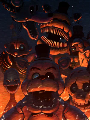
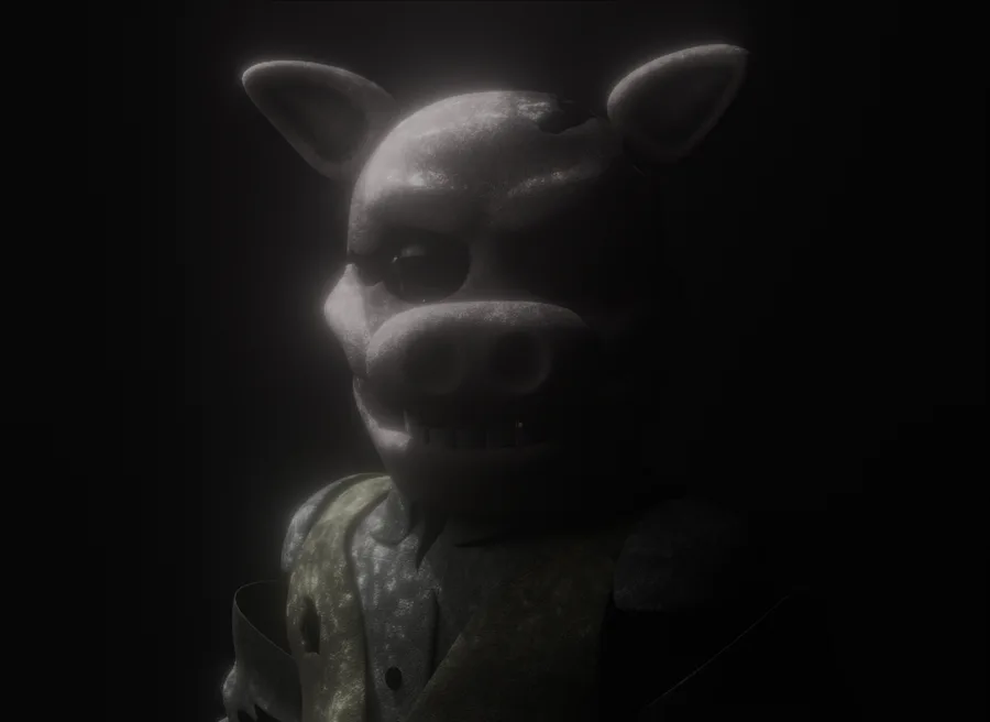
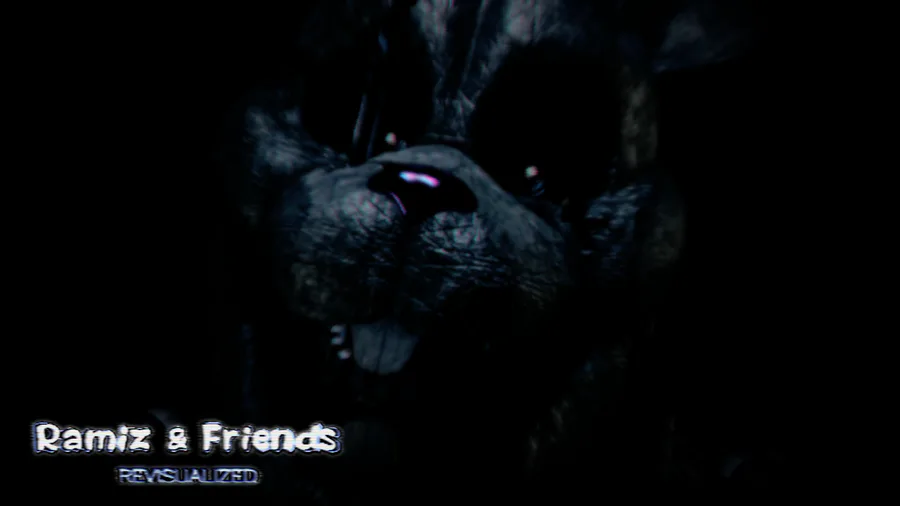
The designs I feel are too kid friendly. I understand the idea of using context and lighting to make them scary, but ultimately, they aren't. There's no intimidation factor when they're the same height as you. It doesn't feel like a looming threat and more like a mannequin you can easily push over.
These are things that just don't really make sense to me and aren't enough to have entire sections over.
The credits for the entire game as opposed to credits for the people who contributed to the demo.
An extras menu for a demo.
Battery in game = battery in real world.
Demo doesn't feature the main gameplay of the game
Ratings
Gameplay - 5/10
Environments - 6/10
Designs - 5/10
Overall, I think this was a pretty okay demo. I went in with extremely low expectations, but it turned out better than I expected.
I wouldn't call it good, but I wouldn't call it bad either.
Once again, I cannot stress enough that these are opinions. Your views may be different and that's okay!
I think this game could be really good if given more time.
The team behind the game is very talented, and I hope to see more from them!


0 comments