This is Christopher writing my last post, for this game school project has come to its end. It has been fun, stressful and confusing at times.
We all had dedicated responsibilities. Nevertheless many of us in the team worked on several other things to fill the void.
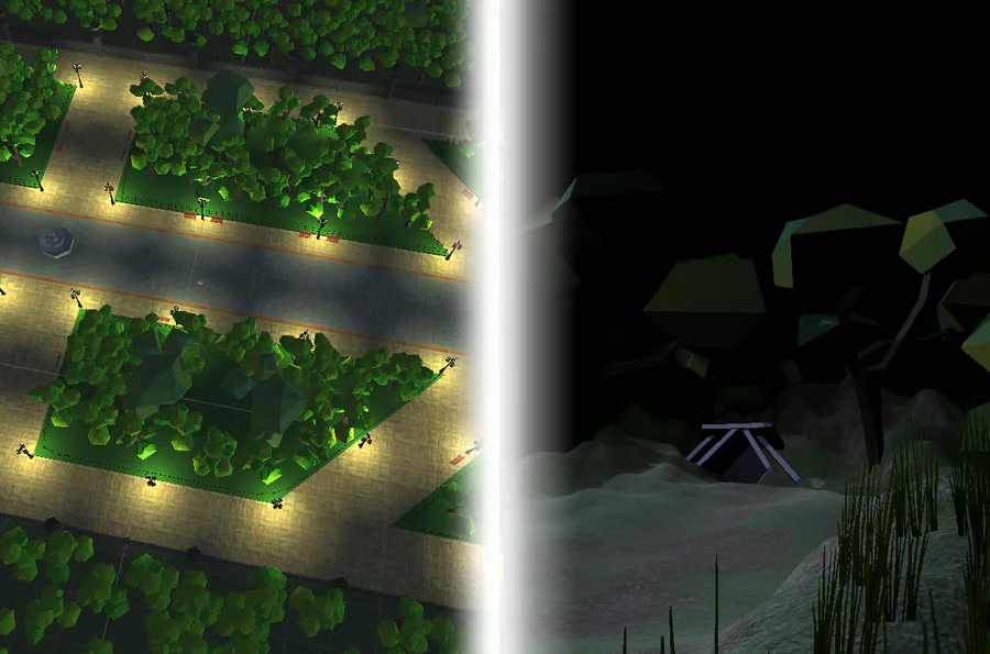
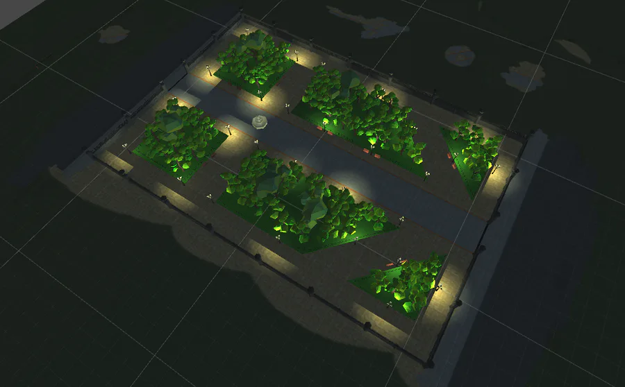
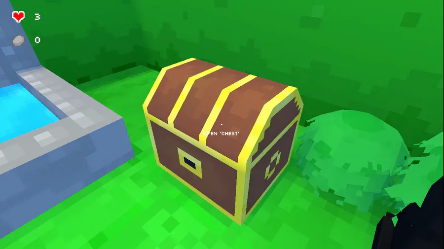
For my part, I really felt the style of the game absolutely can’t have mixed art. I’ve already taken part of projects that had just that. Where the game has made deadline and is fully playable but with no clear-cut style. That’s why I put some energy into 3d modelling assets for our environment when my dedicated area was level design. Of course it was easier for me as a level designer to go outside boundaries when I didn’t have any other responsibilities, only one level to work on, plus the fact that this is only a school project. To the point -> having the option to create assets as a level designer gave me full control of the overall environmental visuals. I’m certain the situation would look like previous projects if Emanuel hadn’t let me be responsible for the 3d art.
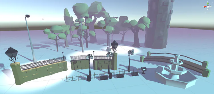
Testing performance, I think, shouldn’t have been as big a part of my job as it was, but my level was most performance heavy, so naturally I felt I had to fix it.
A level designer out in the real world I’m sure has knowledge about texturing and correct use of materials, which are some important things I’ve come to learn about during this project. At first, I had too many unnecessary materials for each model. In the game engine too many materials yield too many draw calls and makes batching useless. Having a game with mostly static objects and very few dynamic objects absolutely shouldn’t be performance heavy.
I fixed the models so that trees, for example, only had 1 material. Then I marked trees as static and batched. Now meshes sharing the same material are combined into one large mesh, making the run time rendering less heavy.
The difference between having good material use and bad was my biggest lesson, easy.
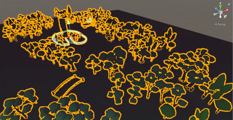
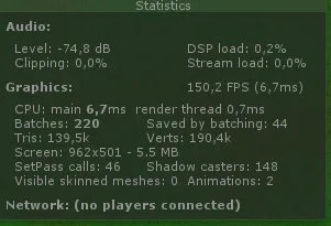
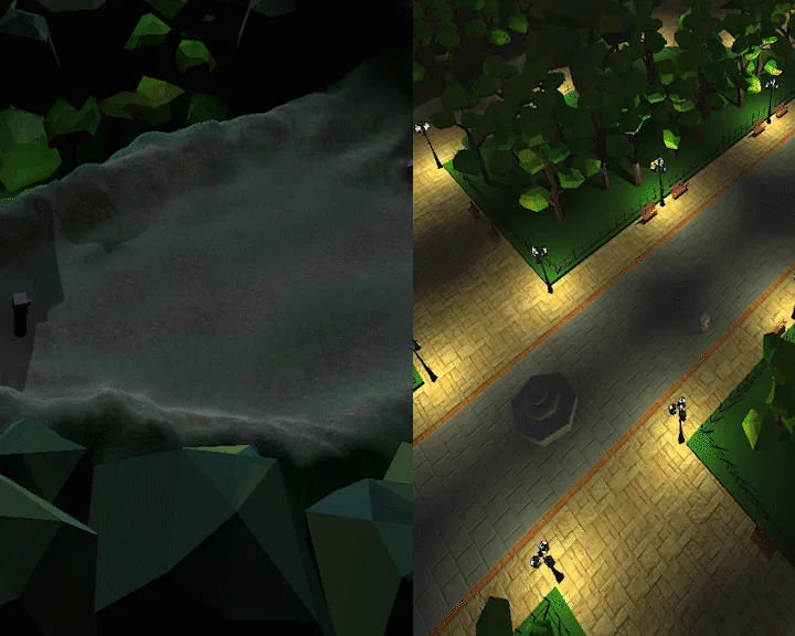
My main focus for this project was to make level design that helps the player forward and make the design fit together using shape, color and light. I would say I unfortunately strayed away from some of those points when I did the performance fixes. In retrospect this wouldn’t have taken up much time at all had I used assets from Unity Store. The level designing would be quick and I could’ve completed the dialogues or assisted a teammate with something unfinished.
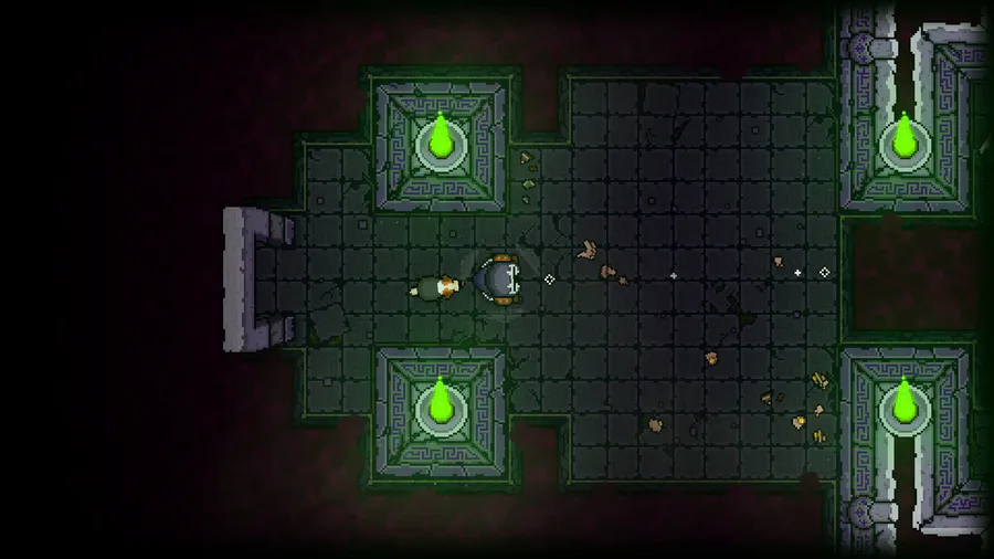
However I’ve learned a bunch and I’m happy to say that our levels at least fit together design wise. If we had more time we would’ve had some game testing’s with our class to ensure the level design is also easy to progress through.



0 comments