Game
The Inferno Game BETA


1 year ago

Okay, I finally got a part for another project done, so I can focus on this for the day. I’m going to carefully draw the background assets for the kitchen. I still made sure to darken my room for a better view. Process details are in the article below.


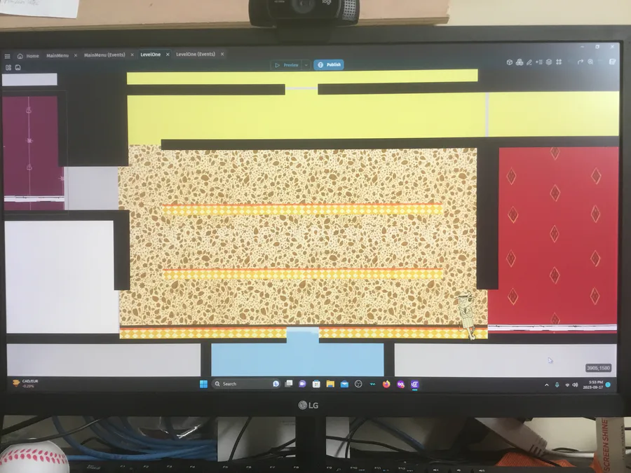
Pic 1: Here’s the room when it’s almost bare. I drew the wall paper and flooring traditionally and coloured them digitally. I zoomed in/out a little under the page’s space. This way when I scan the pages, nothing will accidentally be lost because they were too close to the edges. I also need to remember not to zoom in or out and just use the sliders to do the other rooms.

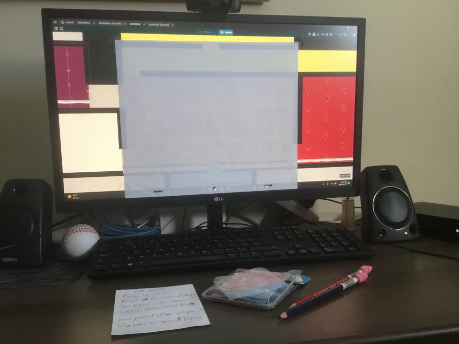
Pic 2: I taped the animation paper to my computer screen so my final assets will just be more consistent and sized right. That was a problem for the rough assets. I used removable adhesive dots.

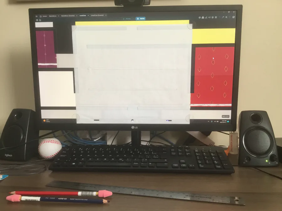
Pic 3: I used the darker blue pencil to draw The solid outlines of the room. This is how it basically looks.

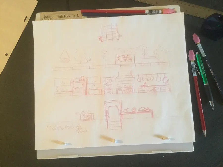
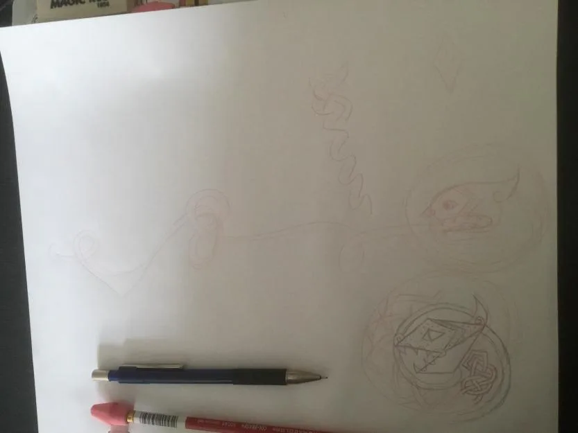
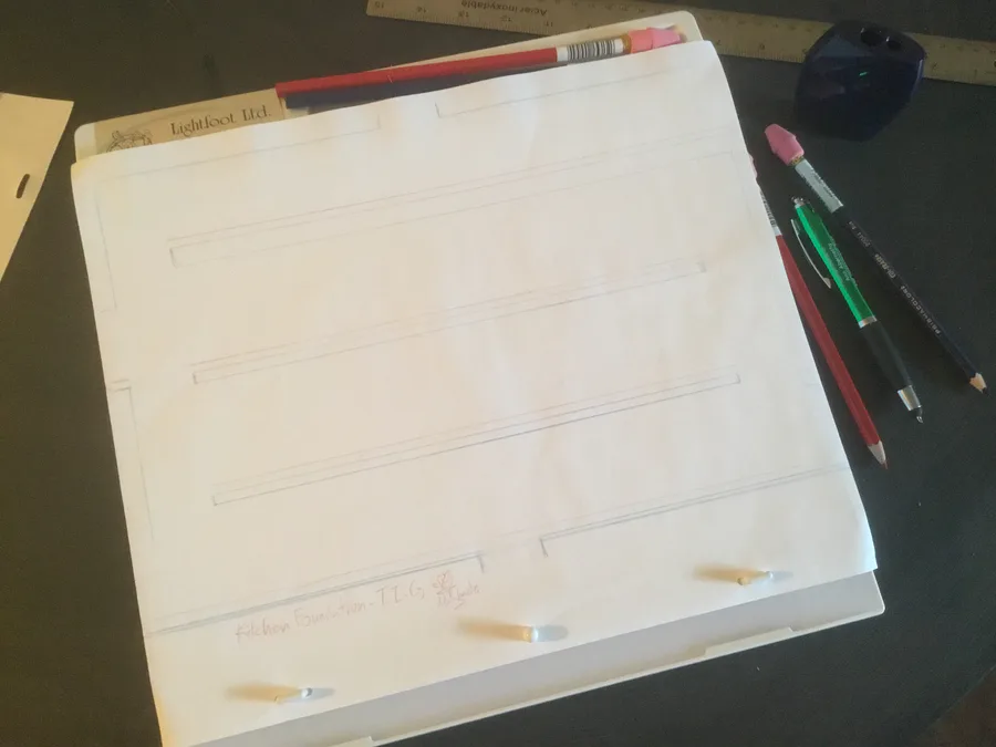
Pic 4: I took the paper off so I can draw the assets with my animation desk. I don’t want to leave them on for too long because the warm computer could melt the adhesive. Then I’ll draw the assets on another paper. The red lines are for where the background assets are placed to create the illusion of depth

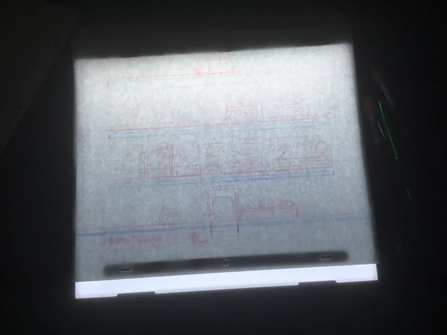
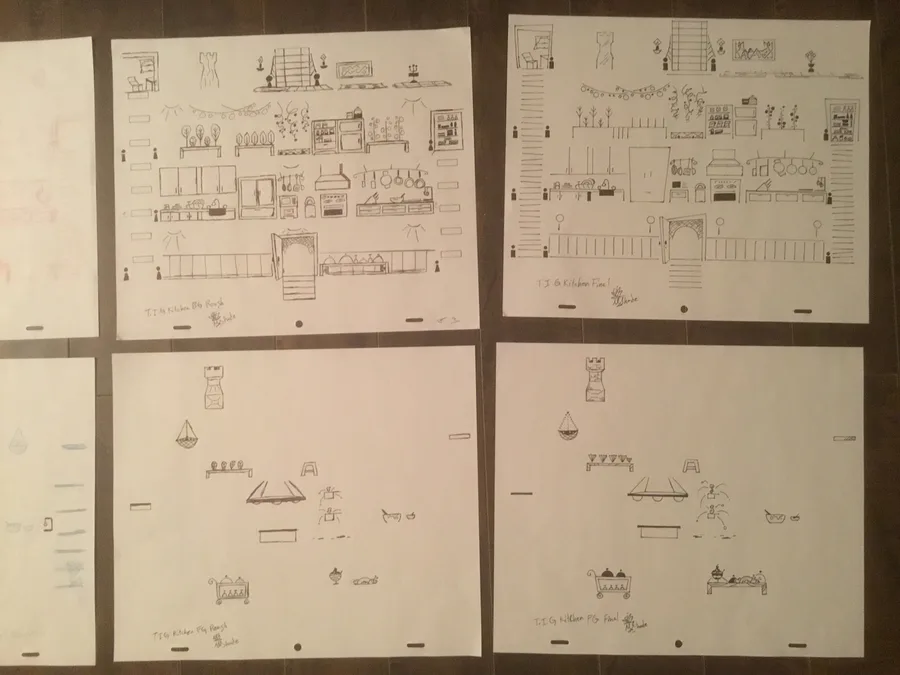
Pic 5 & 6: Sketched out the rough bg assets! One shows it with the animation desk’s light on and the other with the light off

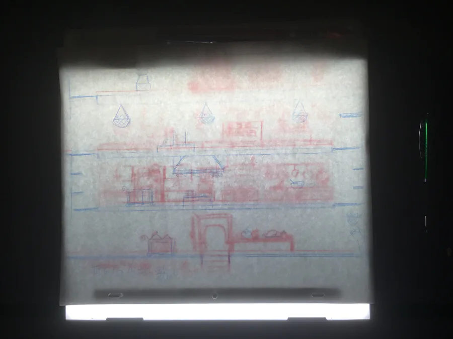
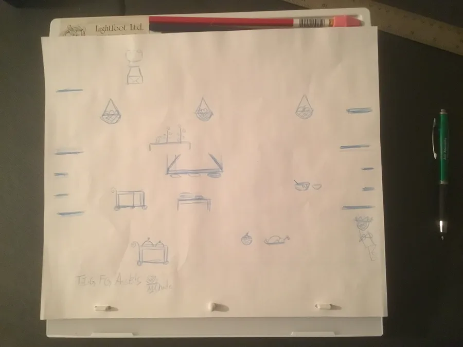
Pic 7 & 8: I placed the bg rough assets first, then the foundations paper, and then the fg rough assets on top. The fg assets are the platforms or interractable objects.

9: Did the final art with a sharpie to get a stark black. I didn’t outline everything because of the art style. I’m trying for a mixture of simple Art Deco (more for the bg assets) and more detailed old Gaelic Art (more for the fg assets).

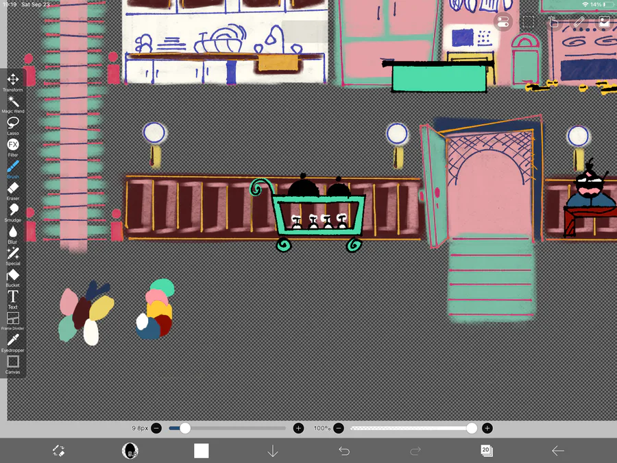
10: Since I don’t have the money, I decided to colour them digitally. I did the bg assets with alcohol marker brushes and the fg assets with ink brushes.
0 comments

Loading...

Next up

Updates:

New Tutorial Page

Boosted Player's Frost Ability

Boosted Player's Fire Ability

Enemies react to Player's powers

Make Enemies Harmless when Stunned

Added Kick-Off Wall

Kickable Objects

Added Secret Passages

Alternate Routes

Art Direction Decision

2.8.0’s release will be this Friday. I started a new summer job this week and it’s been great so far, but I;m also very tired. I’m starting to commission play testers to help me out with it’s development. Thanks for everyone’s support!

Hello, Everyone. I have two announcements:

The first is that I'm going to focus on another summer project and summer job to cover the costs of health matters. The Inferno Gang will not be shelved, but progress will be slower.

Celtic knots are hard, but pretty satisfying when I can get them right

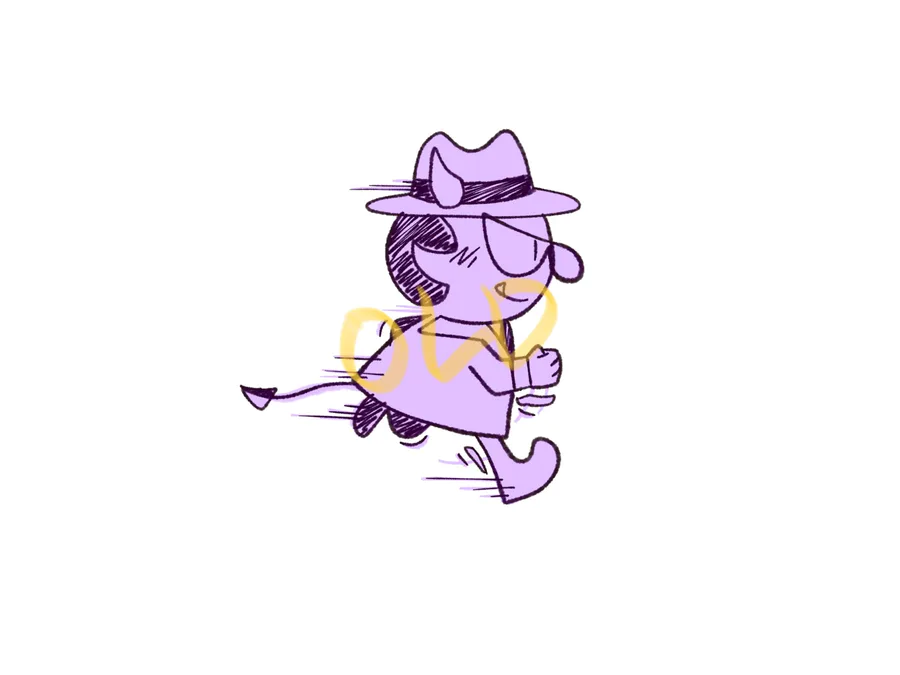
I’ve finally conquered my perfectionism long enough to make some sprite assets. It was fun playing with smear frames to show a bit more life in the animations.

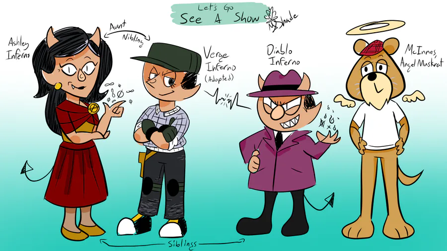
Let’s Go See A Show is comics about Verge Inferno, adopted nibling of Ashley Inferno and happy landscaper, and Diablo Inferno, Ex-Don and Cartoon Protagonist Hazbin who’s getting the help of his Guardian Angel McInnes to live a normal life… so he says.

Minor Update: the Morality mechanic will replace the Health mechanic. Basically, you get a game over if you make too many bad decisions. You wanna make good decisions to keep your bar high. If your bar gets too low, you lose and get the Game Over.

See my ingenuity, mortals! For I have used my canvas holder to take steady pictures with my ipad for traditional assets, bwahahahaha! 😎

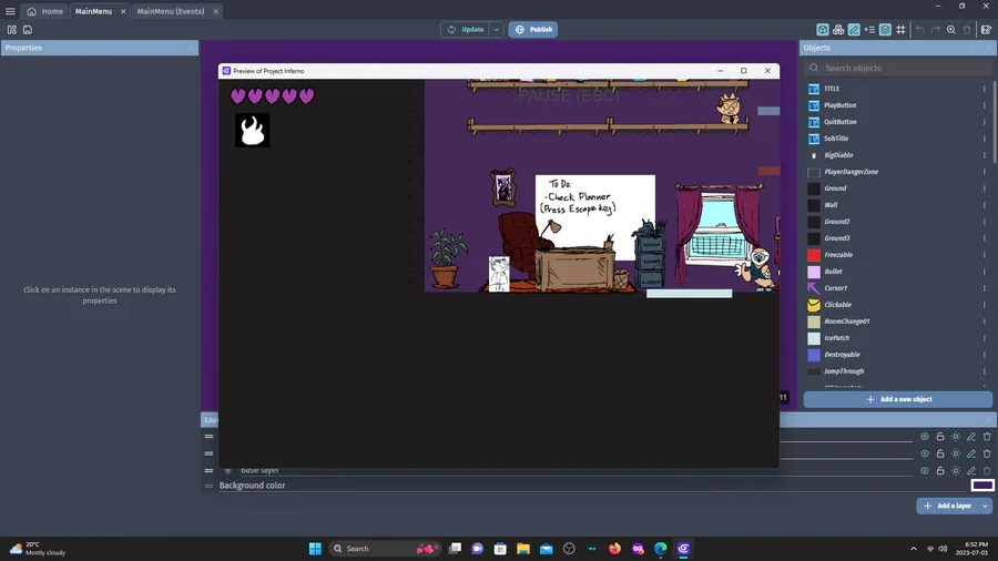
Making a minigame. This is the prototype before I add all the art.

Did a clothing meme. I think I’ll go with the Twill Cadet Cap for Verge. Still deciding the rest of their outfit, but I’m leaning into muted tones, black, and white.