3 years ago

Reimagination of Digital Art Community, requested by @LUKELCS .

Explanation in the Article.


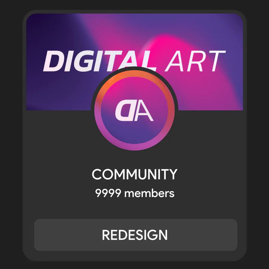
I simplified the header and thumbnail to get rid of the clutter that was present, I understand that you want to show of whose community is this but that information is present on the right panel so I just got rid of that and added a nice gradient, and changed the font from Avengers font to Kanit font.

Again it's only my simple opinion, I'm not saying theirs is worse.

If you want me to visit other communities just comment them down below or if you have ideas about what should i change in my design.


3 comments

Loading...

Next up

And this... this is the coolest main menu :D

THE DOOR

Is... fixed... more or less... :P I was busy with irl stuff... but... i didn't forget about the door... but i really really didn't want to work on it... The Door scares me...

Sticker for my dead server.

Hows the Update going...

I maked a POPGOES poster

software : SAI

@Kane

#digitalart #fanart #fnaf

Making pixelated Textures is somehow harder than the realistic ones :P

Door but not the same one... i hate the other door... the white door... i'm racist towards the white door...

Time to post my arts here that is recent

Some random stuff i added and changed in the ("VideoGame" Pattent Pending).