
Not too long ago, I created a post in our forums exploring the redesigning of game pages in order to improve usability, reduce visual noise and bring the most important elements into focus. Enhancements have been trickling in since then (somewhat silently), but I’ve put on the finishing touches!
Let’s take a closer look at what changed, and why.
Playing and Following
It goes without saying that if there’s anything Jolters love, it’s these two things: playing games and following them, especially if they’re still in development.
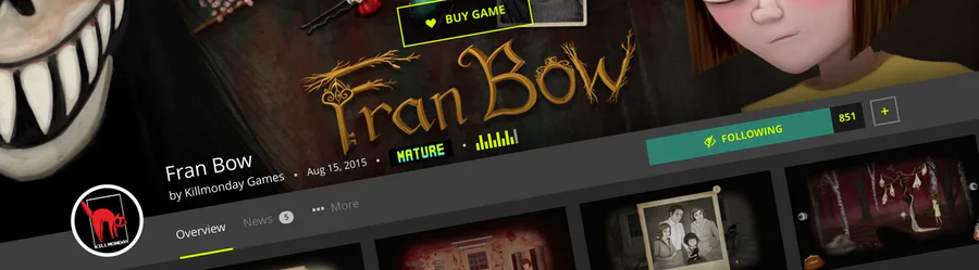
{% pullquote Play quicker and faster with download/play buttons front and center. %}

This first improvement is something I pushed out a while ago, but figured I’d include it here since it was part of the redesign of game pages. To make playing games as quick and practical as possible, buttons have been placed overlapping the game header image. If there is one package to play for your current OS, clicking the button will play/download/install the game immediately. If there are multiple packages to choose from, the page will scroll down to display those available. This alone has ended up improving the rate of how often people download/play a game after visiting a game page by ~17%. That’s pretty huge! Of course, paid games have also received the same treatment; the page will simply scroll down to the Marketplace widget.
{% pullquote A stronger focus on following. %}

Following games has become quite popular, but the button used to be a bit lost in the middle of other information, so it’s been given a special place of its own to the side, naturally making it a better focal point. If you’re viewing the page on a large screen, the entire header navigation bar which houses the follow button will remain at the top of the page as you scroll down, so it’s always there when you need it! Very handy when reading news posts that may pique your interest.
Condensed Header Bar

Information such as the game’s title, creator, content rating, etc. now overlap the bottom of the header image; a gradient was added beneath the information to make sure it’s legible on light backgrounds as well. The developer’s avatar now comfortably sits in the mix to make it even easier to locate and click for more information about the person behind the game, and other games they may have made.
Thanks to both of the above changes, I was able to collapse much of the previously required vertical space to get users into the rest of the page’s content faster. Less scrolling is always a good thing!
And there’s more!

When clicking to another section in the header navigation bar (i.e. Overview, News, Trophies, etc.), the page doesn’t reset/scroll all the way back to the top, and the navigation bar remains within your current view, giving the subpages a more cohesive feel and ensuring quick movement between sections.

Various statistics such as views, plays, followers, ratings, etc. have dropped below the banner bar area, massively tidying up the page in general. This is also where you’ll find the widget to rate the game yourself (which, by the way, is now possible on mobile), and more details about the content rating.

Want to share a game via social media? Sure, copy/pasting a link isn’t too much of a struggle, but I’ve added Twitter and Facebook sharing buttons below the game’s description, so now there’s no excuse!
It’s been said that excess visual clutter and confusion may actually lead to headaches, even migraines… With that in mind, I hope you’re all enjoying the improvements to game pages as much as I am, because finding new cool stuff to play should never be a pain in the cranium!
Till next time, CROS signing out!


24 comments