Hello, folks. For those not in the know, yes, this has been in development since like, before 2.0 even came out. No, I am not sure when 3.0 will come out, though we're shooting for 2026, if the stars align to be indeed shot. And absolutely, you are getting some previews of our efforts today, with the inclusion of at least one casually self-conscious aside for tradition's sake, albeit suppressed moreso than usual because let's be frank - I am also getting tired of doing that. What you just read was the one casually self-conscious aside. Now that we got that out of the way, we can focus on how cool this update is going to be!
3.0 is being centered as a story update, where most content will be only accessible on a 2nd run of the game, and effectively treated as a "Let's try this again" for the game's main ending. Having prepared a full, locked in script ahead of time resulted in a much heavier focus on plot, and an introduction of several focused core themes that take advantage of existing, but underutilized loose threads. This update is likely to feel pretty different from the Ribbit you currently know, and might be kind of a hard pill to swallow for some. But it is true to what I would want to make in every sense, and so I truly hope it finds the people it needs to.
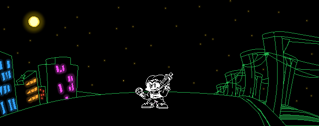
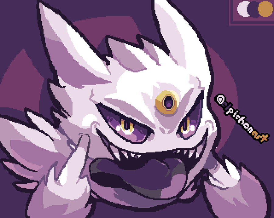
Anyway, that's the briefest primer I can give you, let's move onto what you came here for! While I cannot show you any story content on account of it being too precious, I'm now ready to show you more of Devilredd's Enemy Redesigns (AKA Reddesigns) to tide you over. Every SPAWN-type enemy was given a total makeover! Except Widow, for some reason. We just kinda kept that one exactly as is.
Obligatory disclaimer, I was admittedly a bit apprehensive at first about the need to redesign the SPAWN enemies myself. While I eventually saw the vision and the opportunity to bring out intents and implications that were previously not possible, this isn't a 1.0 YOU the Frog situation, I believe both the old and the new versions of these enemies carry their own equal strengths. As such, there'll be a toggle in the Accessibility options to let you switch back to the old designs, if you so prefer.

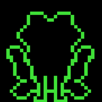
BEWARE AWHOO

Idle

Tamed

Hurt
I recall saying once that the important thing to preserve about these first couple enemies was the kinda blurry, messy shade-job that allowed them to stick out aesthetically from the rest of game's art. The old art is more scrappy in this regard, Redd's efforts are more comparable to a 2D PS1 game with highly detailed spritework. Given my fondness for Playstation 1-2 aesthetics, I lovingly embraced this.

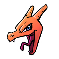
Tamed Concept Art
RATTLERATTLE
Allow me to walk you through a bit of a journey for this one. I can't believe I'm about to say this on both mine and Redd's behalf, but out of every enemy in the game, this one somehow took us the most amount of time to figure out, and underwent multiple iterations before we landed on the final result.
To start with...

Redd creates the shape...

Adds in the classic Karl Pilkington face and the general colors...

It's starting to look really good now...!

And for the coup de grace-...! Wait, this isn't exactly right.

The old one had these 0-2 numbers as well, but they specifically overlapped the body from top to bottom in order to have the enemy form a shape that was more distinct than just a simple snake...

Redd suggests having the numbers circle the snake like this. Still not satisfied, I come to the conclusion - perhaps a bit too late - that the angle the snake's facing at is much more adjacent to the camera, compared to the original design which faces to the side. Due to this perspective shift, it would be much harder to incorporate the numbers like in the original. This design ends up getting scrapped, and with some pain in my heart, I have to ask Redd to start again.
A few days later I realize something else; the problem isn't necessarily that this design ain't faithful enough. The real problem may be that the design is too faithful, while simultaneously missing the one subtle element that results in it just being a better-drawn, but somewhat less interesting version of Rattlerattle. And besides, if we end up keeping the old designs anyway, wouldn't it be more worth our time doing these makeovers if we took higher risks?
So I end up telling Redd to go wild and turn Rattlerattle into a crayon drawing instead.

The initial shape...

The numbers, plus a blur effect...

And an attempt at pronouncing the face more.
At this point, there are still two more problems we need to address. One, the readability of the face is not quite there yet.

Much, much better.
The second problem, as much as I like how these numbers remind me of old spinny GeoCities gifs, I don't quite understand why we can't just overlap these numbers over the whole body like in the old design. Redd offers a solid compromise; On the idle pose, the numbers rest peacefully on Rattle's head. During the hurt pose however, they extend and impale his whole body. I like the sound of that, and so we agree that the idle pose, at this point, is finalized.
Now let's see how the hurt pose goes!

Yeah, okay!
Although, I ask Redd to revise the expression so he doesn't look like Doomguy laughing. Instead, his expression needs to convey genuine offense towards your violence, like he's saying "Fuck you!", or "What the FUCK", or just anything that indicates a road rage.

Good shit. Hey, we didn't need to redesign the whole sprite this time!
A little fun fact for you, Deltarune Chapter 1's base battle code is only capable of displaying a single frame of animation when enemies are defeated. Certain enemies have multiple frames of animation when damaged, but given that Rattlerattle dies instantly, they can only utilize one frame. So when Redd sent me this, I had to readjust the code slightly to allow the functionality for multiple frames. In turn, I have also brought back a 2nd unused frame for Rattlerattle's hurt pose that was drawn back in like, 2019, and gone completely unused... until this update!

Oh, and here's the NICE pose too.

In all its glory.
The lesson to take away from all this, is to anthropomorphize all your snakes to look really hot, so that way they're not as much of a pain to draw. Thank you.
INFIFUN
Redd keeps calling her "Infinifun", and I think that's InfiniFUCKED...

Idle
Important detail to preserve here was the very simple two-frame walk animation on Infifun's idle. Just thought it was cute to make it more EarthBound-shaped.

Tamed

Hurt
At this point, we are starting to form a cohesive idea behind each SPAWN being stylistically different from each other. Effectively, their level of detail represents the level of power. So, Rattlerattle's a childish crayon drawing based on being the weakest SPAWN, Awhoo is a level above by utilizing a more detailed, but monochromatic design, and Infifun is even further up, partially phasing out of reality and retaining some monochromacy, but with added color onto their hair and dress. By the time you end up in the Lodge, much like with the original designs, the level of detail ends up straying so far from the initial enemies, it creates a growing sense of evolution, as I feel is appropriate for Ribbit's tone, and the lore of these enemies.
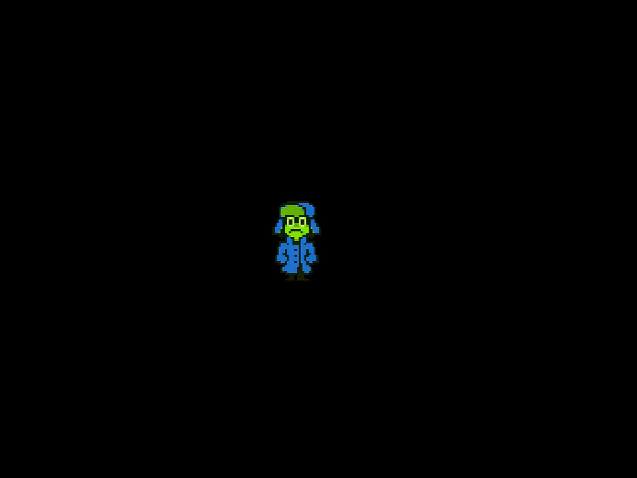
WORRYSOME

Idle
We added some old film reel effects on top of Worrysome's design, plus some foreshadowing. If you're worried about this being too on-the-nose, I wouldn't - we're basing our entire game on something so insanely obscure and terrible, I can't imagine many people guessing it even if we waved it right under their noise. And I sure do love waving things right under your nose, don't I?

Tamed
Accidentally created a 90's Shin Megami Tensei enemy. Or maybe like, some fucked up amalgamation of Clock Tower visuals. Just like, anything within that weird obscure SNES ballpark.

Hurt
Redd achieved the fire effect on this one by layering footage of a film screen burning up.
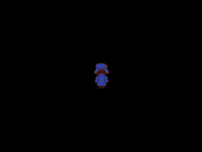
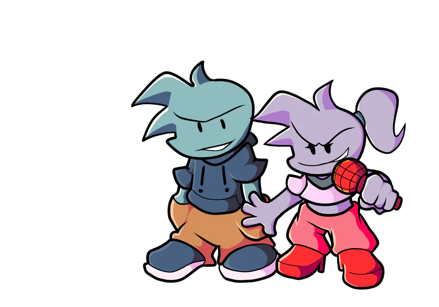
JOHN DOE
This'll be our last enemy shown for today. I skipped over Chu-Chu Force, Bad End & the final boss for a reason - as amazing as the redesigns look in the way they up the ante over the prior ones, I think the full impact will be felt best once you play the update and see them for yourselves. And, y'know, Widow is still literally the exact same design. It's a mystery!

Idle
Technically speaking, I've already shown this on the Anniversary Post, but, you know how it do be...
... The idle is all they have, by the way. That being said, there's a couple other overworld sprites we had to bring up to parity too, in particular the wedding priest.

The way they leave their position, getting closer to the dress in order to punch it, that was actually a positioning bug at first... but, it does make it feel more visceral, doesn't it?
Well, I suppose I could close things off right here, but I have one more surprise for all you art enjoyers. Aside from the enemies getting redesigned, the entire Legend scene is getting new art too!
Unlike the redesigns however, this is not yet complete, in fact, it's in its very early stages as we interchange between focusing on this and assets for the new story content. For the time being, all I've got to show is Redd's cool looking concept art. The following art is intended to be heavily iterated on still, and will likely take a pretty different form by the time it gets sprited into the game, so consider this as what it is - an initial concept, not the final execution.

The First Shot
Going right back to my point of iteration, some of the things I've requested since receiving this art include removing the DELTA RUNE symbols (they're not relevant to this story). We are also planning to make the final end result have a sepia filter, and overall use a much, much darker color palette and lighting. I had a specific explanation for the kind of style we wanna go for, which I explained to Redd in a group chat one day.


Redd summarized it more succintly; focus on outlines, not the color.

The Barrier Between Conscious & Unconscious
This one I've received around the same time as the first image. I've noted we were missing the speech bubbles, so those got added in soon after. Kris harpy!!!


The GIFTed
At this point, we've switched over to the "christmas tree in the dark" style. This is overall close to the original art (which Redd also previously drew), though facing at more of an angle.
We had a discussion about Susie's eyes being a spiral, rather than filled ovals. I have concerns that people will interpret it as a sign of hypnosis, thus making what happens later too obvious. Redd had a different idea in mind. Spirals can also be interpreted as a symbol of death, associated with natural disasters such as whirlpools, or cyclones. Or, perhaps even the shape of a fingerprint. While I very much enjoy these interpretations, I still have doubts that the average player isn't going to jump to hypnosis immediately, so I'm not sure if this will end up staying.

Unconscious Sea (Version 1)
This one, on the other hand, as nice of a piece of art as it is on its own, me and Redd both agreed to scrap it completely. A couple reasons; the angle is completely flipped so the ocean's at the bottom, the field is at the top, and the dutch angle is removed, greatly straying away from the faithfulness of the original shot. In addition, it makes the angle too similar to the flower field shot that comes up right after, with the moon on the top. Lastly, I've found this shot more interesting when the moon could only be seen in the sea's reflection. So, Redd ended up creating another piece of concept art that stuck closer to the original.

Unconscious Sea (Version 2)
Much closer to what I prefer, but we do still have a few things to change. It's likely I'll have Redd redraw the angle one more time to be less top-down (redd if this is how you're finding out about this, sorry), so that you can see the sea stretch out far into the distance. That way, we can create a larger sense of scope. We'll also fill out the sea with many more spirits (like in a rain pattern), and move the moon away from the corner, and closer to the center.
That'll do it, for real! I hope having more images and gifs to look at this time made this article more digestible to read, and that it perhaps gave you some insight into how we work, and what we're going for.
Remaking shit always has its troubles. There's like more than a couple Resident Evil remakes at this point, plus the Silent Hill 2 remake on top of that, and as much as I enjoy them, there's always the point where I get a little sad and wonder "Why didn't they do it this way?" or "Why did they omit that detail?" or I start yelling "Why did she say 'I'll give you S.T.A.R.S' at that stupidly unfitting moment and not at the final boss it would'vE BEEN SO COOL" You know, generic examples like that.
So, I have some personal relation to the concern that I might make somebody feel this exact same way about my work. I mean, fuck dude, I've already seen two, three dudes be like "Ribbit had so much more soul when the main character was Kris with blue weed eyes", so we might as well be one step away from Crowbcat making a video. The way I see it, I don't think there's a world out there where I can please everybody with my choices. But, as the director of Ribbit, now and forever, I promise that the value of a project's soul does not need to abide by one static unflinching rule. As does life, as do people, as should you, Ribbit evolves, and this is what makes me happiest.
So that's like, what, three self-conscious remarks in one post...? Gotta hand it to me though, that was some SERIOUS restraint! And now it's four.


34 comments