Hi there, it’s me, Samuel, again!
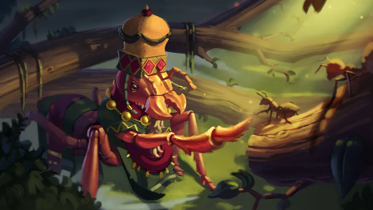
This time I bring to you our first splash art illustration of our first deity: Nyonye-Ngana, internally called the “Ant God”.
It comes with a little tutorial where I will take you through the process of making a long art piece from start to finish.
So, without further ado, let’s get going!

Thumbnailing and Initial Drawing
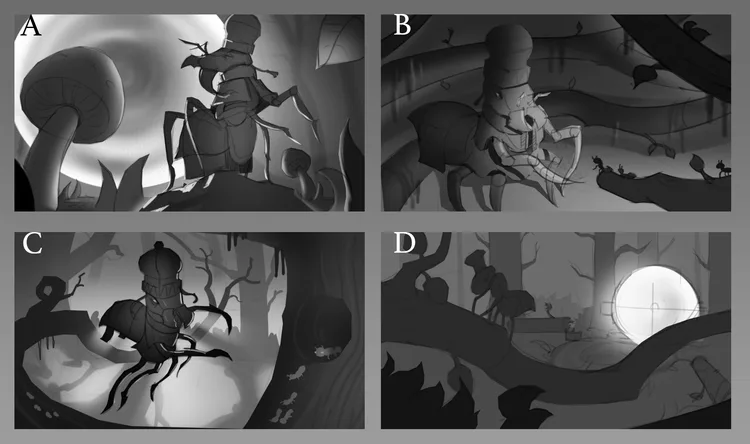
I believe that doing the thumbnails is one of the most important phases of the illustration process, even though it is one of the fastest.
Here the focus is to try different ideas and to explore which directions we can take with the image.
Each thumbnail shouldn’t take more than 1-2 hours to get done, this way you are forced to focus on the composition as a whole and to only work with big shapes and simple values.
Some people like to spend a bit more time on each thumbnail and some people like to do them really quick and rough, what matters is that you convey your ideas in a simple way and have as many options and iterations as possible in the shortest amount of time.
In my case, I like to use the thumbnailing stage to solve and think about the following aspects of my image: general composition, basic drawing, lighting/mood, and values composition.
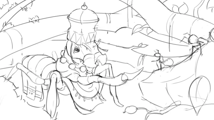
After I finish all my sketches I show them to the team and we choose which one is the best option. Then I proceed to work on a final line drawing of the chosen image.
When I’m done and everyone one is happy with the work, I can finally start painting!
Color and Light Testing (The Best Part!)

For me, doing the color and lighting tests is one of the most fun parts of the illustration process!
Since the drawing and composition is already decided, I just need to care about color and light, my favorite subject!
Making this kind of test before moving on with painting the final image is a great way to explore different moods and visualize what the final image will look like.
It works as a map, that will keep you in the right direction during the whole process.
As I knew I was going to keep working on my image after the color test, I made some simple mask selections of each main object before I started painting, to make things easier in the future.
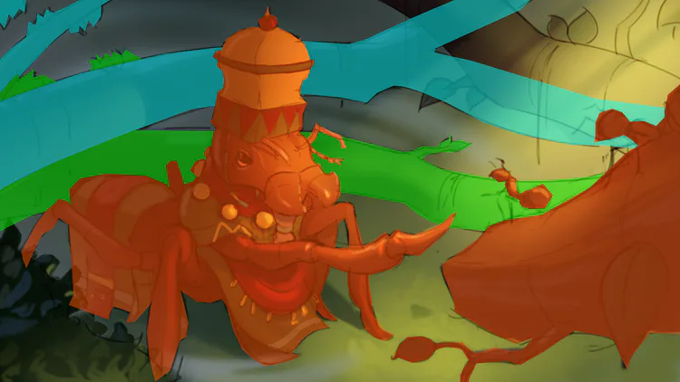
To speed up the process I like to use many different Layer Blending Modes and Layer Masks to create a sense of lighting and mood.
I mostly use Color Dodge and Overlay mode for the lights and Darken, Multiply and Overlay mode for shadows.
But be careful, some Blending Modes can ruin your painting pretty quickly if you overuse them.
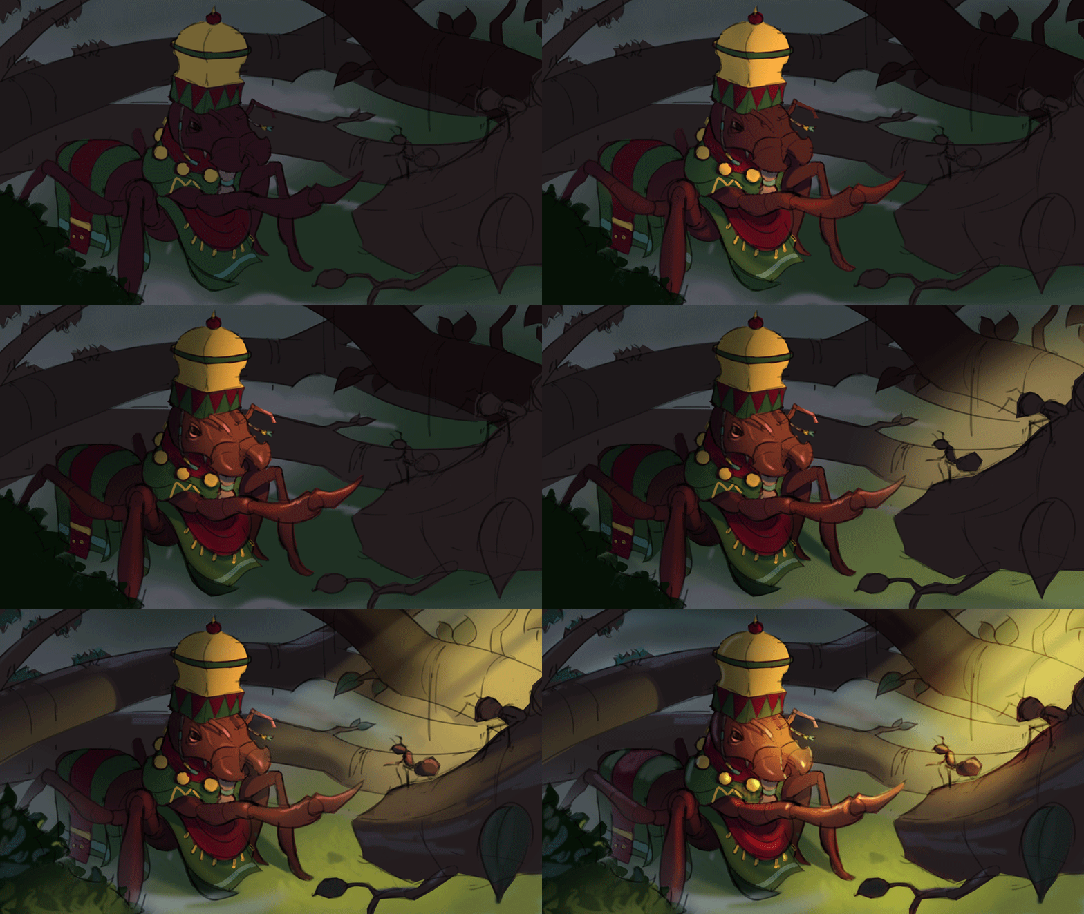
Rendering
Part 1
Rendering is the longest phase of the process, and it is easy to get lost here if you don’t know what you are doing.
Remember to take it a step at a time and to always stop and think about what you are doing and what needs to be done next.
I’ve heard once that painting is like juggling, you have to work with many balls at once, but still, you can’t do them all at the exact same time.
It is really important that you study all the fundamentals of drawing and painting, they are the base of knowledge upon which you will build.
If you learn them well, things will be much easier for you, especially when painting from imagination.
At first, I try to focus on the basic aspects of my painting, like giving form to my objects with light and shadows, roughly defining materials, keeping the light consistent and keeping the original composition.
I try to avoid detailing, adding effects and things like that until the final stages of the painting.
Part 2
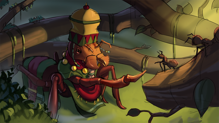
So far the image is looking okay, I had a good start there, but now I feel like there is too much going on with the composition and with the value structure.
If you squint your eyes at the image above you will notice that no specific area on the illustration stands out, they all look like they have almost the same value range: the leaves on the bottom left corner, the branches with the vines hanging and the Ant God have the same darkest darks and the same lightest lights.
Take a look at this GIF showing before and after I’d fixed the composition: I’ve added blur to the image to emulate the squinting and turned the image into grayscale, so you can focus on the values alone.
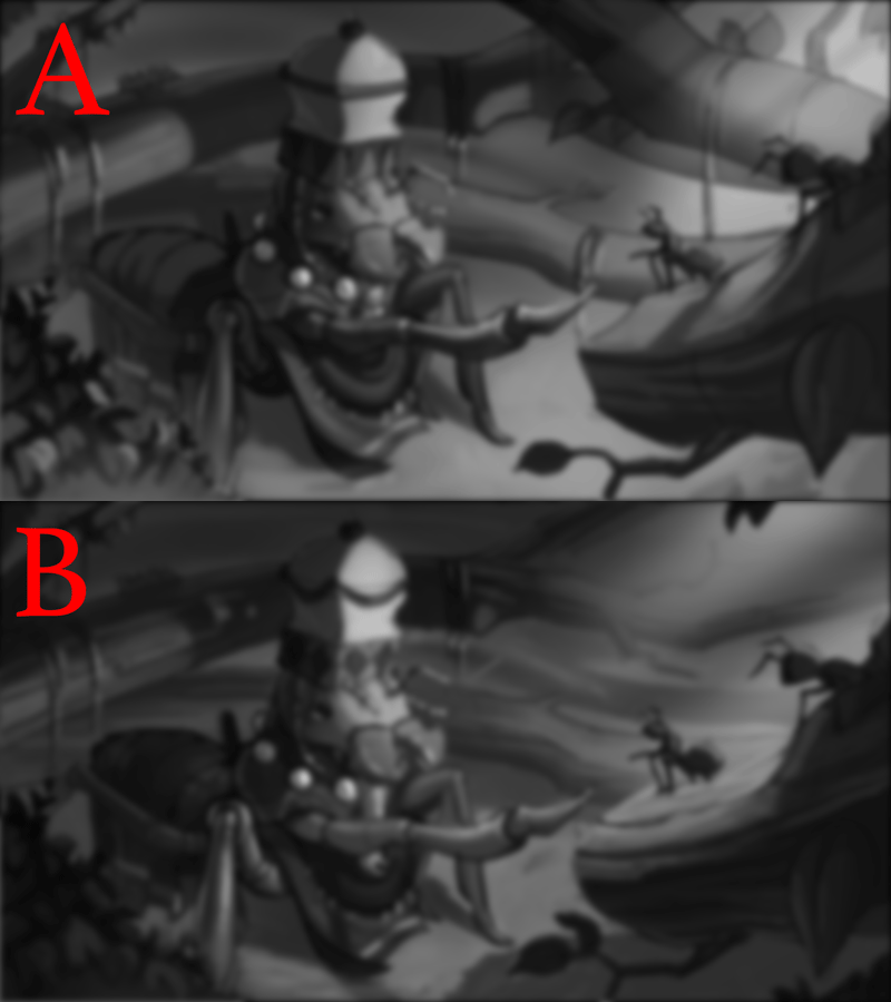
You can see how I’ve hidden the parts that are not that important and increased the contrast on the Focal Point of the image, it is vital that you show the viewer where to look at.
In some cases, you don’t want to make the difference between the light and dark that obvious, and that’s ok, you can use many different techniques and tricks to guide the viewer’s eyes, the important thing is to have a clear composition.
(By the way, Framed Ink by Marcos Mateu-Mestre is a great book on the subject, you should definitely check it out.)
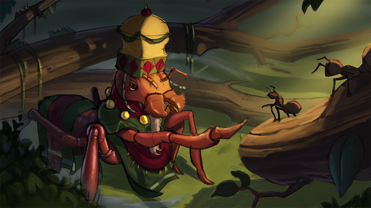
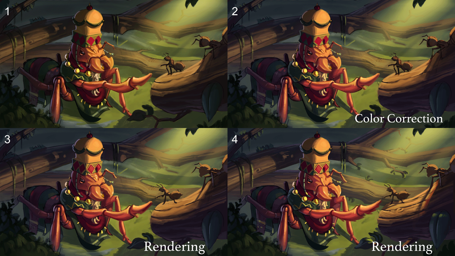
Besides refining my composition, I have also worked on rendering a bit more of each object in my scene, as you can see in the image below.
Part 3
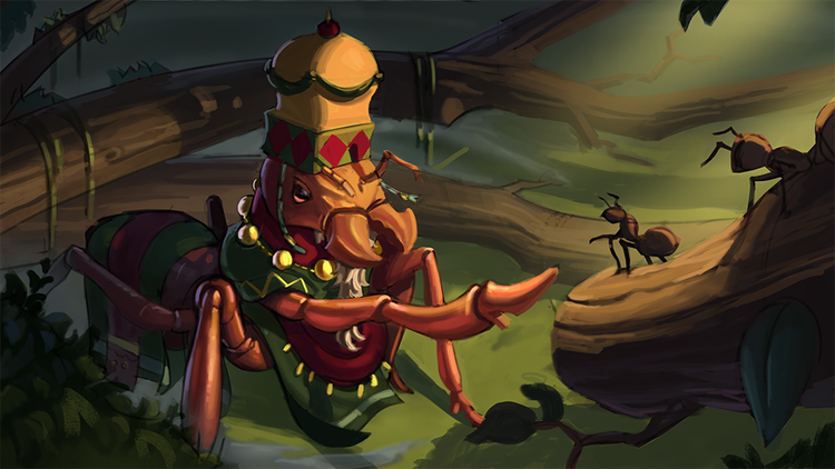
This time I didn’t do anything but fixing the big branch shape with the liquify tool and render more of the Ant God. It is the focal point of my image and my story, so it needs to have more details and interest than the rest of the image.
But I am not satisfied yet with the way the Ant’s face is looking, it looks too harsh and over-detailed to me, you will see later how much I soften it up in the final version.
I also started adding a bit of subsurface scattering effect to the ant’s arm, to show the light passing through the insect’s “skin”.
Part 4
It is time for a bit of COLOR CORRECTION! YAY!
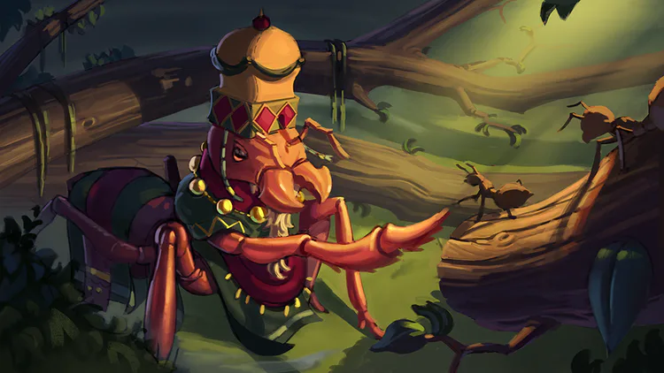
So, I felt that the color of the image needed to be balanced, especially the contrast between warm and cool tones.
As my light is coming from the sun, I want it to be warm and the shadows to be cool.
If you think about it, on a sunny day, the shadows are not completely dark, they receive light from the sky, which usually makes them cool, sometimes even blueish.
Always try to keep in mind what is the temperature of your light and your shadow tones, it helps in maintaining a good balance and consistency in your colors.
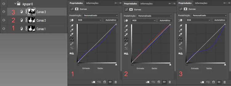
The way I usually balance my colors is with Curves Adjustment Layers, they are good because I can mask each area of my image and have complete control of what I want to do with each part.
You can see below how I’ve done that. I have a stack of several Adjustment layers, and I increase the blue in my shadows and decrease the blue in my light, which adds yellow to my light tones.
In Layer number 2 I even add a bit of red to my light tones, to make it a bit warmer than just removing blue.
It might look a bit complicated at first, but using curves is pretty easy. If you have any trouble understanding how it works, just look it up on your favorite search engine and you’ll find a bunch of good short tutorials on how to use it.
And the final result of the color correction:
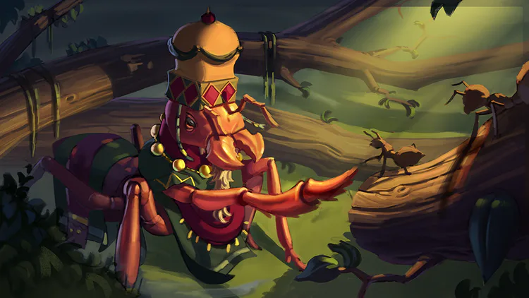
Part 5
What I’ve done now is a bit of correction of the light in some parts, and attempted to fix the face so it looks more pleasant and natural.
Not much to be said about this part :P
Part 6
And now comes the final part! Where I add all kinds of cool effects and finishing touches. To make the light effects, I use Color Dodge and Overlay Layer Blending Mode, and for the blurred background I use the Blur Tool (ohh really?!).
Besides that, I just did some more rendering and detailing, especially on the focal point area, where I want the viewer to be looking and where my story is taking place. You don’t want to add too much detail or contrast in the background or foreground unless you have a purpose for doing so and want to call the viewer’s attention to that specific area. Even inside my focal point, I have smaller areas that are even more important, in this case, the ant’s face and reaching hand.
Conclusions
After a long time, the image is finally done. I’ve got to say, it was not an easy one, but I’ve learned a lot by doing it and it was lots of fun! Having patience, seeking new knowledge constantly and being open to correct your mistakes is the key to improving and producing good images. Don’t give up, maybe tomorrow you will be able to do things you couldn’t do today. Study all the time, keep painting and don’t forget to eat your veggies!
So, that’s it, I hope you enjoyed this little journey, it was very fun to do and I hope I’ve helped you in some way.
Thank you very much for your time and attention!
And, as always, you can get in touch with us and stay up-to-date on:
Discord: https://discord.me/talesofkulplex
Facebook: https://www.facebook.com/talesofkulplex/
Twitter: https://twitter.com/talesofkulplex
If you have any comments, suggestions or questions, please feel free to comment and ask.
See ya!
Eujota

0 comments