
WE HAVE A SPRITER! RIVESTRA SHALL BE CONTINUED! Demo should take a few months
Next up
i do not think this will turn out to well.
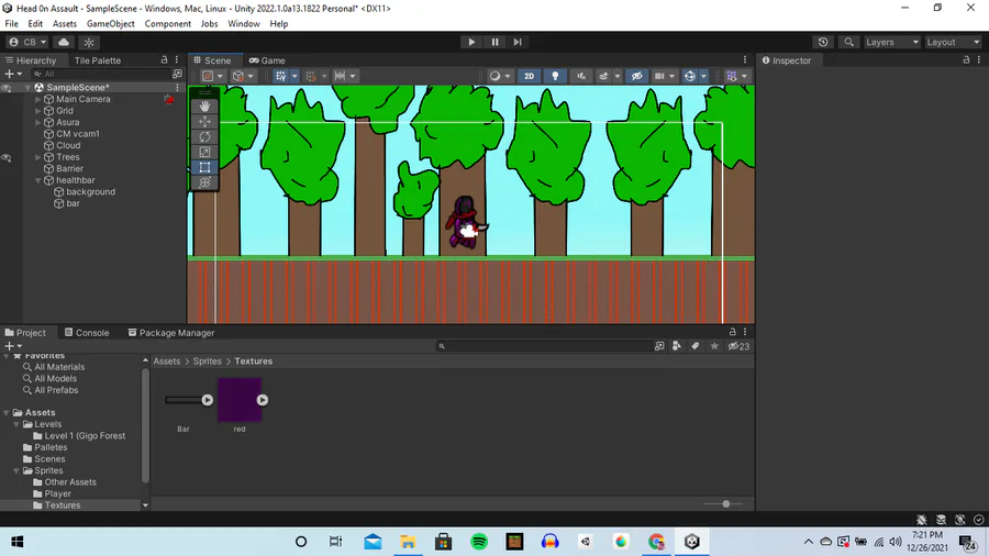
Unity
DONE!
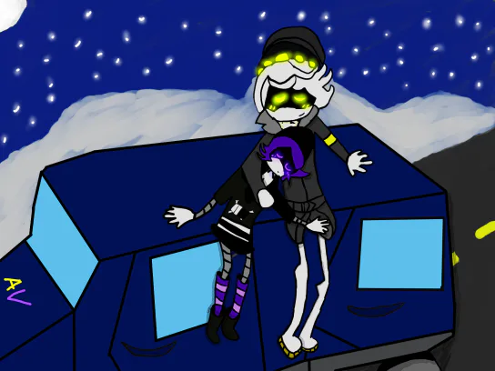
I AM FINALLY DONE!
GOD THIS TOOK WAY TOO LONG!
No idea why i'm even sharing work in progress stuff tbh.
I can't see people seeing this as just wholesome either if i'm bein' honest.
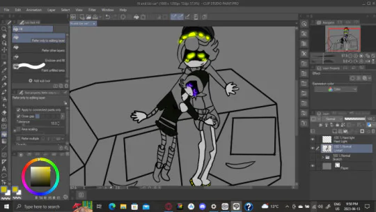
Warning:
This horrendous w.i.p sketch may cause epilepsy due to terrible color management...
Yeah I don't know i'm trying to make a wholesome sketch but every damn time I show the full image people find ways to take it outta' context.
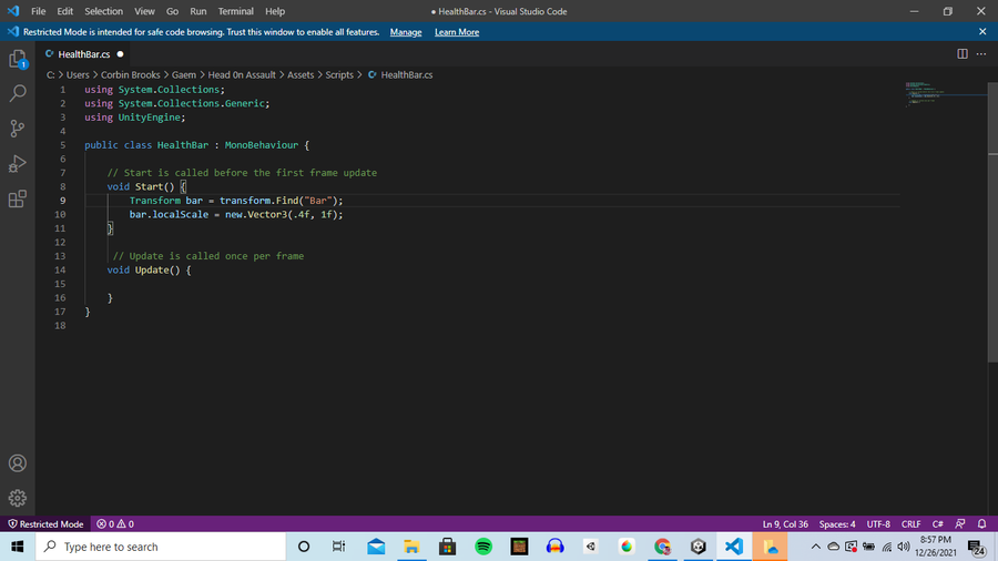
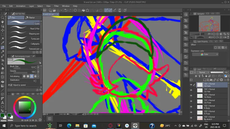
I can't find the diferences. can anyone else see them? (Note the colors mean nothing, and as most of you may already know the words behind "//" are comments)
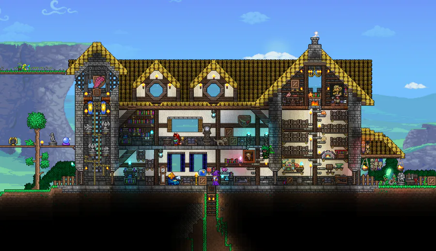

Another house i made long time ago.
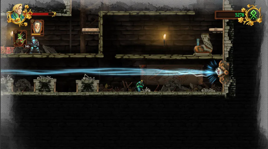
Protege el conocimiento, salva la historia. Guardian of Lore es un platformer 2D en el que debes luchar para mantener viva la memoria de la mitología latinoamericana. El juego llegará a Steam el 18 de mayo: https://steam.pm/app/1211740 #ScreenshotSaturday
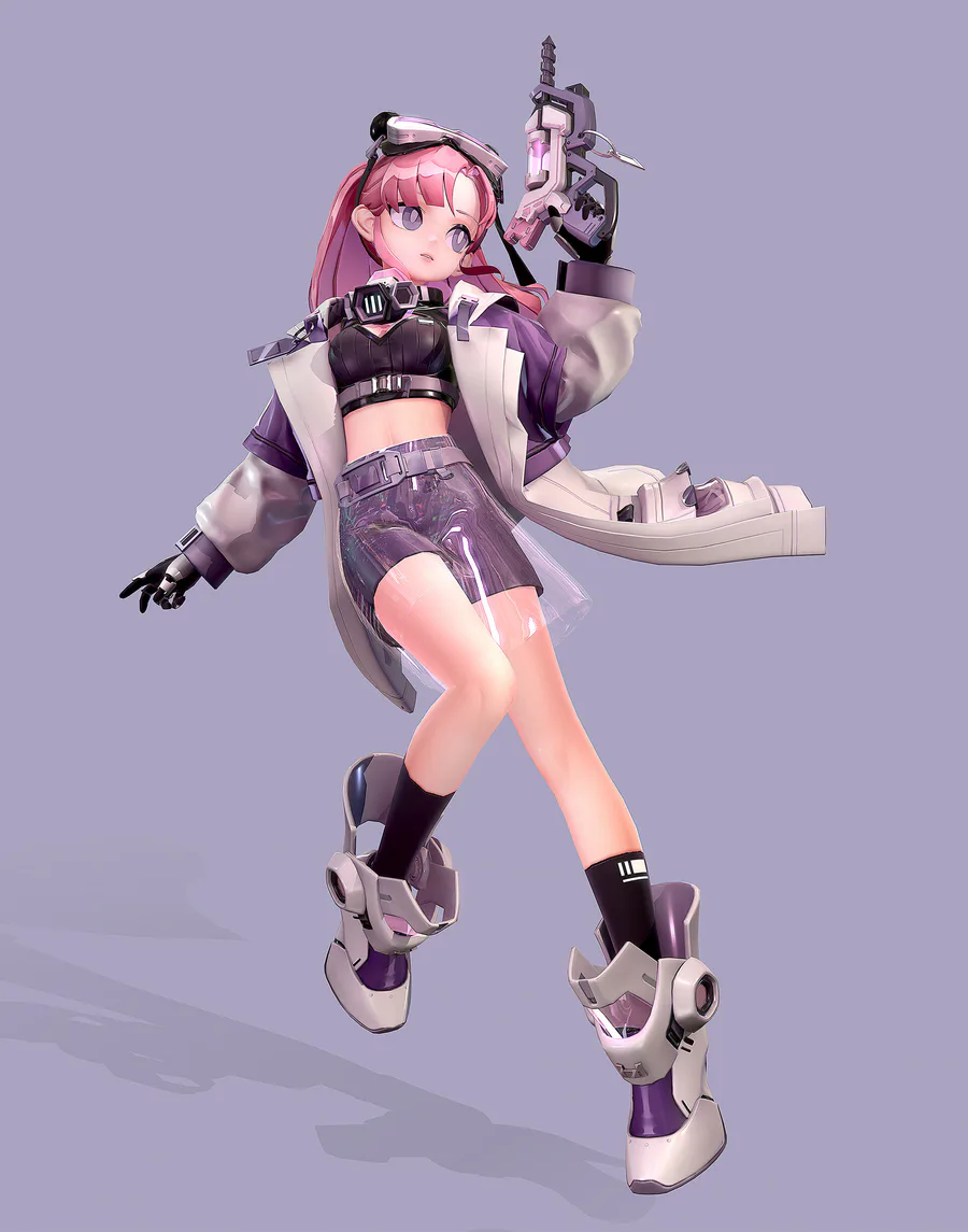
Check out this NPBR cyberpunk character model by Glyong E!
https://www.artstation.com/artwork/8edJRE
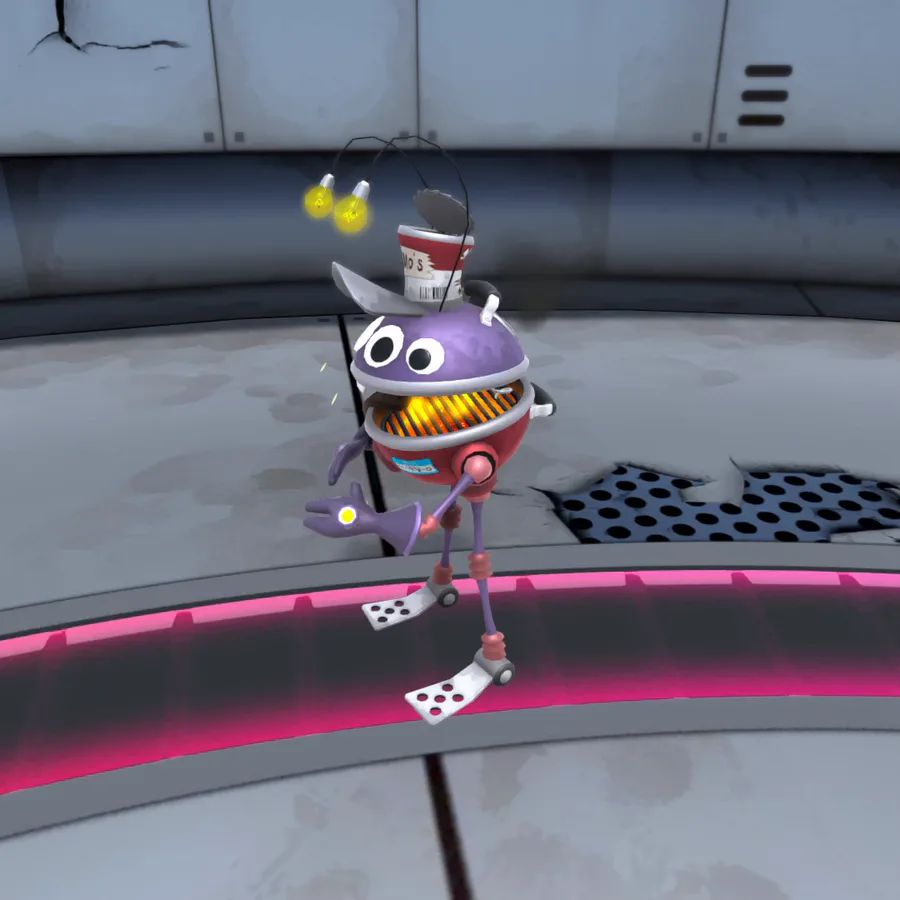

Showing off player 2 😎
What do you think?
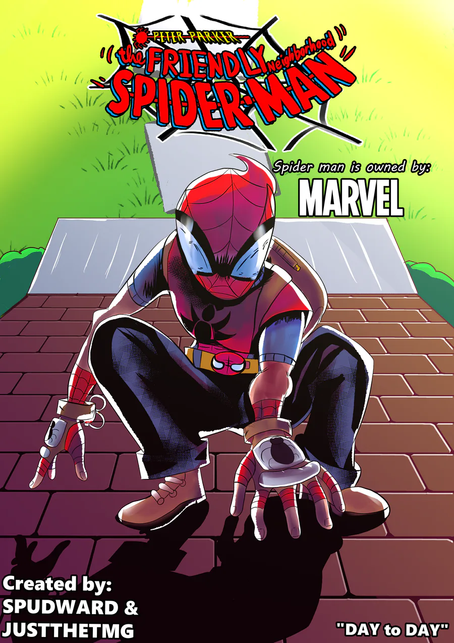

"Day to Day" (also check spud out here he's a great guy and writer: https://soundcloud.com/spudward)
0 comments