Comments (6)
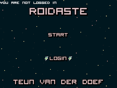
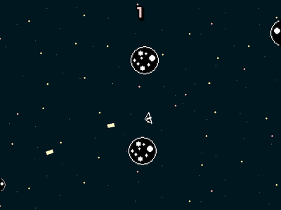
This new update is much improved. I cannot express how amazing the menus look now, especially without that out-of-place GameMaker Studio login box! And I love how you added the GameJolt thunder strikes next to the login button. That's the type of attention to detail that I wish more developers had. As for the movement, it feels better now, although I was kinda hoping it would be more "slidy" like in other space shooter games where the engine "propels" you and you keep going but slowing down over time. When I let go of the W key, the ship just stops. That's not what I would expect to happen in space, but maybe it was a gameplay choice made by you? Either way, I think it would be cool if it was propelled and didn't just stop, especially since now you added off-screen movement where you teleport to the other side of the screen. This would make for an excellent gameplay system. Also, sometimes the asteroids are too hard to avoid because they come out of nowhere. And again, because I simply stop and I accelerate so slowly, I find it hard to get a high score. Still though, those things aside, just the uniformity of the menus and the effort that I can see you put into making this game look as good as possible earned you an updated score of... 5/5. Great job, you earned it through hard work and perseverence :)
I mean that everything in the game looks and feels like it belongs there. The font throughout the menus are all the same, and it doesn't feel like the game is slapped together from many different art styles, which is something most developers don't understand.
Alright, time for an in depth review. I've had some times with this game, and I can say a few things about it even before I started playing it. First, you have the GameMaker studio icon as the game's icon. This is never good for the user, because it says that your game is just like everybody else's made with that software. Second, the username input at the beginning took me out of the experience as well, especially since it said GameMaker studio on it.Now the menus. I was actually quite impressed with the font you used and the uniform menus. Everything in the game, from the color scheme to the sprite-work, all felt like they belonged there, especially the attention to uniformity on the menus. However, I can tell the font was a bit stretched. I recommend that when you're stretching small pixel fonts that you do so at 100% intervals and set the quality to "excellent." This way the newly-resized image won't look blurry and stretched. Almost all of the text from the menus in my games are stretched, and I use this technique to solve the blur issue. Finally, the gameplay. The controls were alright. Having to press W to move forwards and then turning with the A and D keys wouldn't be so bad if there was a more "floaty" feel to the controls. It just feels like I'm pushing a heavy brick, not flying a space ship as I'd expect from a space game. Perhaps try doing the speed += command instead and adding some friction and a speed limit stop? This way the movement will be a lot smoother, and your gameplay will thank you for it. Aside from all those issues though, the game was entertaining, and I could totally see people playing this for fun. If it had a bit more polish then it would truly be one of those few internet masterpieces, especially if it had the "icy" space physics. Bravro on your efforts. 4/5 from me.
Free
Roidaste
Shoot the asteroids and get a highscore!!
Rotate your spaceship with A and D, accelerate with W and move backwards with S.
Shoot with the space bar.
Mild Cartoon Violence
Mild Fantasy Violence
