Comments (4)
Three levels? My recent project has graphics that are so much better than this shit and comparing how much better my game is than yours is like as far apart as the east is from the west. And I thought my game had hardly any levels, it only has 9. You only has a third of the levels mine has. Your levels are very short. Mine takes at least four times as long to complete.
You really suck balls when it comes to game development, you should consider a different hobby. I'd also like to point out my game has had two ratings and an average rating of 4/5 on a different site, your game has about 3/5 which three and below is a solid indication that your game to most viewers shouldn't waste their time with your shit I mean cough "game". :P
My game is alsao commercial - yours is freeware. There's reasons for these things. I have nothing else to say I've made my point abundantly clear, you know you such horse balls yah damn animal raping, learning disabled retard. :)
So you know, the rating was my honest option on your game. Usually when I think a game sucks this bad, instead of giving it 1/5 I ignore it and don't rate for the sake of being nice. But I have no sympathy for you, thus why I rated. If I actually thought your game deserves more than 1/5 I wouldn't bother rating because you don't deserve any attention.
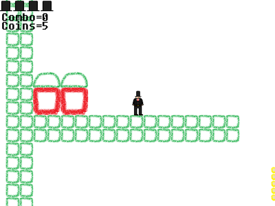
The graphics look amazing - it's just like real life, but even better because it it's very creativer and different, so visually stunning. Here's my little suggestion, the graphical elements are very primitive much like yourself. Instead of having a bunch of green squares with rounded edges you could have much more variety and detail, you could make the top of a platform have grass flowers and trees, the ground underneath could have a dirt-like texture. But a bunch of solid color, hollow squares and solid white background? Really? No sky, no distant sea or landscape? And the character is a stick person.I didn't know this was possible at first, but you animated something so very simple and basic (a stick person) and did it horribly. The title - "working title"? Wtf you have no creativity in your graphics even the title is stupid and makes no sense.
So, how can we stop this over-emotional animal known as "Polan2"?
har har har
Actually quite challenging...in a good way.
I was really quite impressed to be honest, I didn't know what to expect going into it but I really enjoyed myself. Your levels art style is very cool and simplistic, not quite sure on the blend of pixel art and hand drawn yet however... but we'll see. I Love the momentum mechanic when on jump pads and enemies you've implemented, much more fun than jumping the same height each time. Level design is nice as well. Overall really fun and impressive for a quick game... I look forward to seeing more,
Grape.
P.S. What are you using to make your game (program-wise...need a few pointers)
Working title
The game is a platformer which will have an emphasize on having multiple characters and multiple worlds. Later in development i will add a hubworld for every world close to the painting jumping in Mario64.
There's 3 levels to play in right now all from the crayon world.
#platformer


