Spacey3D and Brainoid did a fantastic job at bringing the visuals for Cattenburg together in Ludum Dare 47. We were absolutely ecstatic to earn 3rd place in the Graphics category! However, we knew there were a ton of improvements we were looking to make to help players follow the action of the game more closely.
Over the past few weeks, Brainoid has been working on the new animations in and around characters performing actions. We had some goals in mind when starting out with these changes. We wanted to:
bring a bigger focus on our wonderfully illustrated characters and cards;
follow the action during the card game more easily;
avoid creating additional work for our illustrator whilst introducing animation and polish;
make the combat feel more satisfying when engaging the enemy;
Let's take a look at some examples. There are two before and after gifs attached to the post which help illustrate the following.
Warrior Special
When you play the Warrior on the special card, it will perform its special ability: cleave. This will deal 50% of the Warrior's Power to all enemies.
Previously when you played the card, the enemy cards that would receive damage would pulse briefly and float combat text would float up to indicate a change in the enemies health. If you were already familiar with the game, it was easy enough to follow - but if you were new to the game, it was far too easy to miss what was going on.
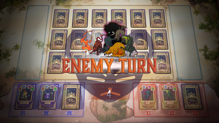
In an attempt to prevent the player from being able to miss where the action is taking place, we decided we wanted to bring all cards that are involved in an action to the centre of the screen. We darken the background, centre the cards and increase their size significantly in order to draw players attention to the action.
Now to make it feel like an attack. We took some inspiration here from Darkest Dungeon and their approach to adding a sense of movement without the need for detailed animation. They pan their characters across the screen when dealing damage or taking damage, in order to convey the momentum of combat.
Considering we are fighting cards against one another, implementing this technique really helped give a bit of life to our interactions. Because Cattenburg intends to focus on RPG themes that people are already familiar with, we wanted to bring the characters to life a little more. As a result, we constructed the cards such that we can animate the character image separately from the card itself. This means when a character attacks, they will pan forward as they attack. When a character receives damage, they will pan backwards. Although quite a simple approach to animation, we are really happy with the result.
Receiving Damage
The second pair of before and after gifs show the Warrior taking damage from a dastardly rat! In the original Ludum Dare version of the game, we would just pulse the card of the character taking damage and show some floating combat text. Like with the Warrior special, we've updated the animation in a similar way - placing all the things we want the player to notice to be smack bang in the middle of the screen.
Along with the characters panning, we also change the character image when dealing or receiving damage. This hasn't been implemented for the enemies yet, but you will see it on the Warrior. We are really pleased with how effective using just three different frames of animation for our warrior has turned out. The upscaling of the card size, the character panning and the screen shake certainly add to the feel too.
The scrolling combat text on the card communicates key information about an attack to the player. You can see the world "CRIT!" floating up from the character when they receive a critical strike. Whilst we used scrolling combat text in our Ludum Dare version of the game, the position and size of the cards meant it was difficult for the player to digest the text.
What next?
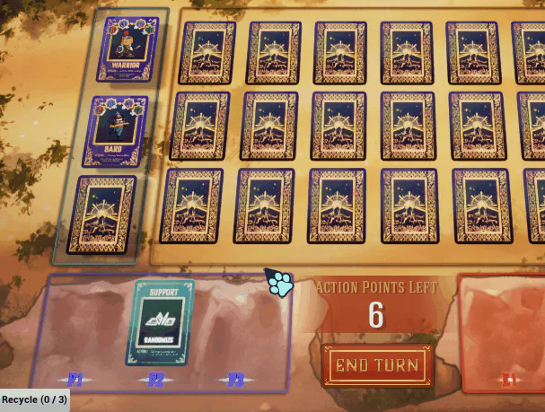
Whilst we are really happy with the improvements, we are not investing too much more time into the game's visuals whilst the final design of the game is still not nailed down. You can see that we have moved the characters to be on the side of the board instead of the bottom of the board. This is just an idea we wanted to trial, and one of many ideas that we have bouncing around that hasn't been settled on. These are the sort of ideas we'd love to get in the hands of our discord community members in private builds to get feedback on.
For us, we feel we need to finalise our game design before we move forward with more illustrations, animations and polish. We would hate to spend time creating new art assets and animations, only to have to re-do them again when we iterate on our design. However, the benefit of at least investing time into polish early on in a project is that it can help get people interested and excited about the game.

0 comments