Hello. This is a blog post. A blog post about the basic character design rules for Friendship Club, and why the characters look the way they do.
Because Friendship Club was originally concieved at a 24 hour game jam, the time restrictions forced me to come up some super quick character designs. All of the imaginary friends are based off the same design principles.
1. Simple shapes!
The general design of each character is quite basic. They’re all made up of simple shapes. This was partly down to the time limit of the jam, but I was still trying to get a group of characters with really defined, obvious features; that a small boy might actually imagine and draw. It also makes for quite strong character silhouettes, which is always a good thing.

2. Identical bodies and guns
All the characters have identical bodies and guns. Again; this was mostly down to jam time limitations; butfortunately it also seems to make the individual heads stand out more and strengthen their personalities whilst still making them appear ‘equal’.

3. Unique character colours
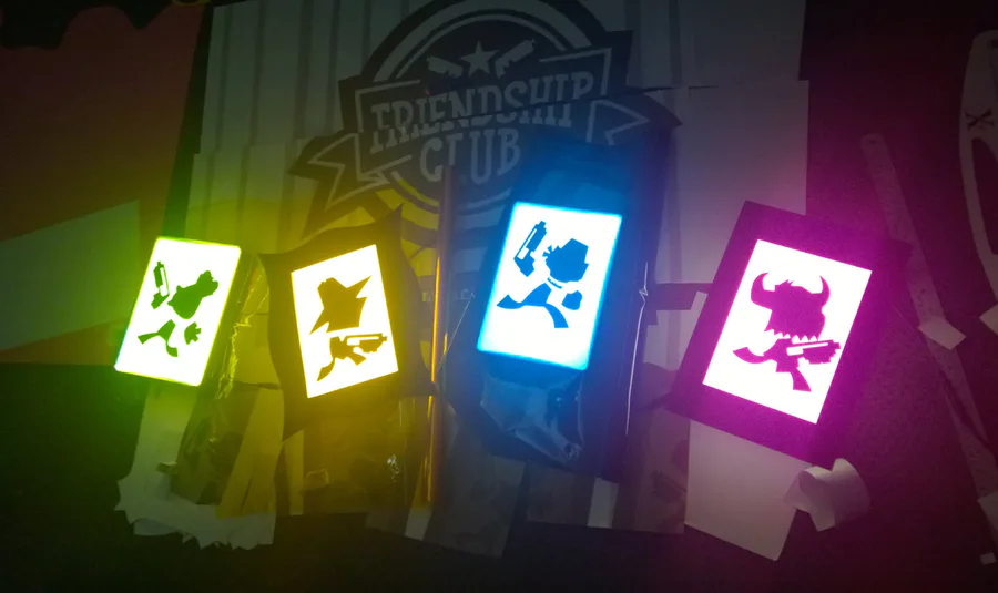
Each character has an individual defining colour to set them apart from each other. The obvious choice, (which is the same for pretty much all local multiplayer games) is to go for the primary colours (plus green) for maximum contrast between players. I wanted to do something a tiny bit different, so it’s a slight variation on these; hot pink, lime green, orangey yellow and aqua. The colours needed to be really bright and saturated to stand out against the dark background.
I also wanted them to be a bit strange, unrealistic and different; because it’s the imagination of a child. Green ducks are totally legit.

The unique character colour (I’m going to call it a UCC ‘cause I talk about it a lot.) is present on the torso (or top!?) of each character, their gun, and on a defining feature of their head. For Chud, it’s the horns and nose; for Shakey Jake it’s the bandana/mask thing. For Old Man Ricketts, it’s the decoration on his hat, and for the Canardinal it’s the whole hat.
The UCC also extends to each character’s bullets. It seems obvious, but it really ties the player to the action; which is really important in a game like this. You want to know exactly who’s shot who (or if you’ve shot yourself!) - it’s part of the fun.
4. Limited palette
This is probably more down to personal preference, but each character’s colour palette is limited to 5 colours (in their neutral expressions.) and are based off their UCC. I guess this is just ‘cause I like heavy stylisation and limited palettes; but it makes each character’s unique colour all the more prominent, which really helps with player identification in game.
Even though a lot of these intial design decisions were made in that initial 24 hour period (and we’ve had plenty of time to change things up!) the characters have stayed mostly the same; they work so well with the gameplay.
It’s a very fast paced game with a lot going on, so keeping things simple - at least graphically speaking - just seems to make sense. We need all the important elements to stand out from the backgrounds and not be confused with each other, and the designs (so far) seem to tick all the boxes.
5. Fan Art / Community Engagement
When people play the game, they seem to develop favourite characters almost instantly, which can only be a good sign. :) (This is partly down to Nick’s audio skills and Tom’s glorious voicebox for bringing them to life!)
An added bonus of having these super simplified character designs - which appeals particularly to me - is the potential for other people to draw your characters! (See the step by step guide below on how to draw a Chud!)
They’re pretty flippin’ easy to draw, and people can add detail and put their own spin on them. I find this pretty exciting and inspirational, especially when I imagine seeing them in a completely different art style to my own.
Here’s Ashley’s take on the gang; pixel style. So cool.

Also, some proof that anyone can draw these characters and have them still be totally recognisable!

I’ll go into some more detail about character design in another post; but hopefully this little slice is interesting to someone out there. We’ve all become quite fond of these stupid characters, and I hope that other people like them too. If you have a spare moment, try doodling a Chud (or any of the others!) and send the result our way on Twitter or Facebook. We’d love to see how you’d draw them!
- Sophie

1 comment