

Ahh, the Five Nights at Friedrich's UI. Or menus. Whatever you wanna call them.
When you think of the Friedrich's UI, what's the first thing you think of. Probably the wiggly, hand-drawn, white text, right?
I love that wiggly aesthetic. You've probably seen it before in other games like Baba is You or The Binding of Isaac. Heck, I've even used it in some of my older games! It's a great way to breathe some life into some otherwise static imagery.

The wiggly look was popularized during the heyday of Flash games and cartoons. In Flash, you could take a drawing and automatically "smooth" it, altering the lineart ever-so-slightly. From there, you could quickly alternate between the original and the smooth linearts, creating the wiggly effect!
Unfortunately, I don't use Flash anymore. And this "smoothing" effect isn't really commonplace in other drawing software, mostly because it wasn't very good at actually smoothing things. How would I achieve this wiggly effect without Flash?
My solution to this problem was not the best. For every piece of UI in Friedrich's, I would write it out by hand not once, but TWICE. Everything. The title screen, the HUD, the extras, EVERYTHING. The credits nearly killed me.

Needless to say, this was not sustainable. Having two images for every UI element was not good for the game's overall size. Making small edits to the UI was also much more tedious than it needed to be. Worst of all, it made my hand hurt like crazy.
SO, I knew for the full version of Friedrich's, I had to think of something else, even if it meant sacrificing the aesthetic of the current UI. And I think I found a pretty good compromise.
I made a font for my own handwriting!

(It's called Ryfont)
I designed this font to look as much like my own handwritten letters as possible. There are even some hardcoded letter combinations (ligatures) for certain letters to make them look more natural!
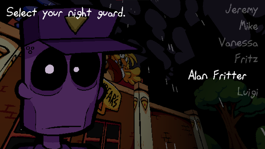
Using this new font, and a wiggle shader, and the Friedrich's title screen now looks like this:

Every piece of text on this screen uses the font. (except the logo) I'm hoping this still captures the vibe of the original title screen, please let me know!
Anyway, sorry this update isn't as flashy, and is a bit more technical, but I was really proud of this! This little detour will make UI development MUCH faster in the future. And thank goodness, because I was not looking forward to writing out all this new Extras menu stuff.

Until next time!


23 comments