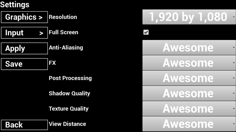
We have a wonderful new UI focused update for this game. After some feedback from our wonderful community we implemented some changes to our Game Settings UI. These fixes address a few issues
Scaling on various screen sizes used to clip menu options, this should not be the case anymore
Scaling on various screen sizes used to result in super tiny menu text and options, this should not be the case anymore
The Post Processing options included "Low" and "Medium" which resulted in the game not being visible. Now the only two options are "High" or "Awesome". All other options are allowed to run on the original four options available.
The Input menu had strange spacing and padding, this is not longer the case
All buttons have the same style.
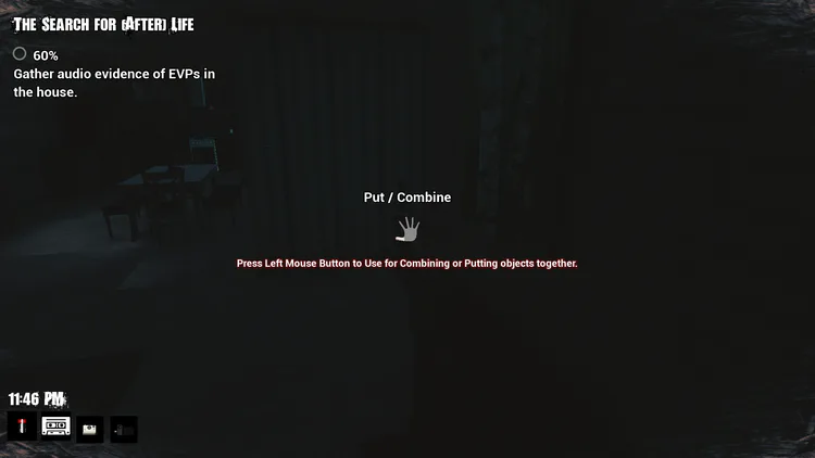
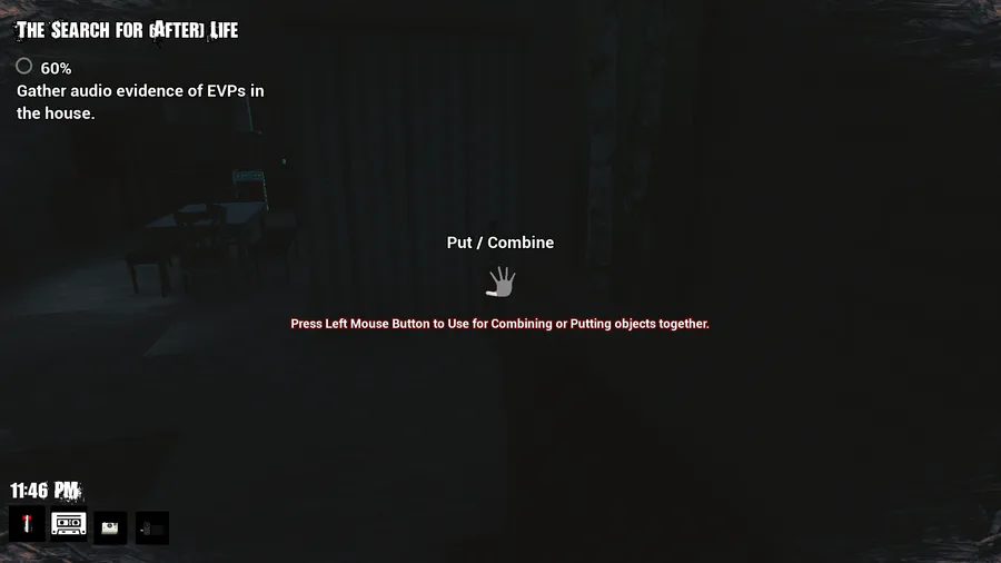
Objectives are listed one at a time to reduce confusing order completion
On top of the myriad of UI changes, we also added a few fixes addressing the following issues.
The Entity would spawn on top of the player, instantly killing them
The time between audio captures was too great, resulting in an impossibility to proceed without losing.
Items would not combine, this is fixed
We really hope that these changes make the game more exciting to play! We also pay a lot of attention to our community so if you have any feedback whatsoever, comment below or on the game page.

0 comments