Hi all. This update (112 ) and the next one I'm currently working on are focused on refining a bunch of Down Ward's rough areas in UI, mechanics, and levels.
Some of the notable changes in 112:
Default Wide: Camera mode is now "Wide" by default, and the original "Wide" menu item has been replaced with a GB-Res option, that zooms in to 160x144 GameBoy resolution.
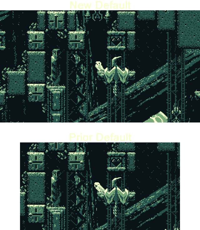
(Note that in the zoomed in GB-Res mode, the game will still use all of your screen, rather than cropping to 160x144. This mode scales up the game by the largest integer amount that will fit the 160x144 GB resolution in your monitor. This gives you the option of playing at GB pixel scale, but with full widescreen support. The menu option just below "GB-res" is "GB Frame" which will letterbox the screen to exactly 160x144, if you want to try out the classic pixel count of the GB LCD panel. Also, because Down Ward was initialy create for a GameBoy-themes game jam, this is the original resolution the game ran in. I've kept this option in mostly for fun.)
Music update: I've adjusted, and recomposed some elements of the music, added a few instruments, and trimmed a few elements I felt didn't quite fit. I've also done some additional work since the 112 update that will be out in the next update.
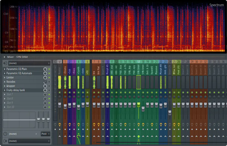
Picture of music things happening... Specifically the mixer rack for the Down Ward theme. At some point, it might be fun to do a post on the music and audio side of things. Composing music is super fun. :)
Audio volume: The Sound and Music volume now both start at a quieter default volume. They're both set to the quieter 2nd quick-cycle volume step, instead of the 3rd step. (Just a note: The N and M keys quick-cycle the sound and music volume respectively. Each has 4 volume steps, 0%, 12%, 35%, and 70% at the loudest. In the sound menu you can set the volume all the way up to 100% if needed.)
Level Color Palettes: I've updated almost all level palettes for better contrast. Some have completely new colors that I think work a bit better. For most I wanted to try getting the darkest color a little darker, if it was on the foggy side, which quite a few were.
Stack (level 10): I fixed a possible stuck state on the level "Stack" where it was theoretically possible for a player to lock themselves in a section of the level. Fortunately, given the pretty roundabout way it worked, I don't think it would be easy to do by accident, but I also didn't want a player to get stuck while exploring around and experimenting with stuff, so I worked out a fix. When working with sliding blocks and switches that can only be accessed from certain directions, or which shouldn't be accessible depending on the states of other switches, building a level that can't ever trap a player is a puzzle in itself. :)
Arbourfringe Gate (secret level 1): I've rearranged a decent amount of "Arbourfringe Gate". It's now less linear and allows access to the upper gallery from either the left or right of the outdoor portion of the level. The long heart block bridge can be retracted from below now, so it opens up a fairly different alternate approach to the level.
The first feather in the cage just outside the starting room is now accessible via a nearby switch. This gives players a much more forgiving introduction to the arc owl specters.
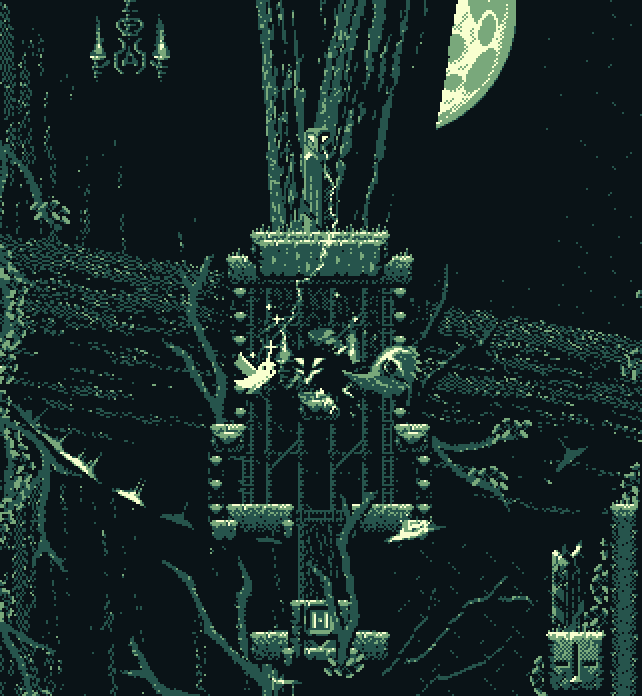
Gable faces an arc owl.
Likewise, the Mantle has been moved to the starting room, so it's much easier to remember where you need to go to enable saving partial progress.
Arbourfringe Dungeon (secret level 2): In "Dungeon", the one safety block you could raise in the horizontal flight corridor has been expanded to three blocks, and is quite a bit more forgiving. This area has been one of the hardest in the game since nearly the first version. It still is if you don't partake of the safety blocks, but even with the optional one-block island, it was pretty treacherous. This addition should make the level much less of a hard gate on the rest of the secret levels. A few other areas have been opened up a bit for more fluid platforming.
Labyrinth (secret level 4): I've added blade prisms to the "Labyrinth" level, and integrated them into some of the puzzly stuff. I've also added the blade prisms to the diagonal heart block area (seen in the gif at the top). The original razorvine on the switch made for some somewhat awkward platforming, which the blade prisms resolved. Several tight areas have been opened up to make moving around in them more fluid. For the brutally hard vertical flight gauntlet at the far upper right of the level, I've restructured it to include several switches and heart blocks that can be used to help you along. Though, if a player is so inclined, they can still "iron-bird" all the way up without any heart block support, if they are angling for a speedrun.
I'm working on another game update now, which should be out shortly. :)
4 comments