I have some feedback about the button system I used to activate traps in game, I have two option, and I would like some reaction about the two possibility I have to change that
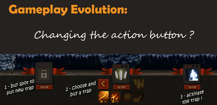
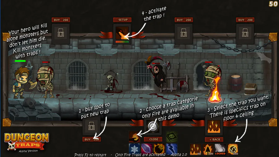
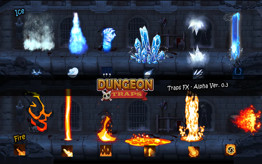
In Dungeon Traps, there is for each traps two buttons, one to buy and setup the traps, and one to activate the traps when monsters is bear.
Some of players who tried the game ask me why there is two buttons instead of only one to buy and activate the game. It’s clear that it could be more easier to play on it with only one big button.
In fact in my idea, I plan to let player the choice to change the traps during the game. You bought a fire traps and during the game, you see a new monster coming, one who don’t care about fire. So youhave the possibility to buy a new traps at the same spot. It’s why there is two buttons.
On an other way, as a level won’t be longer that 3/4 minutes, I can choice to have only one button, considering that there is 7 spots for traps we can inmagine that players have to choose to keep some spot free in case of a new monster come during the game.
So what do you think about thats ? I will take care of what players thinks about that to have a better game.
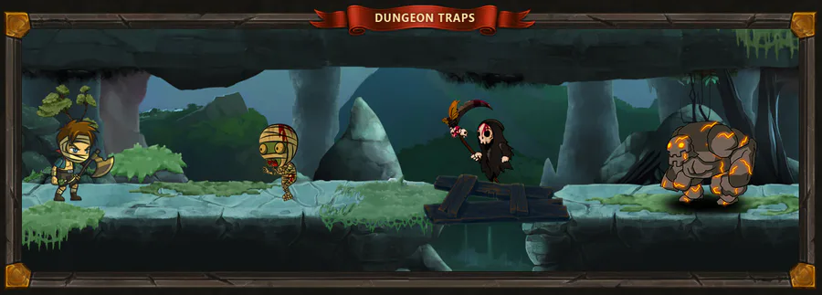
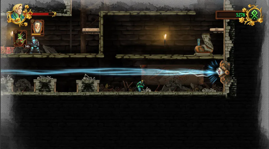
You can take a look at that gameplay video to see how it actually works, or you can even (and it’s better !) try the game :p



0 comments