

Do more interesting shapes, not everything has to be a box.
Here's a good visual example :

We can start off with a very basic box shape, similar to the person I was giving advice to (they asked for advice on how to make their maps look better)
Note, this is just the base for what the maps look like, without any decoration added. This person DID have decoration, but the foundations of the map looked something like this, with the decoration removed.
Cupcakemans in those comments made a good point about not making the player have to walk too far, or move too slow, but that's a different question to how it looks design wise; so I won't cover it. Overall I think this examples map size is a good option of many, though.
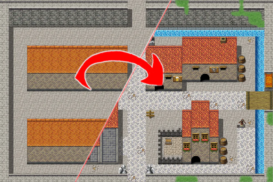
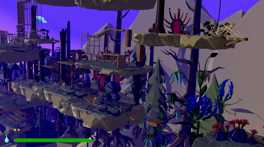
Now, let's improve this foundation a bit :

Here we have some very different shapes, as well as mixing and matching some different materials. I also included a building with a little fence. There's also contrast in the road and the surrounding ground. This works well, even for a location with a stone floor. I also included a sort of river with some bridges to make the environment itself a little more interesting. The only piece of decoration in this map so far is the moss in a few places.

Lastly we have the details. The vibe of this place is it's upkeep could do a little better, but over-all it's doing pretty well.
I wish I could've just included regular doors, but they weren't in the tileset, so I didn't include them. (you'd use events)
Some things of note are that none of the decoration really gets in the way of the players path. I also added an additional direction to go to take you to the graveyard (or where it would be) since I think that one would definitely exist behind the church, but there wasn't room for it on the current map.
Interconnecting maps for a single area aren't a bad idea, but one large map can also be a lot of fun, so I'll leave it up to you which you prefer and when.
The water-pump and bench are from the Sci-Fi tileset. All I had to do was edit the existing tileset and add an image already in the games files by default. Don't be afraid to do this from time to time, it will give you a lot more options. I wanted the bench to be sideways, but that didn't exist in the tileset, so I had to make do.
You can also see there's a little treasure chest in the fences area, that the player can only access by going inside the house and finding a way to it from there. Things like that can be fun.
The angel statues on the bottom only show their upper half, since their lower half might be hidden by the wall.
Note, this map is basically a big square still. You do NOT have to make the map itself square! In-fact, I'd strongly encourage you not to.
Here's some examples of non-square maps from one of my games:


I very rarely make maps that are straight up squares, since real life doesn't exist in a square.
More square-shaped maps can still have their place though, but more interesting shapes tend to create more interesting environments! I think that's the biggest thing to take away from all this. ^.^


21 comments