Next up
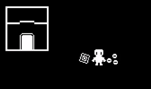
This is what 'Item Get' animations will look like in Chroma!
A gif I made showing the beginnings of a map and some animated tiles.
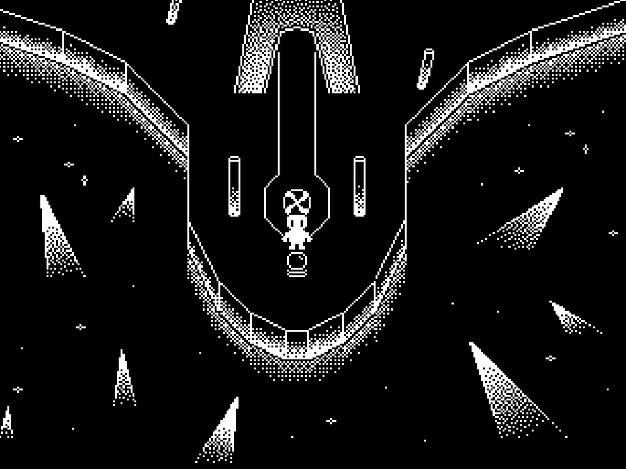
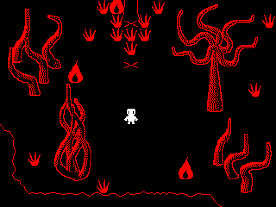
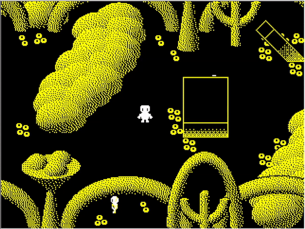
Chroma has progressed quite a lot since the last update! Here's a few screenshots of some extra-interesting parts of the game (including the first peek at the battle scene). I hope you like them! More will be on their way in good time, stay tuned.
myPOPGOES Mobile is out now on Android and iOS! 
Android: https://play.google.com/store/apps/details?id=com.clickteam.mypo…
I posted these screenshots on Tumblr a while ago, posting them on here now too.😅 Here's a look at three work-in-progress maps, plus a peek at what it looks like when I'm editing them. Also yeah, there's gonna be a demo - details on the demo coming soon!
@Patata1236 ![]()
is a Jolter to Watch who makes games and art for fun! Follow @Patata1236
![]()
before the quest ends on November 18 and you'll get Coins!
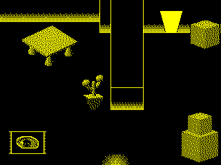
This is what a standard house would look like in Chroma.
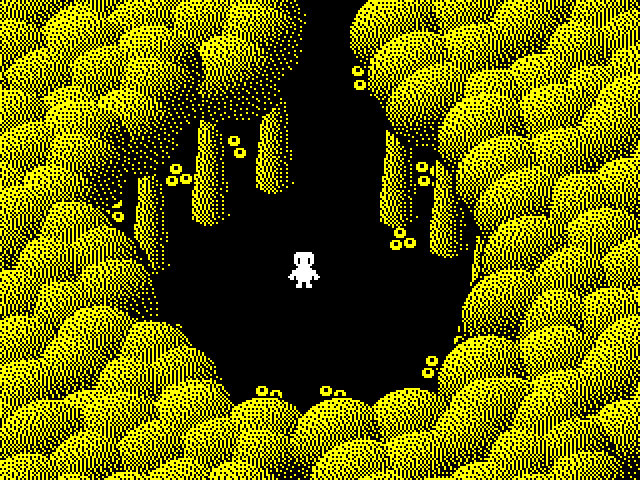
But it's yellow... what could this mean...?
A couple more sneak peaks! I really like how the starting area for this zone turned out. - RPG Maker parallax mapping is fun. I'm also really enjoying implementing the item sprites into the 'Item Get' animation.
Happy #WIPWednesday! Are you working on a game? Making some art? Practicing a song? Something else? Tell us in the comments!
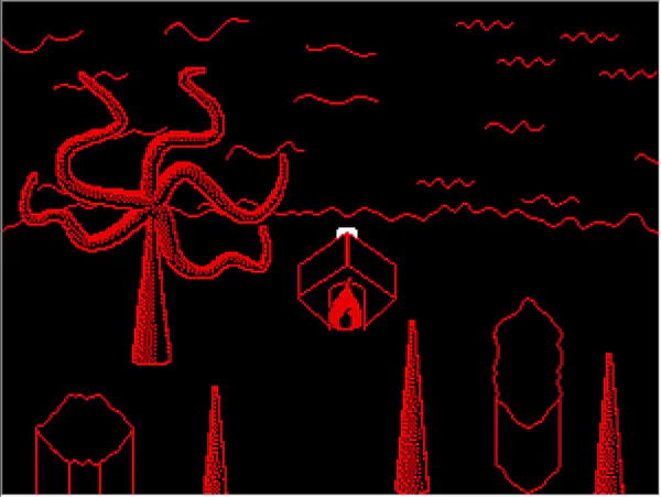
Sometimes you just have to chill next to the blood red waves. https://harrybutharryblog.tumblr.com/





1 comment