Basic advice:
Don’t be afraid to use references (from real life examples)
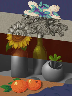
when shading, it’s best to shade with slightly dark colors but never straight up black/gray unless you’re FULLY rendering in greyscale first!
Anatomy can be broken down into basic shapes such as cylinders and boxes!
when shading, first treat what you’re shading like a basic 3D shape before worrying about shading the extra details.
More Advanced advice:
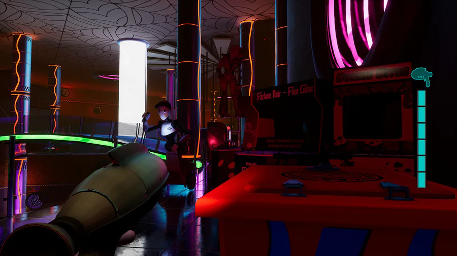
when you’re doing full scenes, pay attention to the color “hierarchy” and how that draws the viewers attention, a piece with primarily cool colors (blues), if you add a small amount of a warm color (red), that red will draw the viewers focus/attention giving them the impression that it’s supposed to be the focus of the scene!
focus on details that are meant to be in the actual focus of the piece, the more detail something has the more “in-focus” it would be in real life, as if you look at something in real life in the distance you notice that it has significantly less detail than it would close up.
with rim lighting, rim lighting is ALWAYS going to be touching the darkest shadow in the piece, opposite of the light source.
both soft and hard shadows/light exist, so don’t be afraid to use a softer brush and harder edge brush! But look at real life references to understand how to properly use them both. There is usually never just one or the other in a setting though unless it’s specific circumstances.
anatomy, it can easily be broken down into three different repeating shapes. Boxes, ovals, cylinders!!
although the spine ends halfway down the human body the line of action connected to it goes down to the foot, when drawing if you’re struggling with a pose try to extend that line of action! It will help and also make the pose more dynamic.
















2 comments