Next up
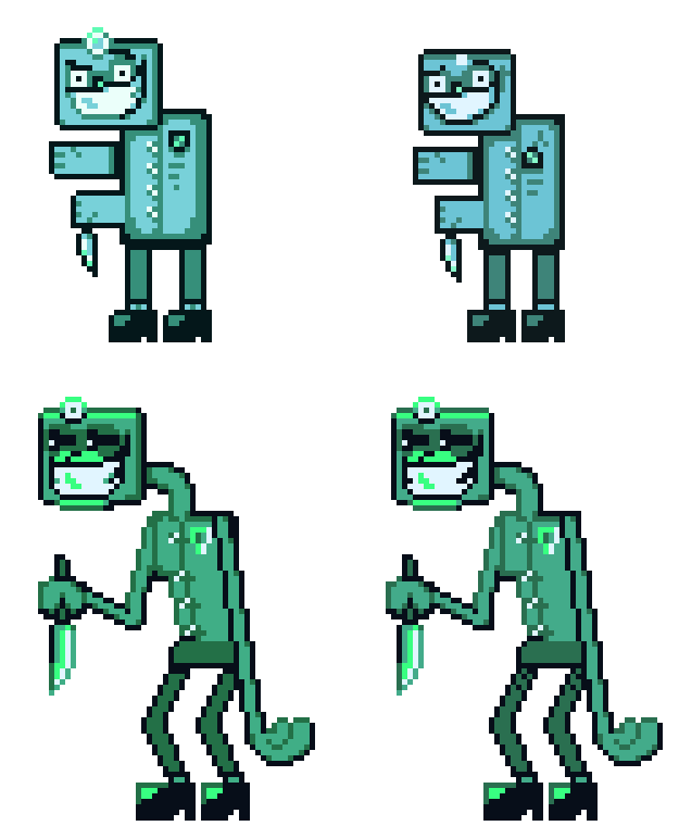
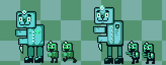
Remaking the Overseer Model, although I may change its name to just Sculkian or something else.
It may not look much different, but I got an Idea how to make it more Unique. (Second Image is First Version)
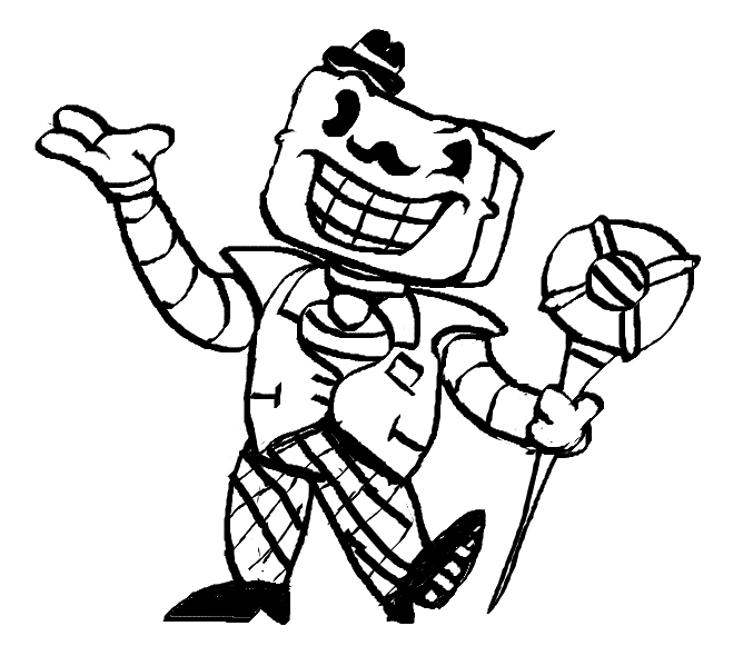
Little Follow up of that one "Chapter 5 Leaked Image", obviously it was fake, but it was still fun to do.
Also as a Bonus: Decided to Sprite what the mysterious Figure on the Bottom-Right would be, of course Stylisticly unique.
Thanks for the Support!
Been feeling like Re-Spriting Dr. Icede to be a bit more Polished (But also a litle smaller)
If that doesnt make Icede more liked; Idk what will..
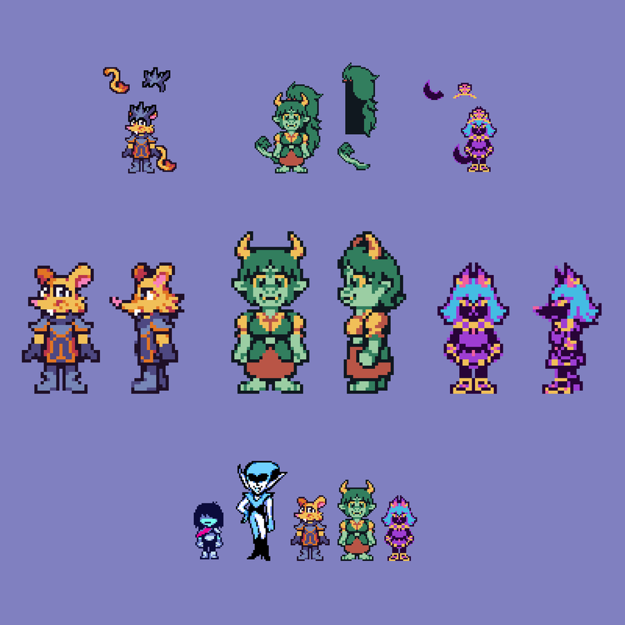
UTDR Styled - Nocturnis' OCs
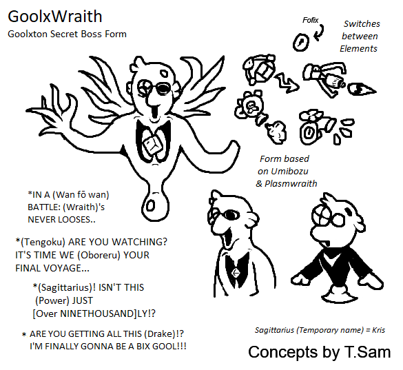
More Pikrune Concepts, this Time with the Wanna-be Wraith: Goolxton W. Goolxton, more specificly his BIGSHOT- i mean BIX GOOL Form: Goolxwraith (Name pending)
I looked at a bunch of Umibozu Designs & Similiar, and this was the Result of that.
This week's Fan Art Friday celebrates Cult of the Lamb! Accept the quest in your quest log to get started.
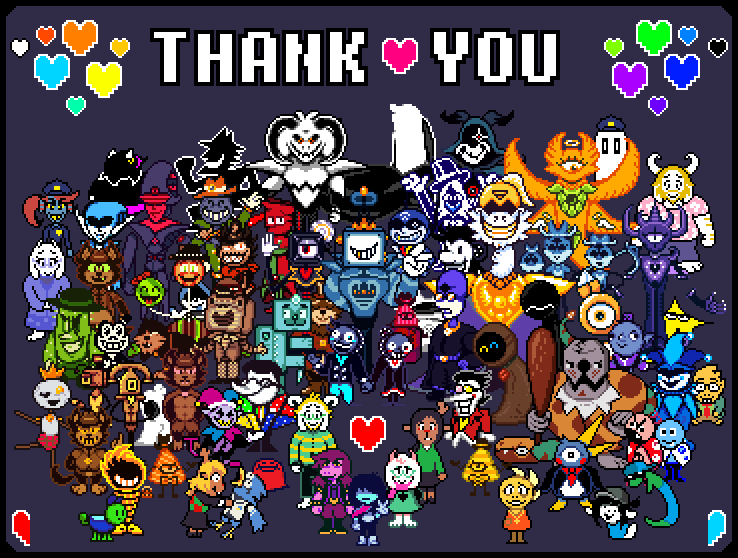
Thank you. For the Years and Sharing; We Thank you.
Since Chapter 3 and 4 are on the rise; We dont know the Future for DR:BtD, if we Stay or abandon it; It's unclear.
But even then: We hope you dont Forget us, even Beyond the Darkness..
So.. its nothing really Special, but here are some Concept Ideas for Re-Designing some of the Characters, be it just Minor or some Major Aspects.
Characters in Order: Zatick Zestatic, Toby & Tapi (and Projectionist) and Roaring Knight (Our Take)
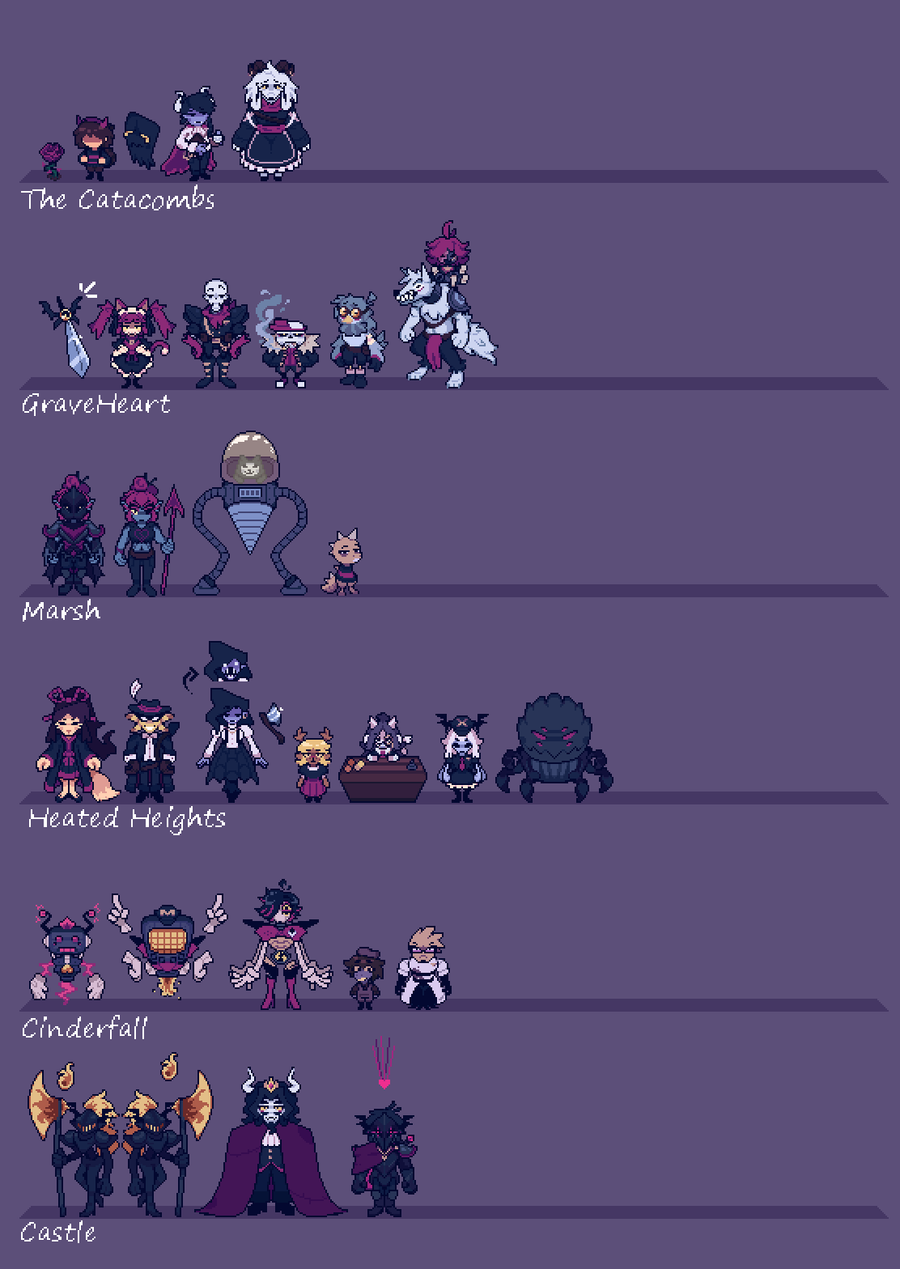
gulp more progress -Finished the calculator -Added Alphys -Added Asgore -Added Axis -Added Temmie -Added Noelle -Added Undyne armor alt -Added Susie -Added MK -New Skele bro designs -Few changes to Ceroba -Added the Kings Personal Guard
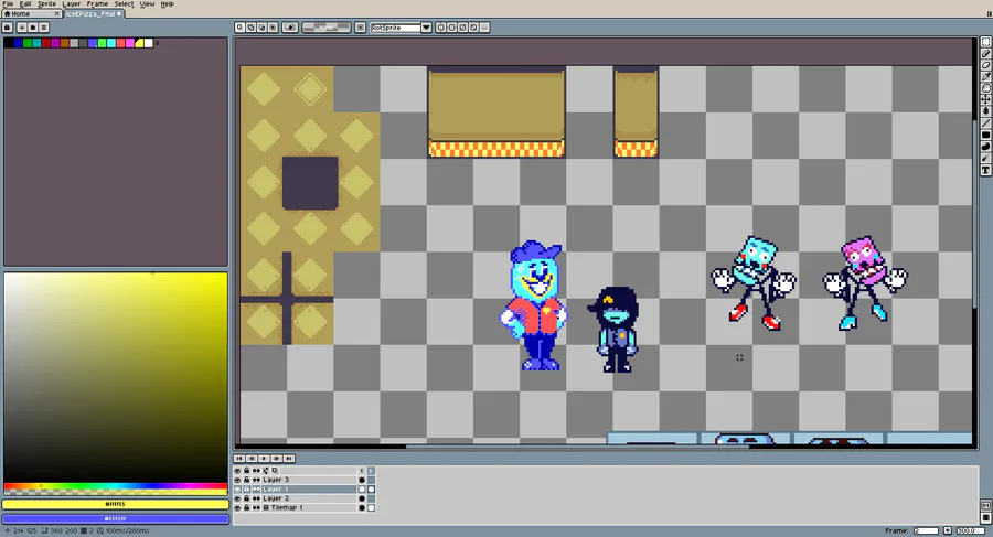
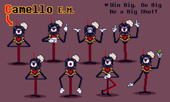
One of the more notible side Antagonist of our Chapter 3 would be Camello E.M.
The Egotistical News Reporter, Game Show enthusiast and Tenna's Second Hand.
What do you guys think of him? (Design wise and all) Comment and share your feelings!






2 comments