1 year ago

I don't really have any Halloween art to post to uhhhhhh

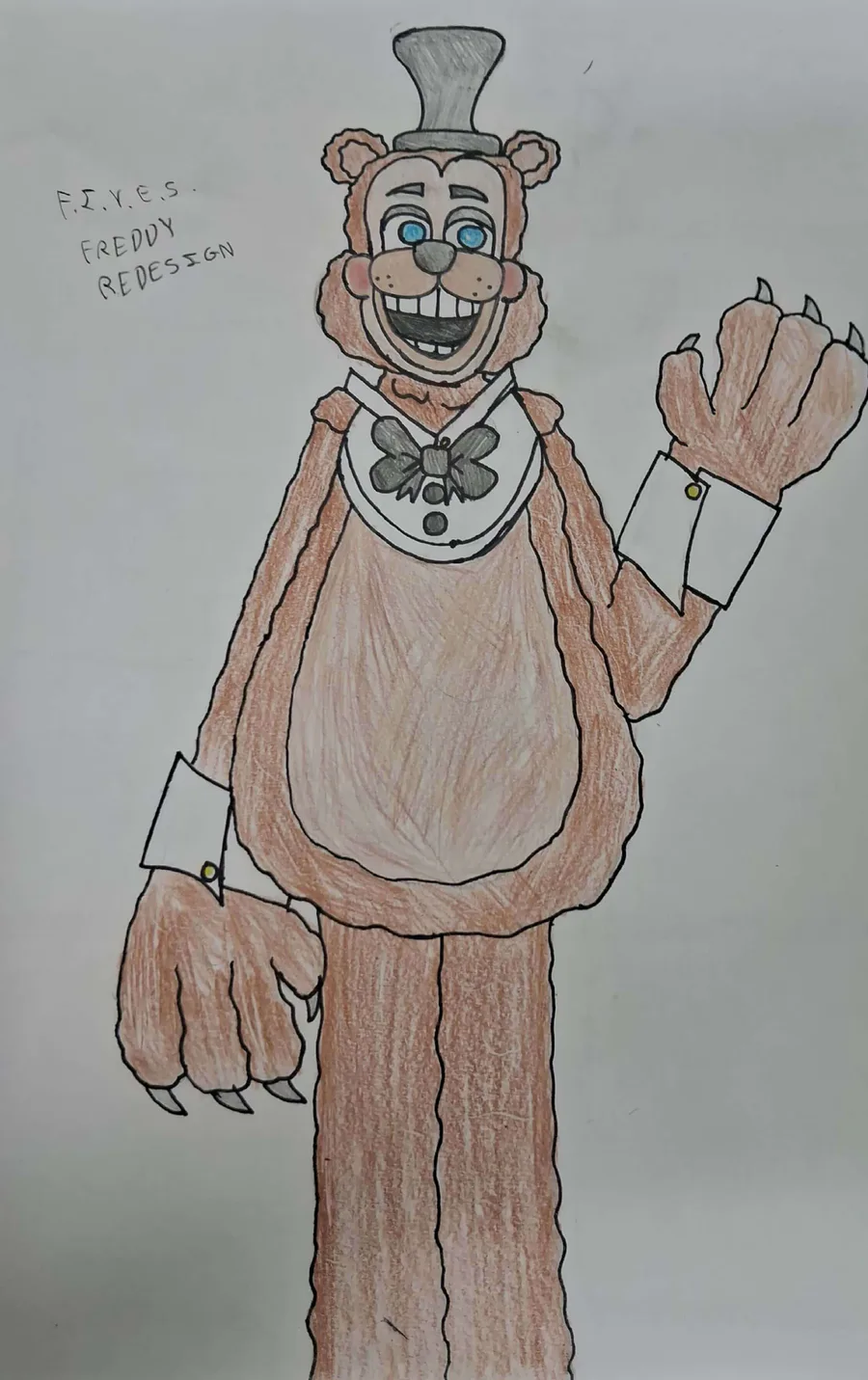
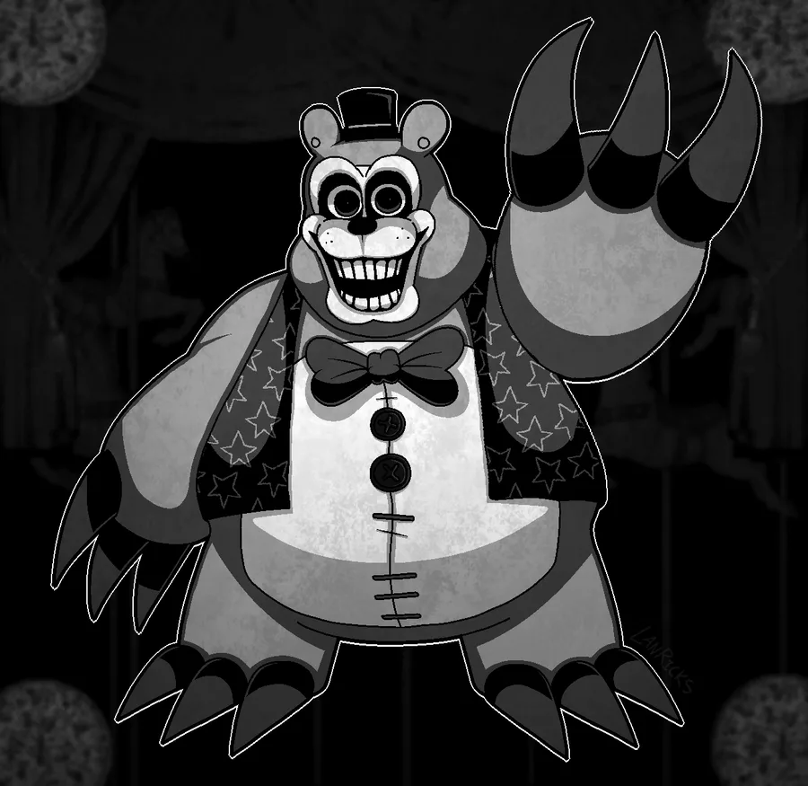
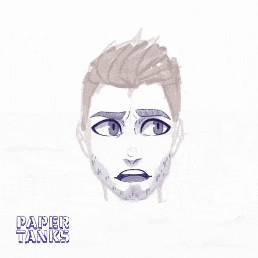
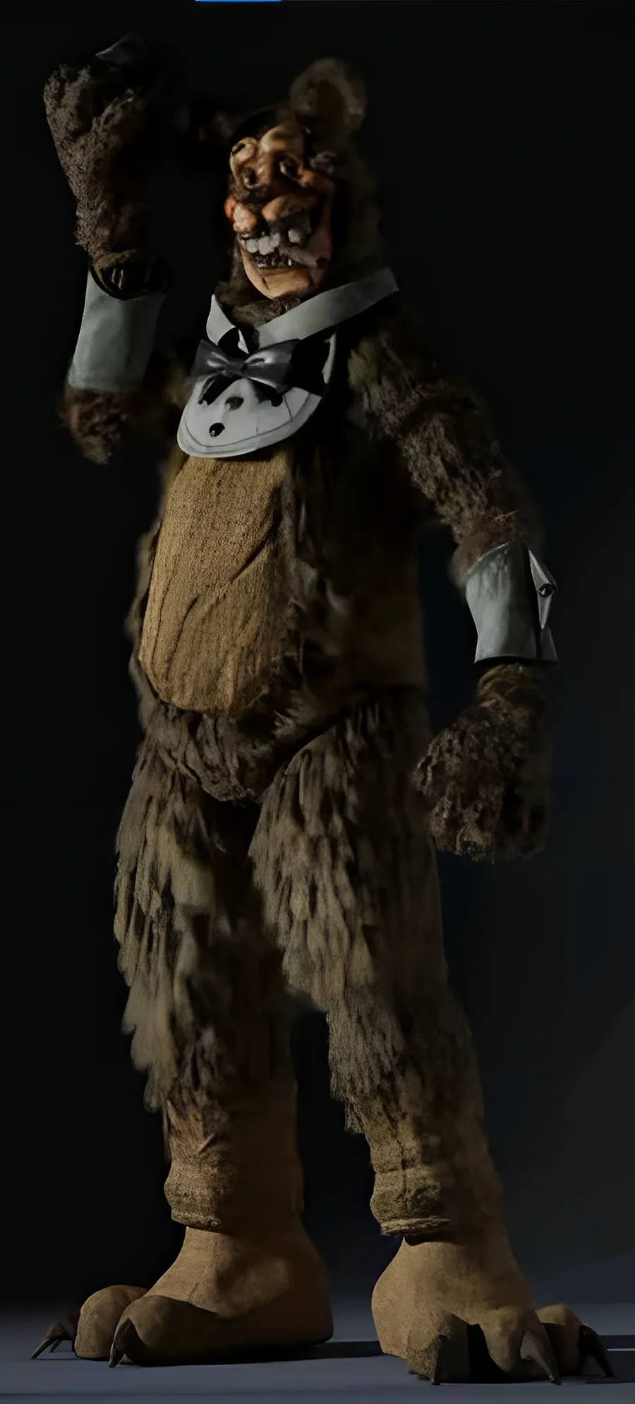
Here, have a redesign I made of the individual known as F.I.V.E.S. Freddy from the first picture to be less forced creepy


As cool as I think he is, his design is 100% something you would never see in a kid's restaurant, seeing how children would be terrified of this thing. This type of design is called forced creepy, where a animatronic design is made solely to be scary, without thinking about how it would fit in a kid's restaurant. Some examples of animatronic designs that are plagued with this issue are the FNaF Plus, Jr's, and finally, F.I.V.E.S.

I wanted to try to solve that issue with this design. Tell me how I did in da comments


0 comments

Loading...

Next up

#Joltober 2024 has come to an end so we wanted to show off some of the art posted by your fellow Jolters.

Thank you to everyone who participated in this year's challenge!

(Check the article to links to the original posts so you can give 'em a like!)

kitchen

Heya! I wanted to show some gameplay progress i made so far. I hope you like it ^^

Hi everyone! I started to create some environment props for my new video game, here is a cozy house in the forest. I'm planning to switch from Unity to Unreal... Let's see what new challenges I have to face. Made in Blender and Substance Painter.

My D&D art for my family so far (WIP if you couldn't tell)

Made my first ever animation.

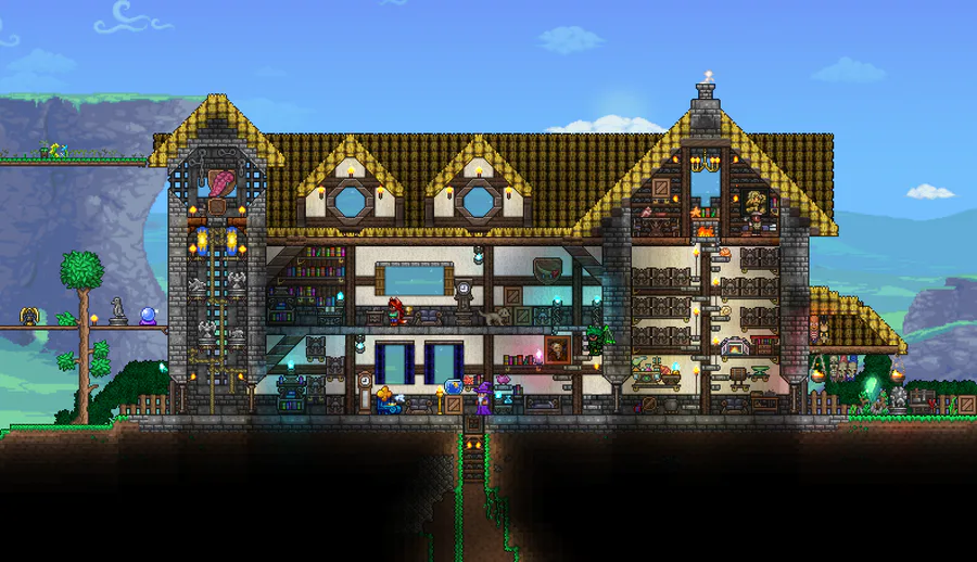
not the greatest house, but it's a house! :D

2d lighting experiment

Some time ago, we posted a screenshot of the Mexico level. A curiosity about it is that, like some other scenarios of the game, it was inspired by a real landscape, The Basaltic Prisms of Santa María Regla. It is one of the natural wonders of the country!