Next up
Before I go to bed before Christmas, I figured I'd share a quick update. Don't worry, this project isn't dead but it has been a LOOOOOOONG time since I made any update.
Sorry for not posting in at least 3 months. I could've sworn I said I'd post more often.
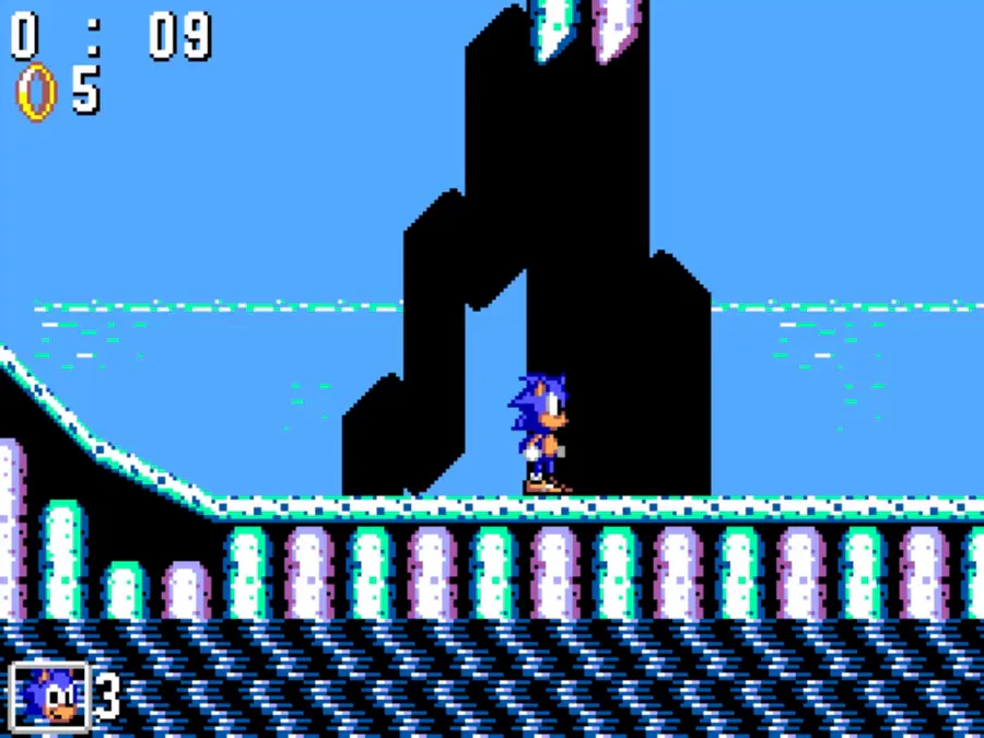
I've decided to tweak Zone 2's boss to give it a bit more substance. I've raised it's HP from 8 to 10 and added a second projectile attack.
What do you think?
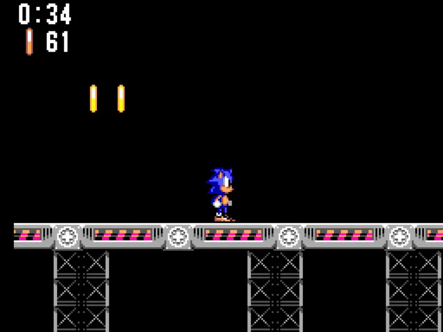
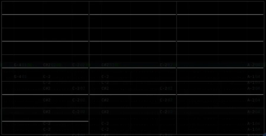
Some of the FM soundtrack in action. In addition, I've added a new punching move to CCZ's boss, Boom Dogg. I've also redone his sprites. His animation is still limited but I think he looks a bit better.
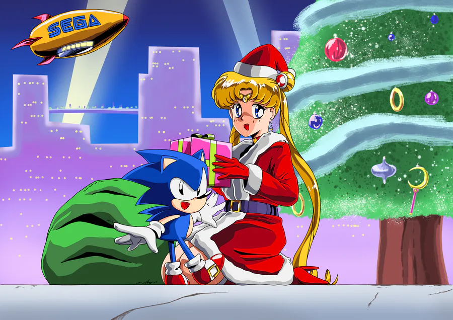
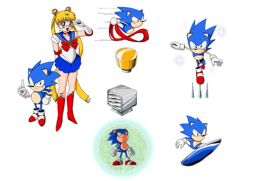
I drew a piece of artwork for the project. I hope to do more of these. They'll be perfect for the instruction manual (as well as thumbnails for YouTube playthroughs).
Here's a look at another mini-game, one that's more akin to golf (or SNOLF, I suppose), except with an upside-down parasol.
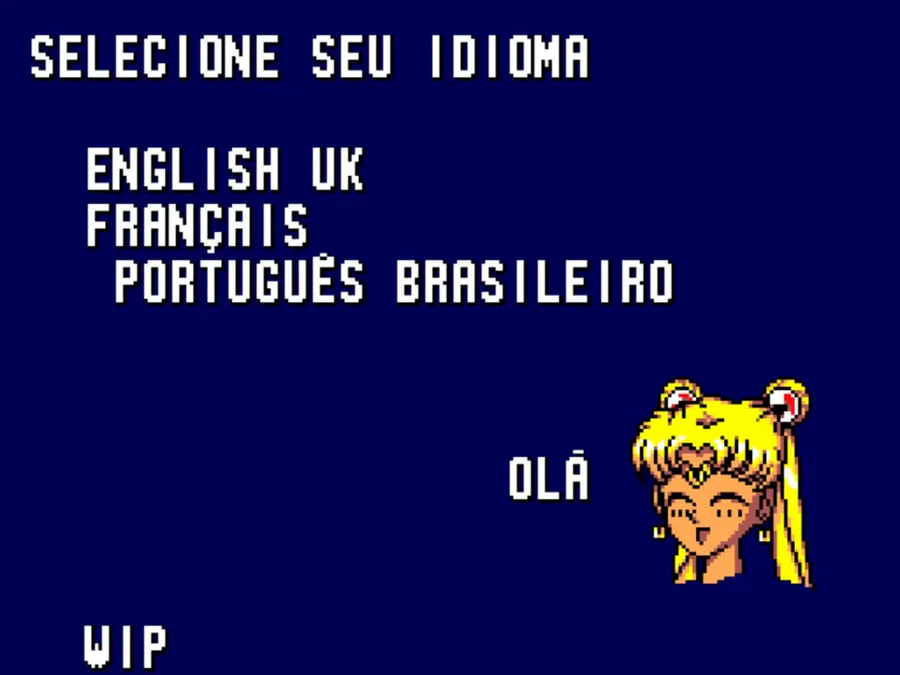
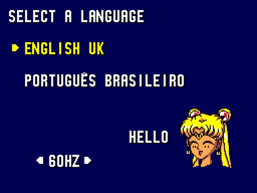
Also, special thanks to Creative Araya for providing some more accurate translations to Brazilian Portuguese.
Merry Christmas to everyone! Demo 4.0 is finally public on Windows!
Quick playthrough: https://www.youtube.com/watch?v=JPw_EUiEexI
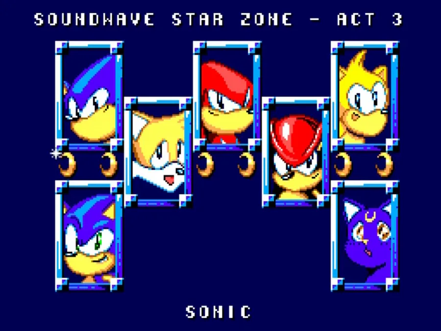
In the lead up to Demo 4, here's Soundwave Star Zone Act 1 which can be accessed via Up, Down, Up, Down, Left, Right, Button 1 running in 50Hz mode.
Important stuff in the article below.
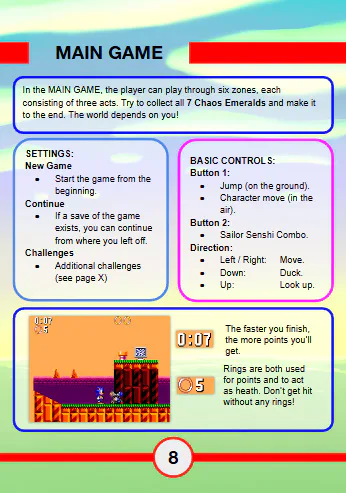
Here's some pages of the W.I.P manual. I was originally going to go with a plain design similar to a lot of SMS manuals. Instead I opted for a more colourful design inspired by several Game Gear manuals I saw.
What do you think?
I can't believe this project has hit 400+ followers (my own account event hit 200+)! Thank you all!
More in the article:
Decided to redo the art. I prefer drawing them like this (smaller, multiple drawings per sheet). What do you think?



0 comments