Hello!
Today I would like to share the process of Trago’s cover illustration.
It all started with the desire to design a strong composition.
1st sted: thumbnails
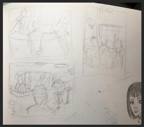
I was trying to make a poster but the I realised a movie scene would be much cooler.
After some studies I decided to focus on Juca’s feelings towards the end. The telephone at the first plane, Juca looking at it and all the lines leading to the back of the picture where something important is happening.
2: lines
So in photoshop I made some two perspective grid with lines by hand (photoshop sucks to make perspective drawing, right?)
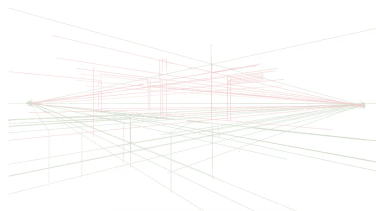
3: drawing at the grid
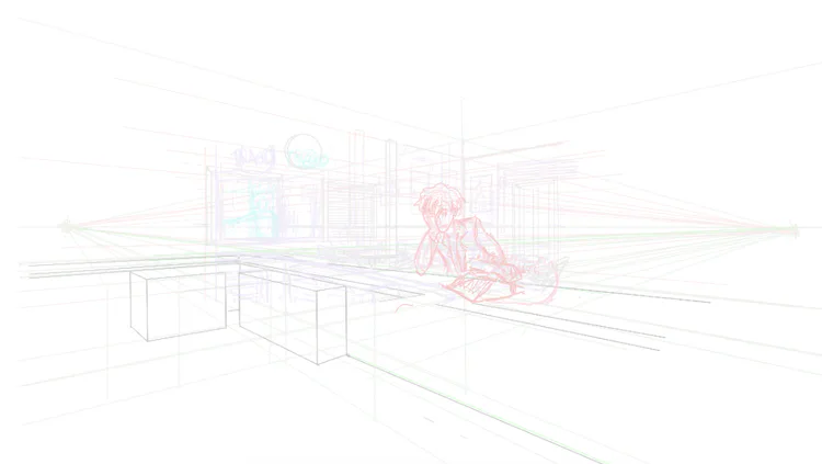
So all the elements of the scene where drawn into the grid. Not easy to set the scale as the things moves backwards. But I managed it somehow.
4: coloring, composing.
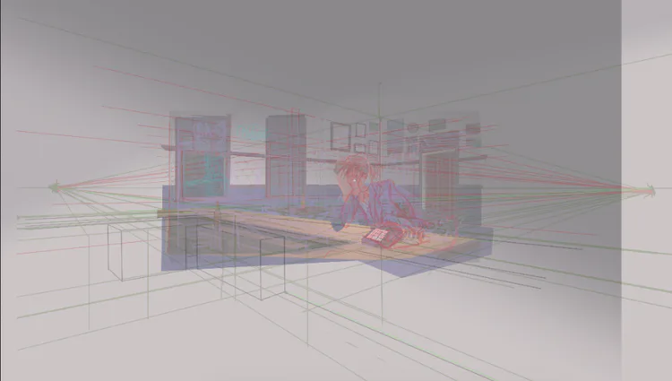
As the vanishing points are far apart, we can see that the picture itself is smaller than the whole psd file. Setting the light, and colors were already because its the same scene of the game, but another view.
5: final result:
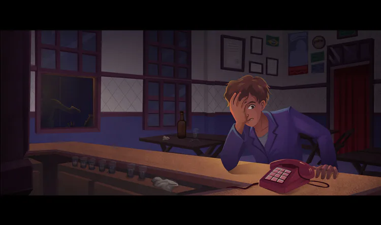
So this is the final result! Like a movie scene. I kept the aspect ratio to 16:9, wide screen. Does it feels like a movie to you? :)






0 comments