It's been quite a while since my last post here, just wanted to reiterate in my original post that this is a passion project I'm making in my free time when I get a burst of determination and inspiration to work on it. This page simply exists to document my progress on the game to the public, and also as a future repository for me to release the game once it's complete. I've been quite busy recently, and took a two-week break after my last post, which turned into a month, which eventually turned into 6 months. My apologies for that, in case I have any very interested viewers.
Now onto the good stuff. The rest of this post will be about the inventory system (selecting weapons and equipment) and how exactly the game will be displayed (resolution and FPS, apps).
Inventory System:
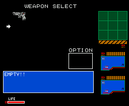
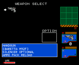
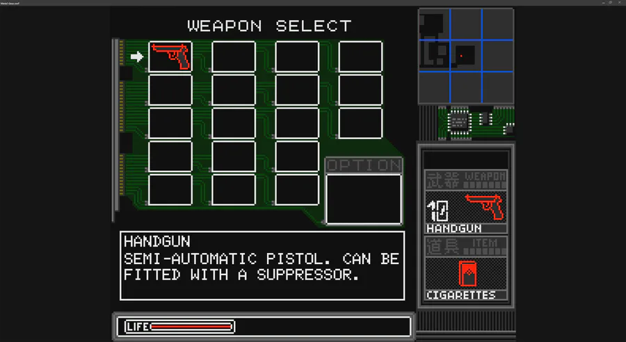
The inventory system will work exactly as MG2's inventory system. Because it's pretty simple, especially compared to later MGS games and later released games in general, I didn't expect this to be too much of a trial to overcome. Yeah so having never created an inventory system in the past, it's been quite a learning experience. I ended up creating a separate development environment to test the inventory screens with the aim of porting it over to the main environment after completion. After many failed attempts and long nights, the Weapon Select screen is finally finished. I've started on the Equipment Select screen as well, but this won't take nearly as long since I can use a majority of the code I used in the Weapon screen for it.
It works exactly as MG2's inventory does. If you have no weapons, none are displayed in the menu, and it simply says "Empty!" where it would normally display a name and description of the item or weapon you have selected. The screenshot I previously released of this system was the original system I created, which did not allow left and right navigation in the menus. Originally I figured I could get away with not including it, due to extra difficulties, but I ended up biting the bullet and figured out how to implement it.
Again, I've never created a system like this before using AS2 or AS3, so it was a great learning experience for me, and extremely satisfying when I finally got it working exactly like MG2's inventory system. Now that these screens are about finished, next I need to worry about adding items to the actual playable map which you can pickup and add to the inventory (sounds like hell).
Resolution:
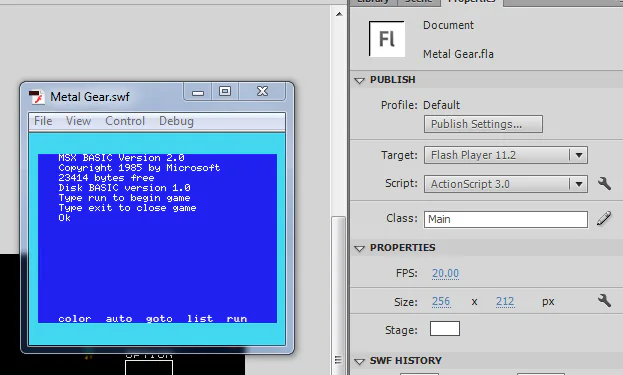
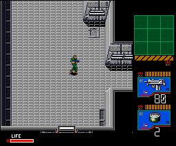
Rewinding a bit, I wanted to talk about something some of the viewers are probably wondering: Why the hell are all the screenshots so small? Well, in order to get maximum quality out of the environments and sprites used in MG2, I wanted to mimic the constraints of the MSX2+ as best as possible. A common display resolution of those machines was 256x212. And while I could run the game at whatever FPS cap I want, technically, I chose 20FPS.
In addition to using the common MSX resolution, I also used colors only present in MG2's color pallette to create new sprites (or modify existing ones rather) and ensured all colors pallettes were universally the same across environments and sprites.
As for the odd framrate of 20FPS, I chose that because 30 seemed a bit too smooth. After emulating the MSX games and playing both the "HD Edition" release and the PS2 release of MG2, the game does not run at a perfect 60FPS, it seems slightly slower than it should be. Same thing for when emulating on MSX. The game probably runs closer to 30FPS on MSX hardware, and Flash Player can definitely handle that and higher with the sprites I'm using, but I think 20FPS keeps it smooth enough to enjoy but also retain some "retro goodness," if you can call it that.
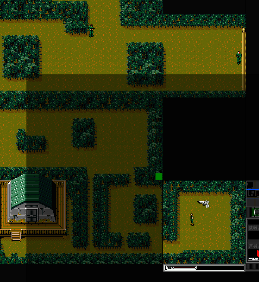
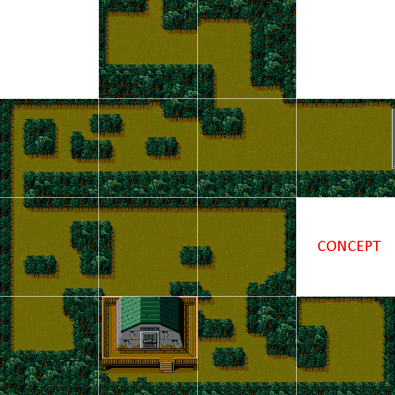
Another final thing to note before goodbye until the next post: all screenshots I've posted so far which don't say "CONCEPT" on them are taken directly from the game build. If they're simply a concept layout or unfinished image not yet input into the game, they will have "CONCEPT" written on them.
And that's all for now! Thanks for reading!





0 comments