After weeks of sleepless nights and hard work, King’s Conflict has now been heavily updated and upgraded. The game now has new and improved artwork, a walkthrough tutorial, and many improvements to the interface.
I’m very pleased to be able to announce that the King’s Conflict team has been joined by the talented young artist Nikita Kaur - Nickkaur.deviantart.com - who has produced new card artwork and, perhaps most importantly, a hugely improved set of map tiles. Nikita is busy churning out more high-quality artwork, which will make its way into future updates
King’s Conflict is still the same great game, but now it looks much better and is far easier to learn. It’s also still free, ready to download and play, and looking for alpha testers. Download and join the fun!
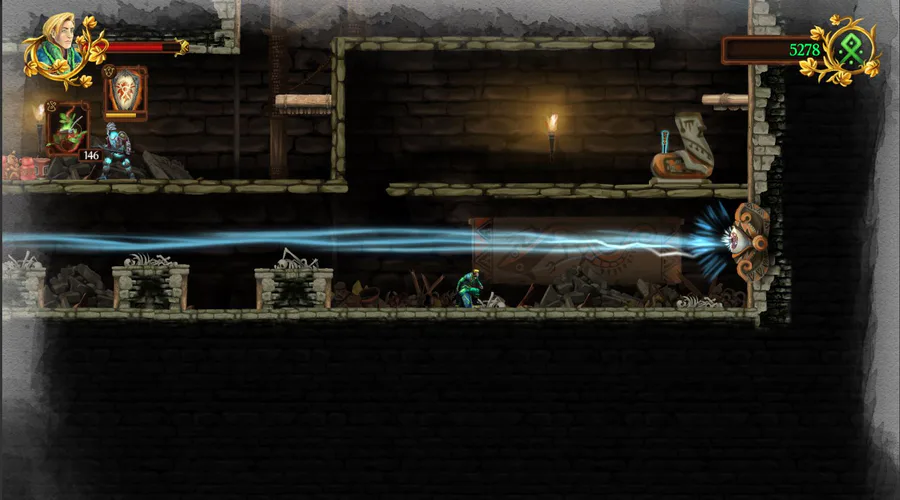
Some updated media:
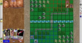
Main screen - with new map tiles and improved layout
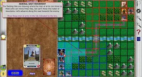
The new walkthrough tutorial
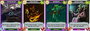
Some of the new cards from Nikita Kaur
Full list of updates in this version:
Miscellaneous:
Tutorial now available from main menu - this carefully walks players through a game against the AI, explaining all key game concepts.
New and improved art for ‘Oakenhearts’, ‘Spy’, ‘Armoursmith’, ‘Mermen’, ‘Fire Mage’, ‘Lightning Wielder’ and ‘Mage King’ cards (see credits for artists)
New set of enormously improved artwork for the map tiles, courtesy of Nikita Kaur
Log window listing all game events now available, so if you missed something you can scroll back through it to see what happened.
Two-minute time-limit on turns no longer applies when playing against the computer
Music volume now automatically drops to 25% during help system audio narration
Installer now offers a ‘start program’ option
GUI:
Units can now be moved by dragging. The old click-and-click movement system still works as well.
Options and help icons on main menu screen now on top right, player name on top left. Help icon is bigger.
X and check (tick) icons reversed in all pop-up dialog boxes
Settings page is now closed using an X icon in the top-right, rather than by clicking on the background. It can still be closed by pressing escape
Close icon in help system now at top right, not in button row at bottom
Problem with flickering button text in help system fixed
Several in-game icons not directly related to gameplay moved to a second column on the right hand side - these are zoom in, zoom out, settings, and the chat icon in multiplayer. Only gold, food and fire icons remain on the left column.
Fire icon moved to the centre of the left column
New ‘resign’ and ‘help’ icons added to column on right. Resign does same as pressing escape. Help does the same as the help icon in the menus, bringing up the help system
Mouseover tooltips added for most game-screen controls. These tooltips can be turned off in the settings page.
Highlighted squares on map (for movement and card placement) are now more strongly indicated with pulsing colour
The tile into which you are about to move or play a card is indicated with a flashing black-and-white border
Card translucency when dragging over the map slightly increased to improve clarity of placement point
Map now scrolls a little slower when ‘flicked’, and correctly scrolls to the edge. It no longer overshoots and bounces back
The mouse wheel now zooms the map in and out. Currently it doesn’t keep the view central - this is a known bug and will be fixed in future versions
Info on units now appears when the mouse is hovered over the unit for 1.5 seconds. This previously required a right-click - right click still works as well
Info on units is accompanied by on-map indication of which tiles the unit can attack
Info card for units now appears in the play area on the left rather than on the map (to avoid obscuring attack indications). The play area is dimmed to emphasize the card.
Info on an individual region is now available - hover the mouse over a tile for 1.5 seconds or right-click. This shows the region on the map in a yellow highlight, and provides text giving it’s size, value (in gold and food), and ownership. If it is contested it tells you how much health each player has in the region, and it reminds you of the rules
Food and Gold icons now work with a mouse-hover to show income and food source summaries. The enemy icons work for this as well as yours. Right click also works.
Hover-info for units, regions, gold and food can be turned on and off in the settings screen. Right click (or long-press) always works for these.
Card text-box graphics improved
Balance:
King’s Touch raises health by two rather than one
PLANNED for upcoming release(s)
Messages to tell players currently in menus or playing the AI when there are players waiting for an online game
Improved patching system - currently new versions require manual download of a new installer from the website. A more convenient patching system is planned.
Fix bugs with clicking right mouse button while dragging with left (just don’t do this for now- I know it doesn’t work properly)
Audio narration for the walkthrough tutorial

0 comments