
This is a comparison image showing each of the maps for the Lucky47 games.
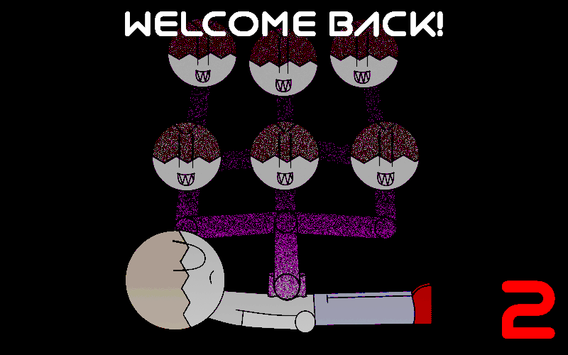
While the sketch I made of the first game and it's bizarre design was what got me to make my own FNaF fan-game, The second game has a noticeably symmetrical design; and doesn't stand out by comparison.
My intention was to have the map laid out in a way that the player would immediately understand how each of the rooms were laid out; This was so that the sensor mechanic wouldn't be nearly as frustrating. The John Head that picks up the sensor can only move to adjacent camera feeds, so at the time, I felt the symmetry was the best way to handle it. Looking back, I wish I had come up with a more interesting design.
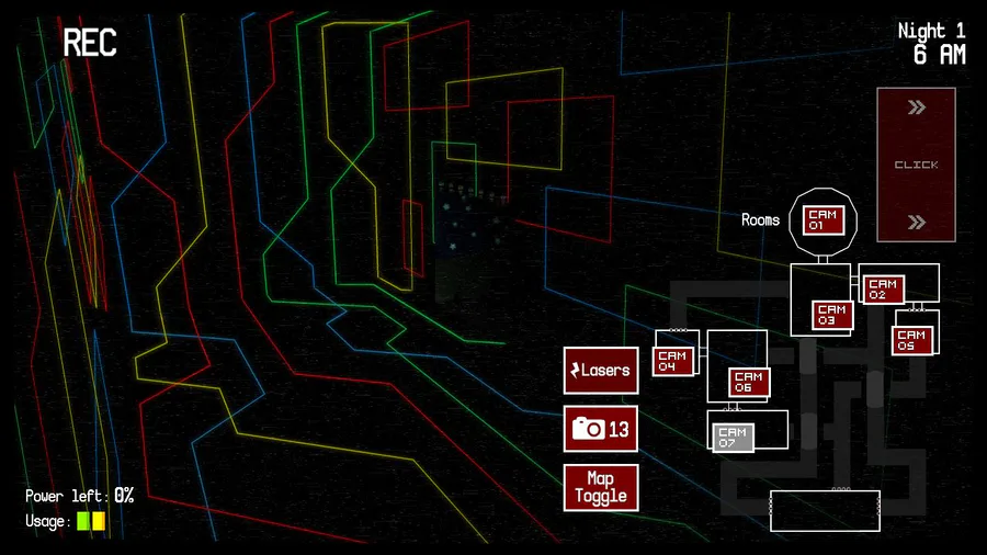
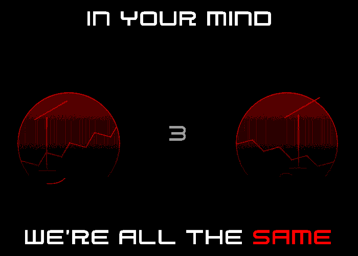
As for the third map, it's designed to parallel the map in 'Five Nights at Freddy's 3,' as I had every intention to parallel that game, from it's audio mechanics, to how the main antagonist moves around the map, as I felt the photo mechanic was so wildly different from any other fan-game, that I felt it would be less overwhelming if the rest of the game was made up of familiar elements. I do feel there should have been more unique mechanics to compensate for the game's copied mechanics.
The third map does pay homage to the first game's map though; look at it sideways, and it's also shaped like the number '47.'
2 comments