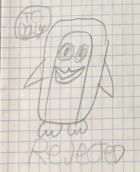
My second concept of Squeak, but it also didn't suit me. Squeak is supposed to be skinny, but in the second concept, Squeak is wider and fatter.
Next up
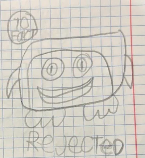
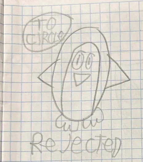
The fourth concept: I didn't like this concept at all, because what? Squik can't look like he's threatening with his flippers.
The third concept scared me a little because Squeak looks more scary and not very beautiful.
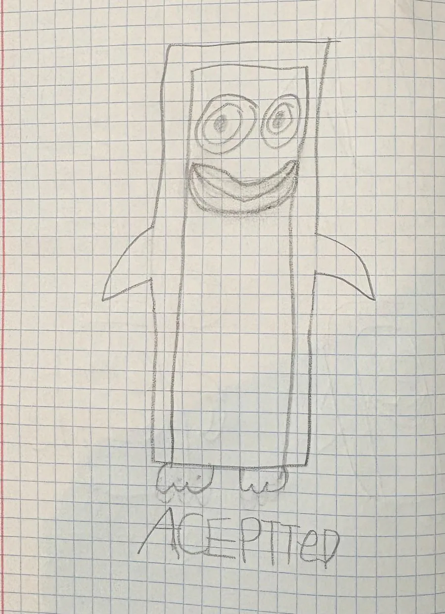
Here is the final concept that suits me.
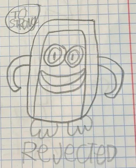
my first concept of Squeak, but it didn't work out because Squeak should be square, but the first concept he's a Circle
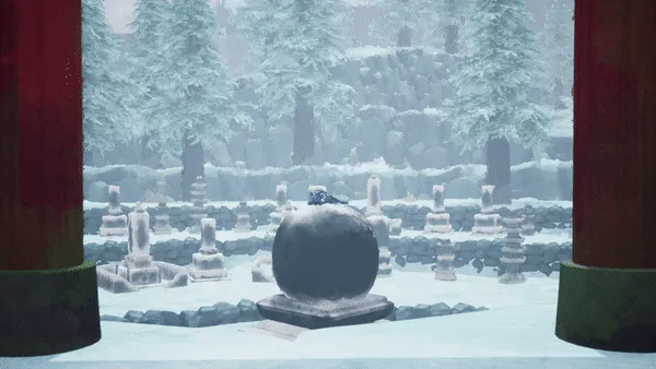

Path of Kami: The Evolution of the Lore
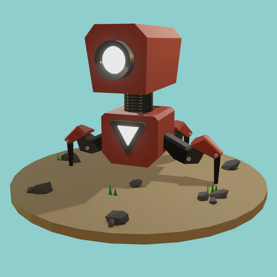

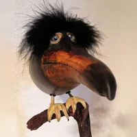
What do you think guys in my robot?Just a beginner in 3d modeling..
My instagram https://www.instagram.com/rojhonbb/
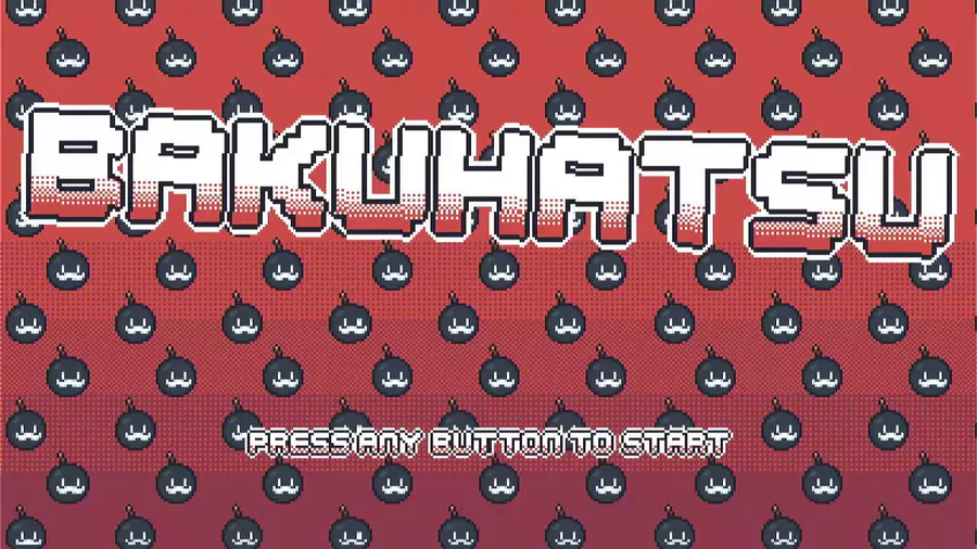

Heya! I wanted to show some gameplay progress i made so far. I hope you like it ^^

Werehog transformation process. #sonicunleashed
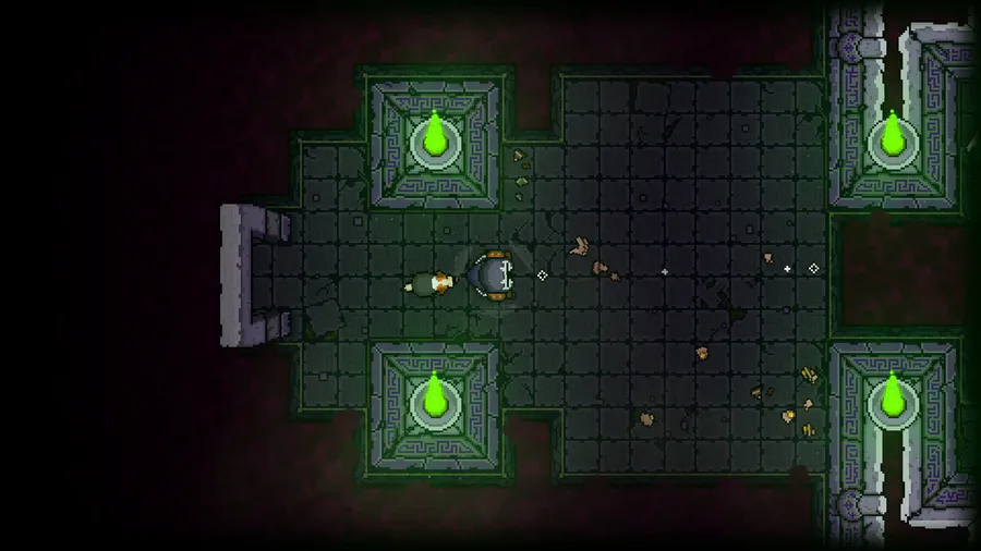
In the quest for accessibility, I'm adding Resurrection Shrines for players on the 'novice' end of the platforming spectrum.
In order to unlock the power of a Shrine, you must collect 3 'Souls' from your dead corpses! (the floating blue orbs)
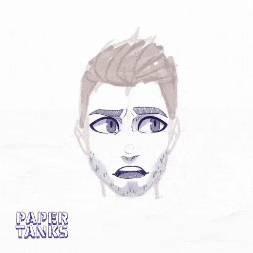

Finished work on the emotions of a new character for the tank universe
0 comments