Zelda’s finally releasing tomorrow, so I’ll make a blog post before I’m occupied playing that.
Since last time I made a website for Mobility! It’s at http://mobility.auroriax.com.
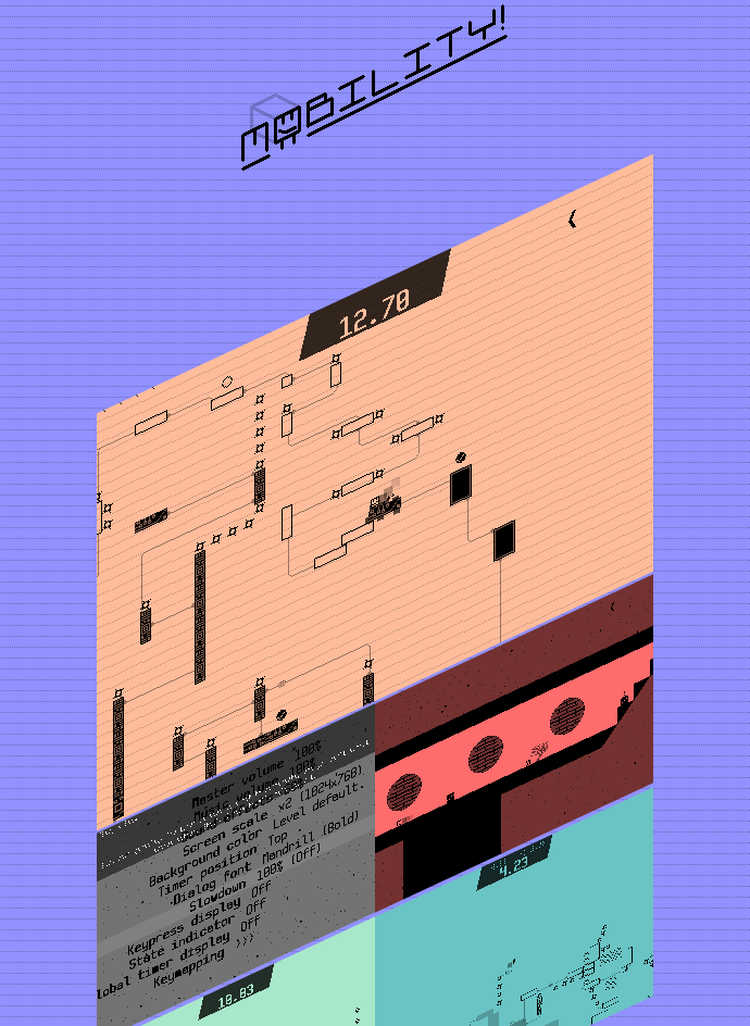
It is primarily a showcase of GIFs of the game, and is intended to link through to this devlog or my Twitter. It still needs a bit of polishing which I’ll do once I make a trailer for the game. (I don’t make trailers that often, but seeing the large amount of time I spent in this game so far, it’ll probably be worth it!)
The other thing I’ve been doing is putting together a new spaceship, the Meteore. I teased it in the last post, but here’s a nearly finished version of it:
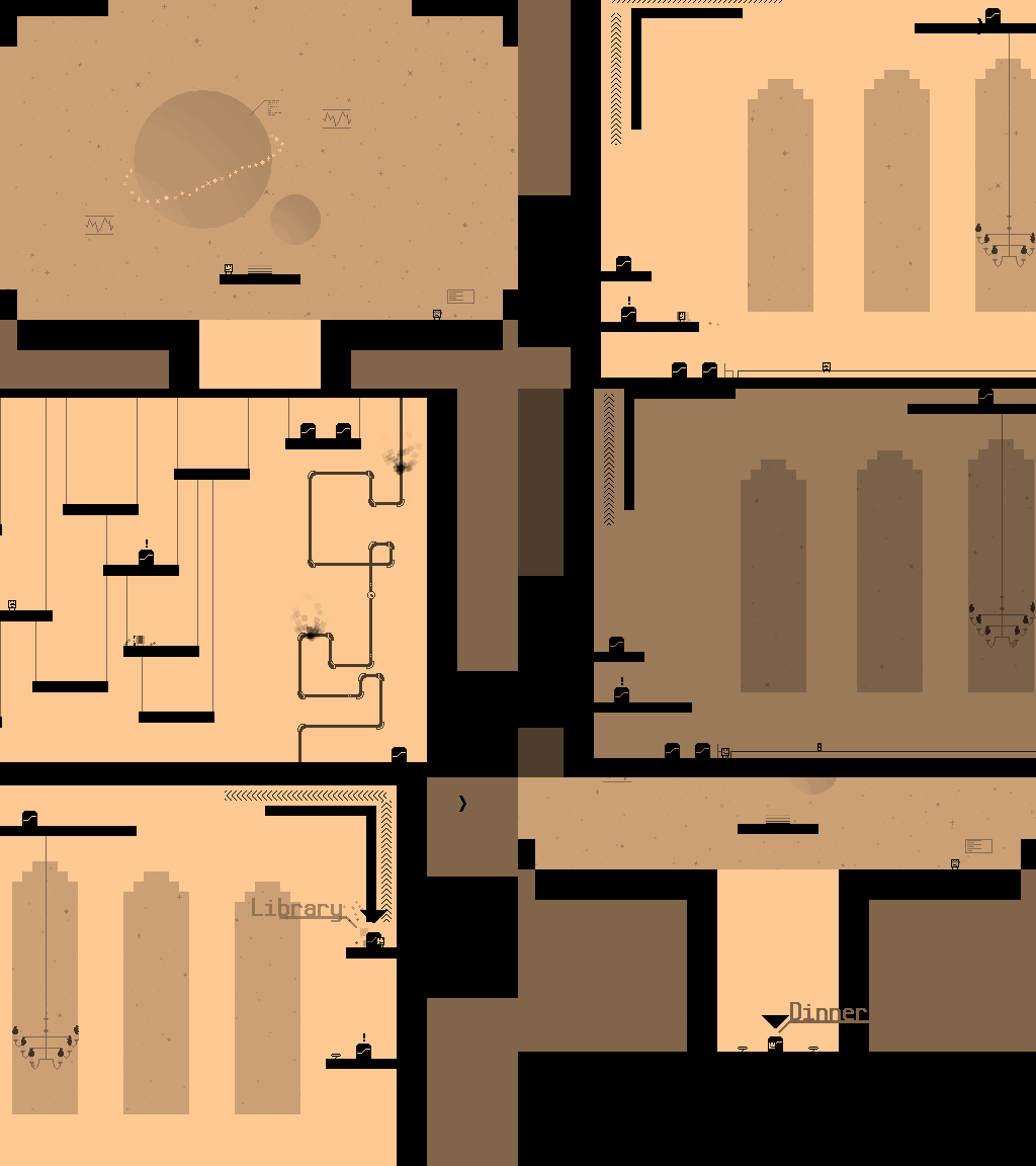
I made a concept for a spaceship that’s intended as a hub, which contains the initial training for the game, and via which you can travel to other spaceships. It was originally drawn by Unidrax some time ago but left unused, and we decided to reuse it to replace the bland original design.
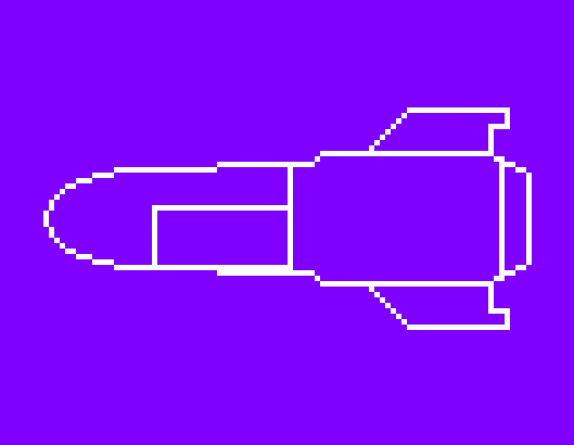
And remember the draft of the final spaceship from my last post? I polished that up a little, the intention is now to break through the layers of the space station and get to the boss room in the middle. I hope this is a good beginning for a great finale of the game!

Also, I redesigned the debug room yesterday. There’s a door to every room in the game here, levels and overworld rooms. Previously, it had the doors to overworld rooms to the left, and normal levels to the right, but now that access to the levels have been assigned to each overworld room, it was quite messy. Now doors to the levels have been arranged below the ship they can normally be accessed from, and yet unassigned levels are at the bottom of the room.
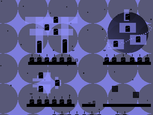
After I finish the Meteore, I’ll continue upgrading the UI of the pause and settings menu in the game! I already showed the settings menu in the last post, but the pause menu needs the most work: here’s how it looks like currently:
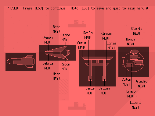
The idea is to split the info over three screens: this one is mostly done but needs some re-positioning of some elements, one will have a full overview of completion throughout the entire game (sort of like the overview in modern Mario games) and one with information like the ship’s background story and game controls. More about that next time, though!


0 comments