So, I've brainstorming ideas for this game for well over a year now, so don't be suprised if I post a lot here.
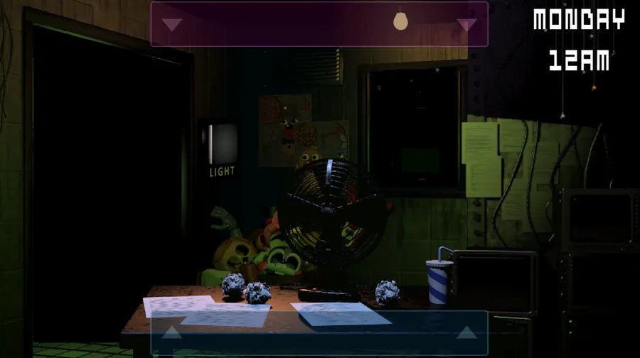
So, the Fnati map. It barely ever changes in remakes, and I'm honestly not sure why. It's small, it's cramped, and most of its features are just sort of... bland?
I undestand making it small, since that means there's less cameras for you to use, but when there's nothing to really look at on them, and they turn back on anyway, it makes it feel like a pointless design choice.
So, here's what I've done.
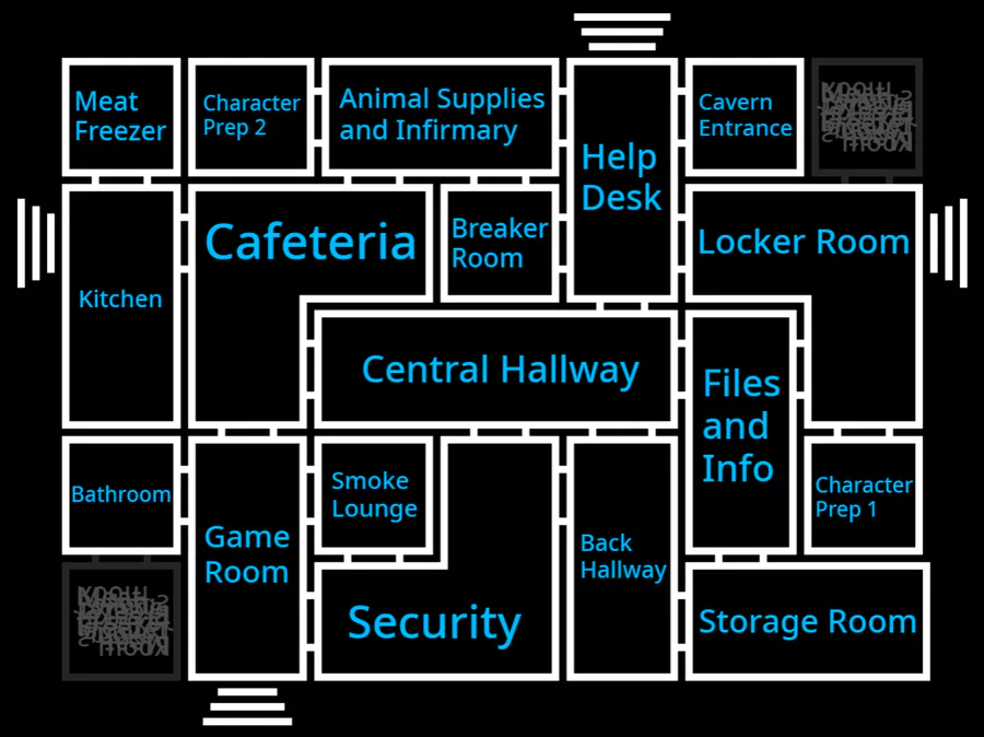
The map now has waaay more cameras, each leading to a lot of other ones, and your office now has 4 entrances.
Now, I can already hear people asking "doesn't having that many cameras make the game too easy?" A good question, but no. Wanna know why?
The cameras don't come back on.
That's right, you only have 19 17 camera shut-offs per night, so you'd better make them, count. And unlike Fnati, there's characters that you need to keep track of, so deciding which cameras you can afford to lose is more important than ever.
You may have also noticed that there's 4 entrances into the building. Those aren't just for show, as there's going to be characters that enter the building through them, so don't dismiss them as unimportant.
Lastly, the breaker room. If certain characters manage to enter that room, they'll tamper with your equipment. They might shut off the lights, they might shut off a random camera, or they might do something else. It depends on who enters, and in some cases, what kind of mood they're in. There will be ways of preventing them from messing you up, but I'm not ready to talk about that yet.
So, what do you guys think? I'm open to answering basically any questions that you guys have about the new building layout (or just this game in general). I know it might be a bit weird, but I feel this is the change this game's needed for almost a decade now.





0 comments