Hey there! I’m Benjamin Overgaard and I was a Unity programmer on the recently released Lightmatter, developed by Tunnel Vision Games. I programmed the visual effects for the game, so naturally this blog goes through the development of those effects.
This post is just a small snippet. You can read the full blog post on Gamasutra: Programming visual effects for Lightmatter
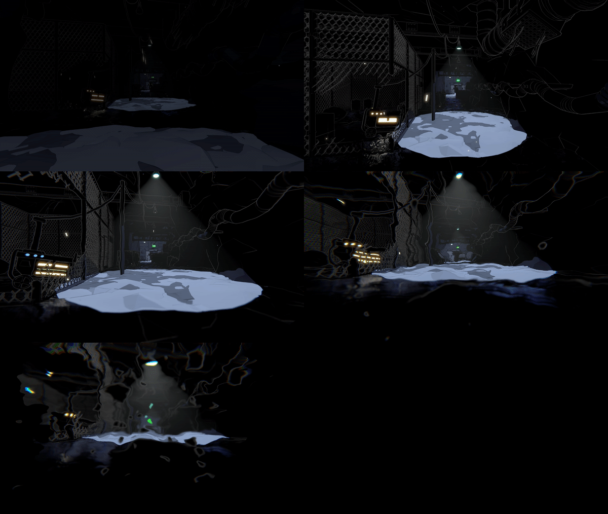
Background
Lightmatter was developed by Tunnel Vision Games - a 6 man development studio from Denmark. We started the company fresh out of the university and spent 3.5 years developing Lightmatter - a first person puzzle game where shadows kill you. I had already worked on a large number of small games before Lightmatter, but mostly as either a systems or gameplay programmer. On Lightmatter, I worked within these areas as well, but I also decided to delve into graphics programming, since we didn’t have that skill on the team.
With several years of experience in Unity, but with minimal experience in shaders, I started out with Shader Forge just to get the basics down. But I quickly jumped into writing my own shaders from the ground up for more control. I can really recommend taking this Udemy course for a basic overview followed by watching Makin’ Stuff Look Good for examples of some more advanced shaders. In general, going into existing shaders and pulling them apart was very helpful in my learning process.
Shadow SSR
We knew early on in development that the shadows needed to look dangerous. My first approach was distorting the white lines as can be seen in the GIF just below.
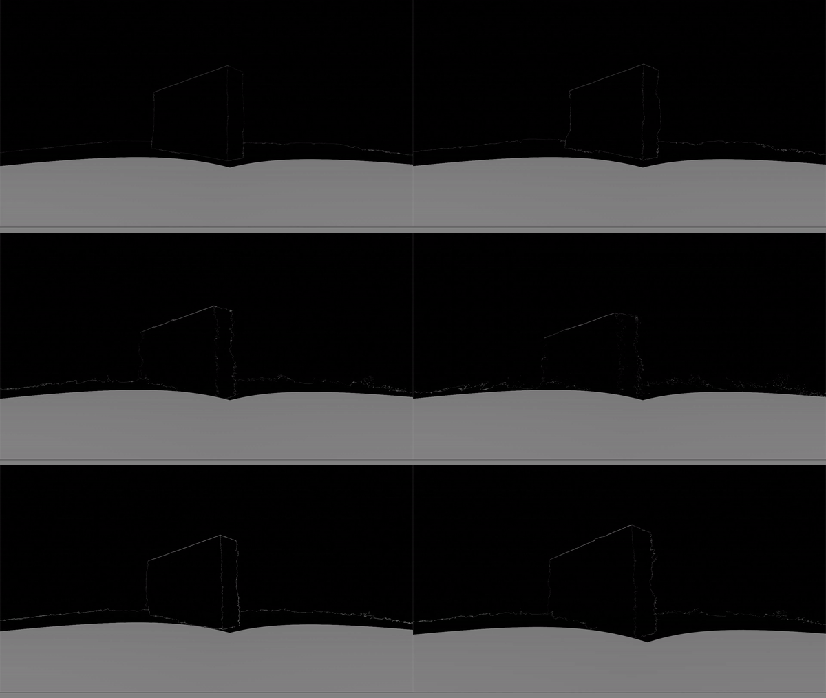
Although an interesting effect, it didn’t work in the context of the game. Due to deferred lighting, all geometry is rendered before the lighting pass. So I could only distort shadow areas in post processing, meaning that I wouldn’t be able to show anything behind the object, since it’s all a screen effect. There might be a way to get around this, but I couldn’t figure it out at the time. Also, since only shadows on floors kill you, I decided to focus on that instead. When the shadows kill the player in Lightmatter, even in the early stages of development, the player would fall into the floor.
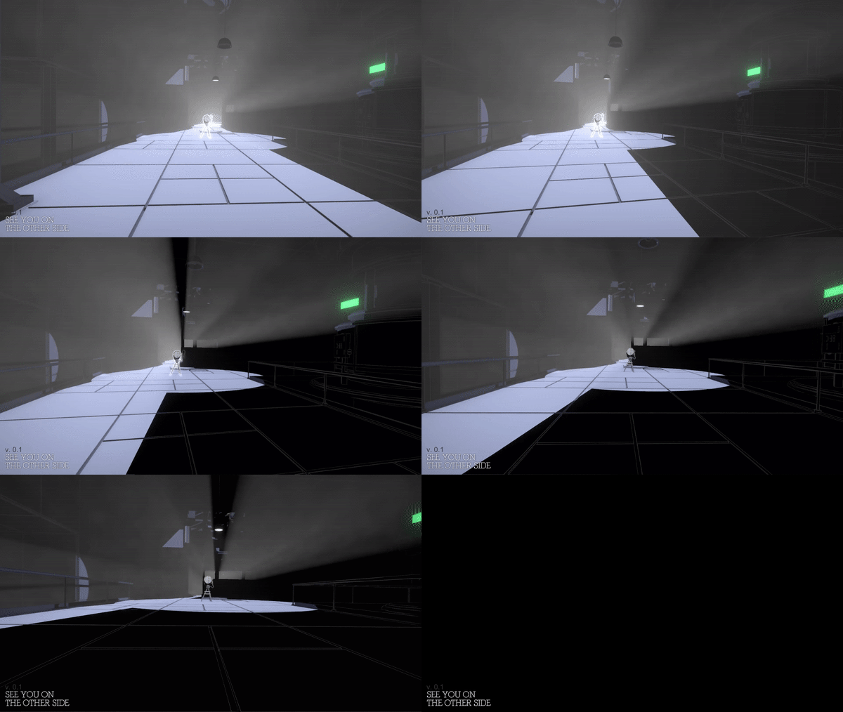
When stepping into shadow, the sinking feeling gives the players time to understand what is happening instead of killing them instantly. We quickly started to imagine the shadows as quicksand or tar. The latter being the most appealing due to it fitting into the context of darkness, and inspired by Marvel’s Venom, we could make it look ominous. Also, levels looked very static at the time, so having dark floor reflect as you move around would add a lot of life.
I had the idea to achieve this using screen space reflections (SSR). Looking into existing solutions, Kode80SSR had the least amount of artifacts and was the easiest to change (in contrast to the SSR in Unity’s post processing stack). By checking for black pixels in the frame buffer and upward normals in the depth-normals texture, I only apply SSR to floor in darkness. Afterwards, I distort the SSR with UV displacement over time to achieve the tar look and add movement to the reflections.
The GIF just below shows how the SSR looks without our distortion effect. Since SSR can be extremely costly, I downsample it greatly, which can be very apparent.
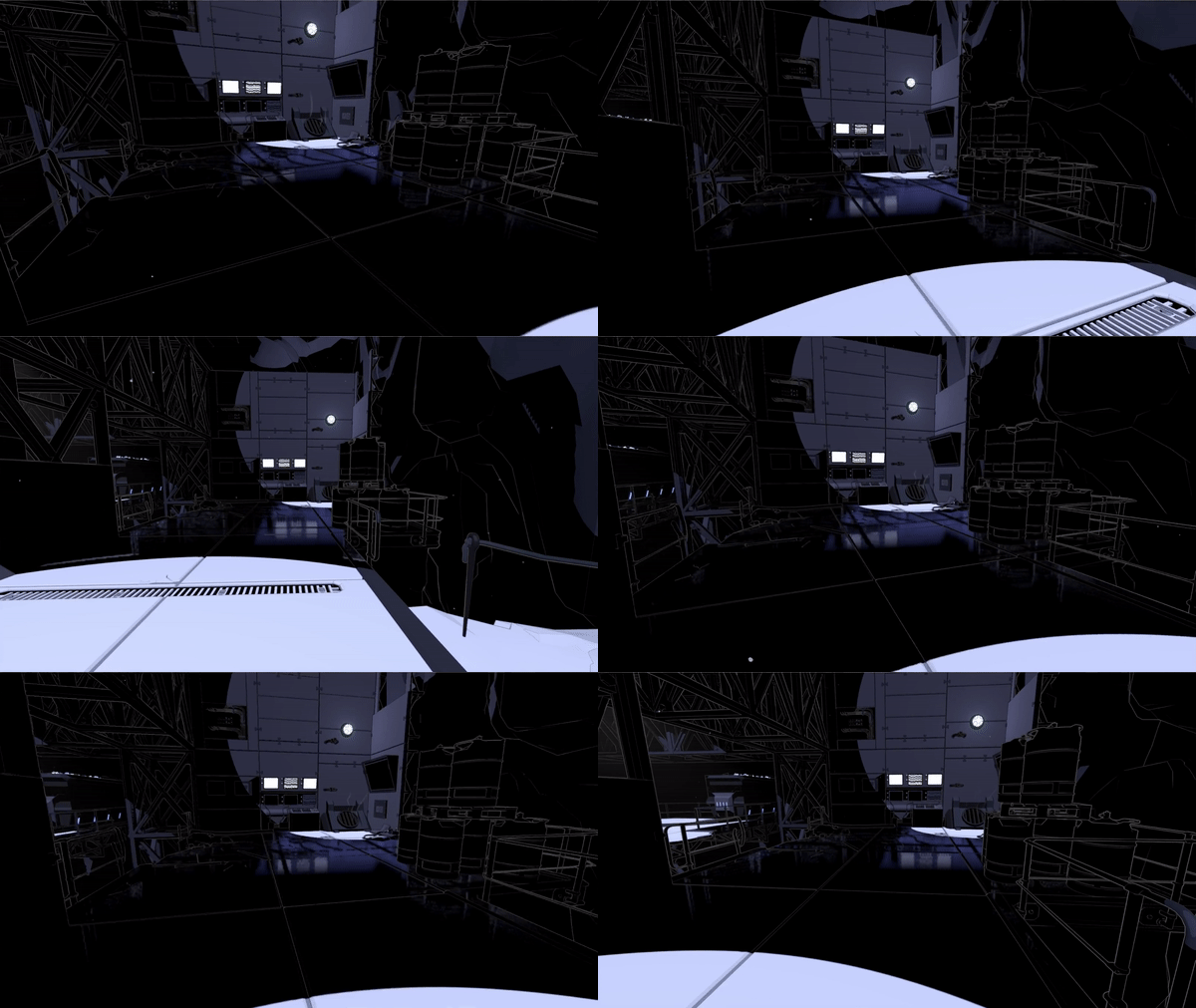
To make the downsampling less visible, I wrote a separate shader pass for the SSR distortion without downsampling. There were additional features of the original SSR shader that I removed for optimization. Due to the displacement texture used, the first version of the SSR distortion had a bit of a water look as you can see below.
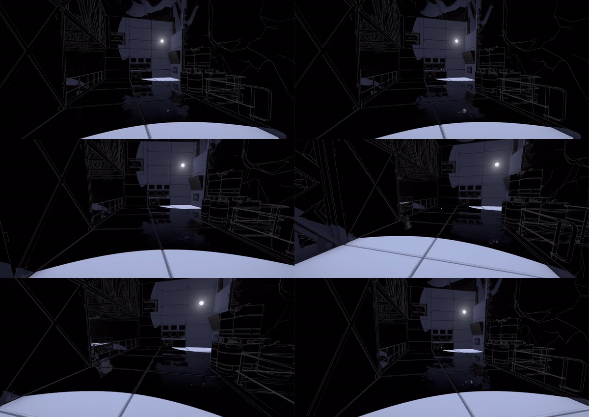
In the version shown above, I displaced the UVs in screen space, which meant that the distortion would move faster when panning the camera. I solved the problem by projecting it into world space. This shader study from No Man’s Sky shows how to do just that. As you might also have noticed in the GIF above, the reflections are quite dark and not very noticeable. Initially I solved it by brightening the entire SSR, but some areas would get overly bright. So I just brighten darker areas. Also, we apply a bluish tint and saturate it to make it look less realistic and more otherworldly.
Surprisingly, Kode80SSR also had an artifact where objects in front of the reflections would be reflected. I solved this by only reflecting pixels in the frame buffer with higher depth than the current fragment. You can see the final result in the GIF below.
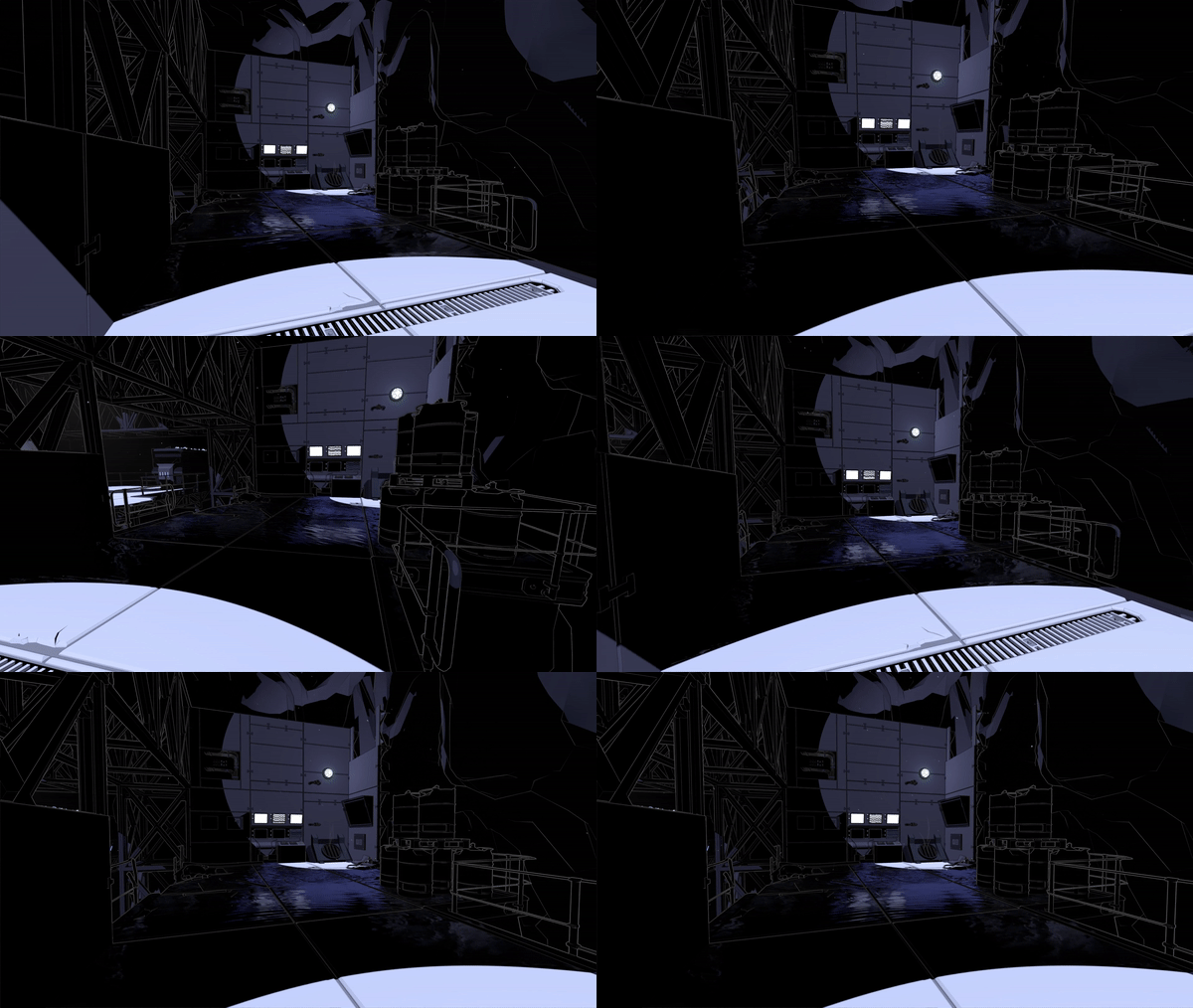
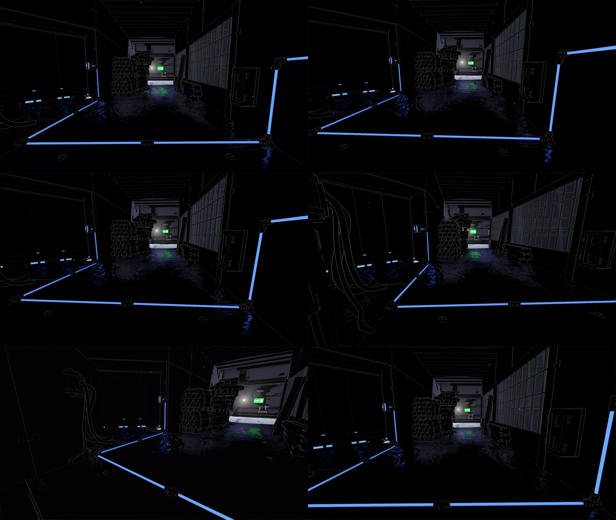
For future work, I would like write a cube map implementation for lower settings, but due to time constraints we decided to prioritize other parts of the game for the release.
Shadow death effect
Our first idea for the shadow death effect was simply having the shadows take over the screen. Similar to how you would make a dissolve effect, our 3D artist made a greyscale vignette texture with a shape similar to the GIF below. The vignette gets brighter towards the middle. In a screen shader, with a threshold value increasing over time, I compare the threshold to the current pixel value in the vignette texture. A black fragment is returned for any values that are below the threshold. I went with this implementation to give our 3D artist as much control of the animation as possible, since it’s simply a matter of making a new vignette texture.
We feared that the effect would getting boring to look at as players die a lot, so we made it as quick as possible.
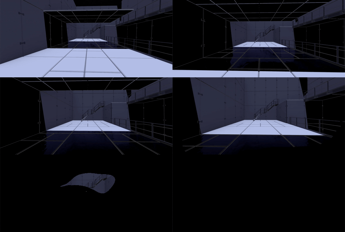
However, it needed to be more dramatic. Players should feel like they’re sinking into thick goo, so it needed to be longer. Furthermore, it was hard to see the shadow overlay if the player was dying in a pitch black area. Also, the overlay looked too perfect, like a cardboard cutout. To fit the tar look, it needed to look more organic. So I looked at the ‘taking damage’ overlay effect in Splatoon prior to the next iteration of the effect.
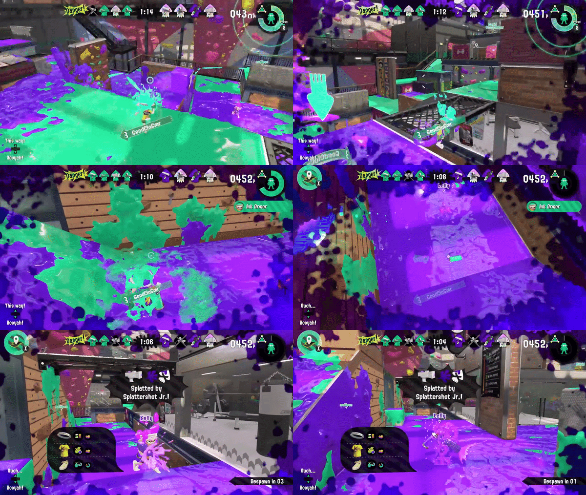
For the next iteration, I prolonged the effect - making players move and look exponentially slower while in the shadows, and making them sink faster. To make the effect visible in the dark, I distort the entire screen, with our good old friend: UV displacement. This makes everything wobble slightly - a strong indication to the player that something has gone wrong. To make the overlay itself more organic, I apply a separate UV displacement to the vignette threshold.
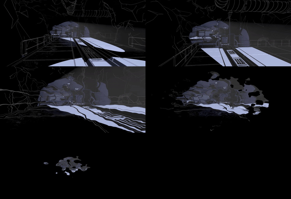
An improvement, but still a bit underwhelming. So, our 3D artist refined the vignette texture - making it cleaner. And I added screen shake, chromatic aberration, blur, and a vertigo effect by animating the FOV. However, since all of these are screen effects, it still felt a bit cheap. Something needed to happen in front of the player in 3D space. So, I added some bubbly particle effects to make it feel like the player is dissolving, almost boiling in the shadows. More particles are spawned exponentially as the sequence progresses, to give the feeling that player is getting more and more submerged into the shadows.






0 comments