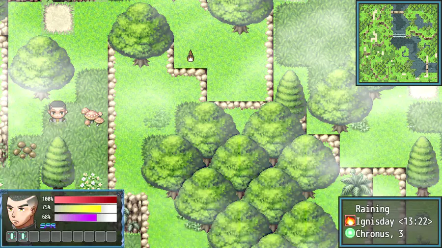
A new redesign for two things, the character sprites (Again) and the thumbnail, which is being planned. That also includes the title screen for possibly THREE more screens. I'll get into that later by the next devlog, but let's talk about why I wanted to do a redesign the character sprites.
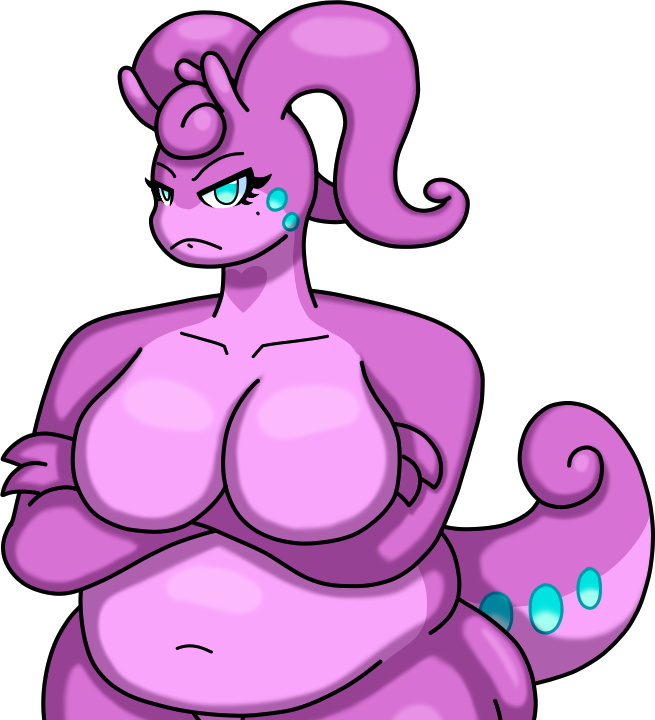
While true, it sounds REALLY redundant, this is because there's no other way for me at least to make ANOTHER costume for Sasara. While I can't say much about it (Because it's more or less story relevant for her later on.), the point is that I don't think a chibi version of her new form would work, so I thought why not redesign it to the point where every character has a sense of proportion because well, 48x48 is limiting but I don't see why I shouldn't increase more so expect sprites to be 72x72 or so.
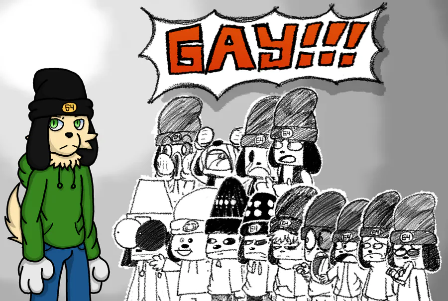
Now the thumbnail, there's nothing wrong with the thumbnail itself, it's that I kinda want the thumbnail to match the title screen for the game. Now, unlike the other thumbnails or title screens, the difference is that I wanted the emphasize on the characters mainly to show the whole friendship mechanic for the game. Sure, the previous thumbnails did show the party, but not so much of the emphasize and just still. The first one was just four characters facing mostly forward, but I wanted to change that, so then the second thumbnail design came in. While there's no problems with it, in fact I like to an extent it's arguably my second favorite BECAUSE it's made within 16:9 and 4:3 back when I thought it would be easy to upload the game on Itch.io. It isn't, but it doesn't reflect the emphasized mechanics of current JABE, so a redesign is needed.
That's all for this devlog and for this February, see you in March.

0 comments